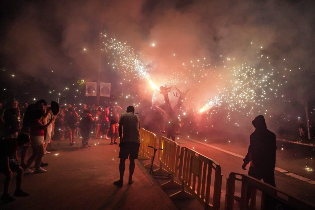
Festa de la Primavera
A festival that takes to the street.
The brief
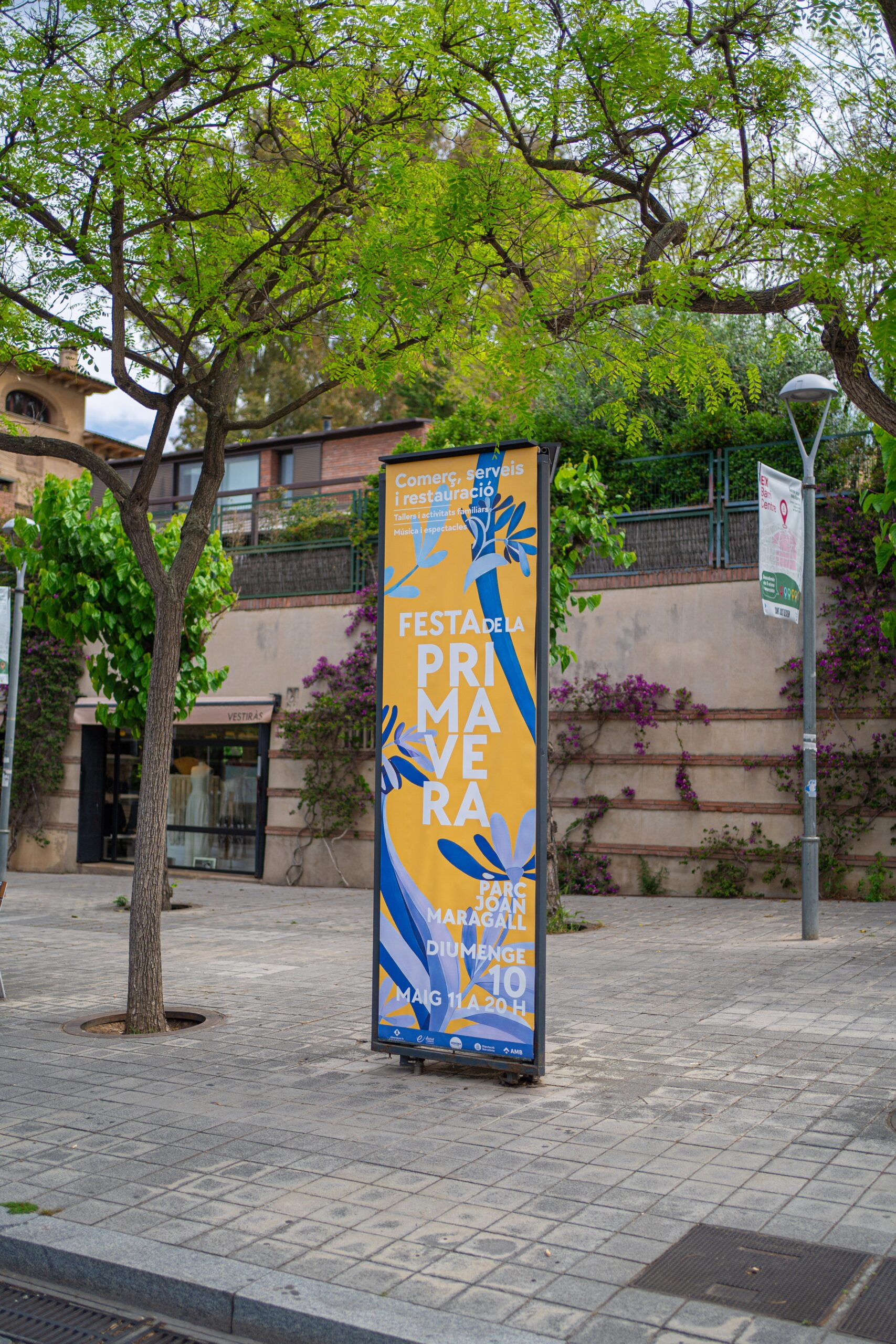
A town festival is announced in the street. On totem signs, on banners, on the lamppost round the corner… and also on the flyer you take home with the programme. Sant Just Desvern City Council needed an image for the Festa de la Primavera that worked as well in large format as on a sheet of paper you read up close.
Recognisable, fresh and with that festive edge, without falling apart when it changes size.
What we did
We designed the full visual line for the campaign. An image with character, made to live in the street and on the formats closest to people: totem signs, banners, posters, flyers and every graphic application needed.
We started with the biggest and the smallest format at the same time. If the image holds up on a totem sign seen from across the road and on a flyer read in the queue at the bar, it holds up on everything in between.
We ordered the information by reading distance: from far away, the festival and the date; up close, the programme. Each format shows what can be read from where you look at it.
The key was consistency: from the giant format to the smallest printed piece, everything had to sound the same. Presence, colour and graphic judgement for one of those dates that make a town.
From poster to street display.
A festival campaign has no main piece: it has twenty formats and none of them is in charge. The key was designing a system, not a poster, with rules for colour, type and hierarchy that each format applies at its own size.
From the totem sign to the flyer
Each format is read from a distance, and that decides what goes on it. The totem sign and the banner, from across the road: name of the festival, dates, image. The poster, at two metres: the main events as well. The flyer, in your hand: the full programme, times and places. The social media pieces, under your thumb: one thing per piece.
What does not change is the system: the same colours, the same type, the same image cropped in a different way. That is why a street campaign is recognised out of the corner of your eye, which is how you look at the street.
How it went
Gallery · the project in pictures (click to enlarge)
Spring comes to life.
A new animated adaptation for the case study; not presented as a piece published during the original campaign.
From poster to street
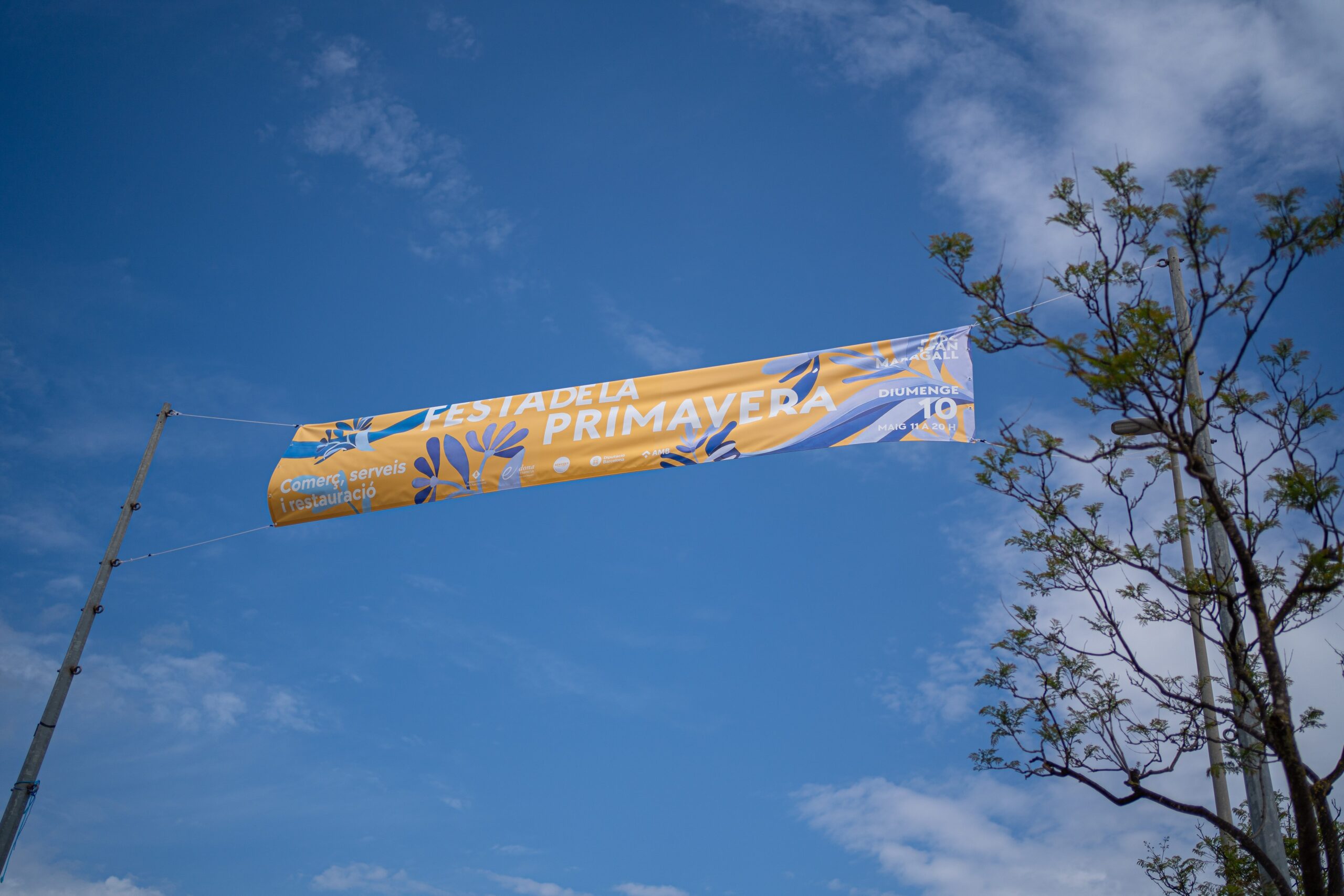
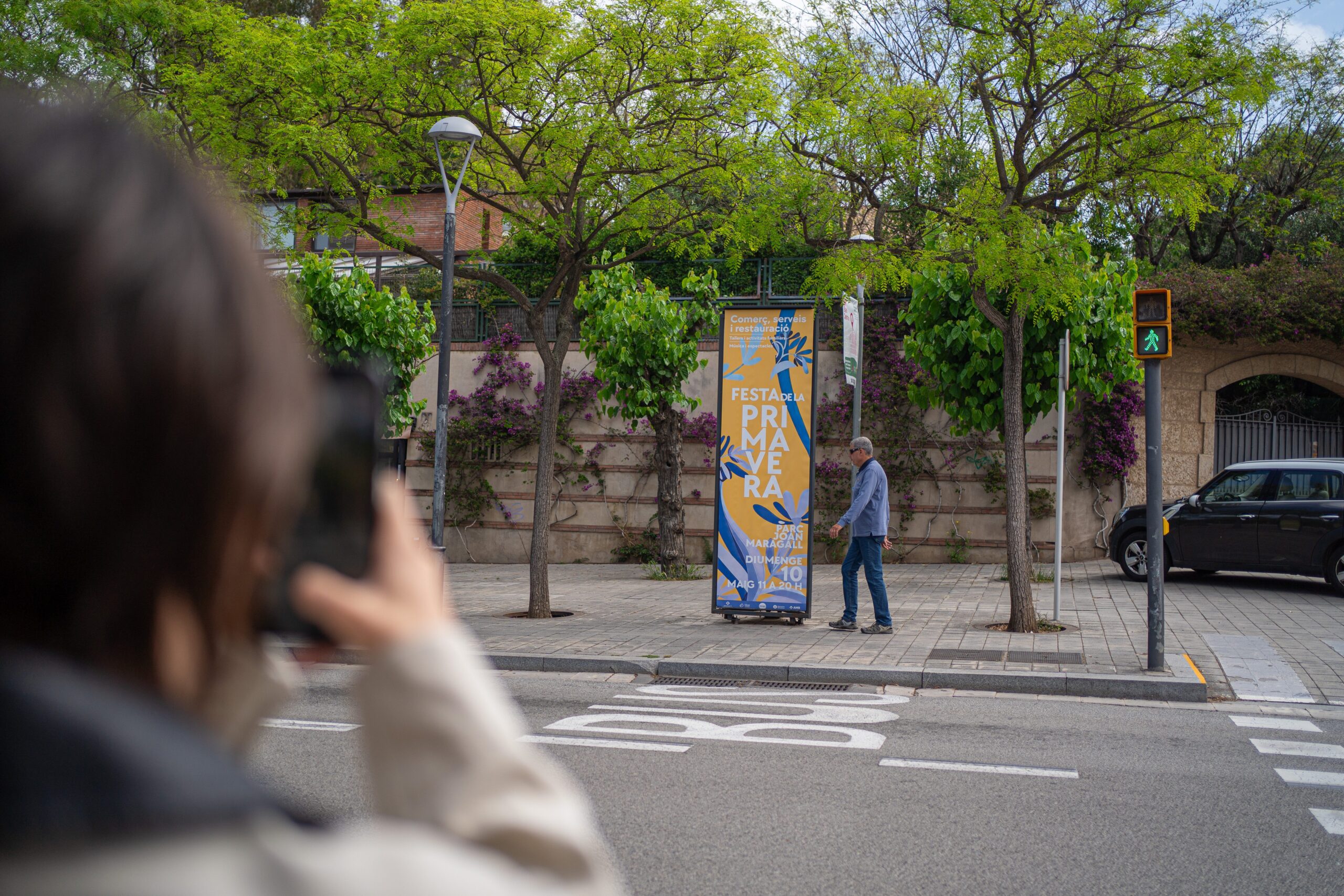
The poster brings the information together. The totem takes that identity into the street: a yellow ground, blue and violet flowers, and a title that reads from a distance.
An identity along the route
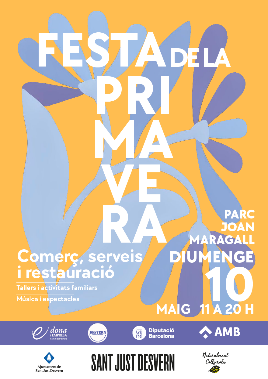
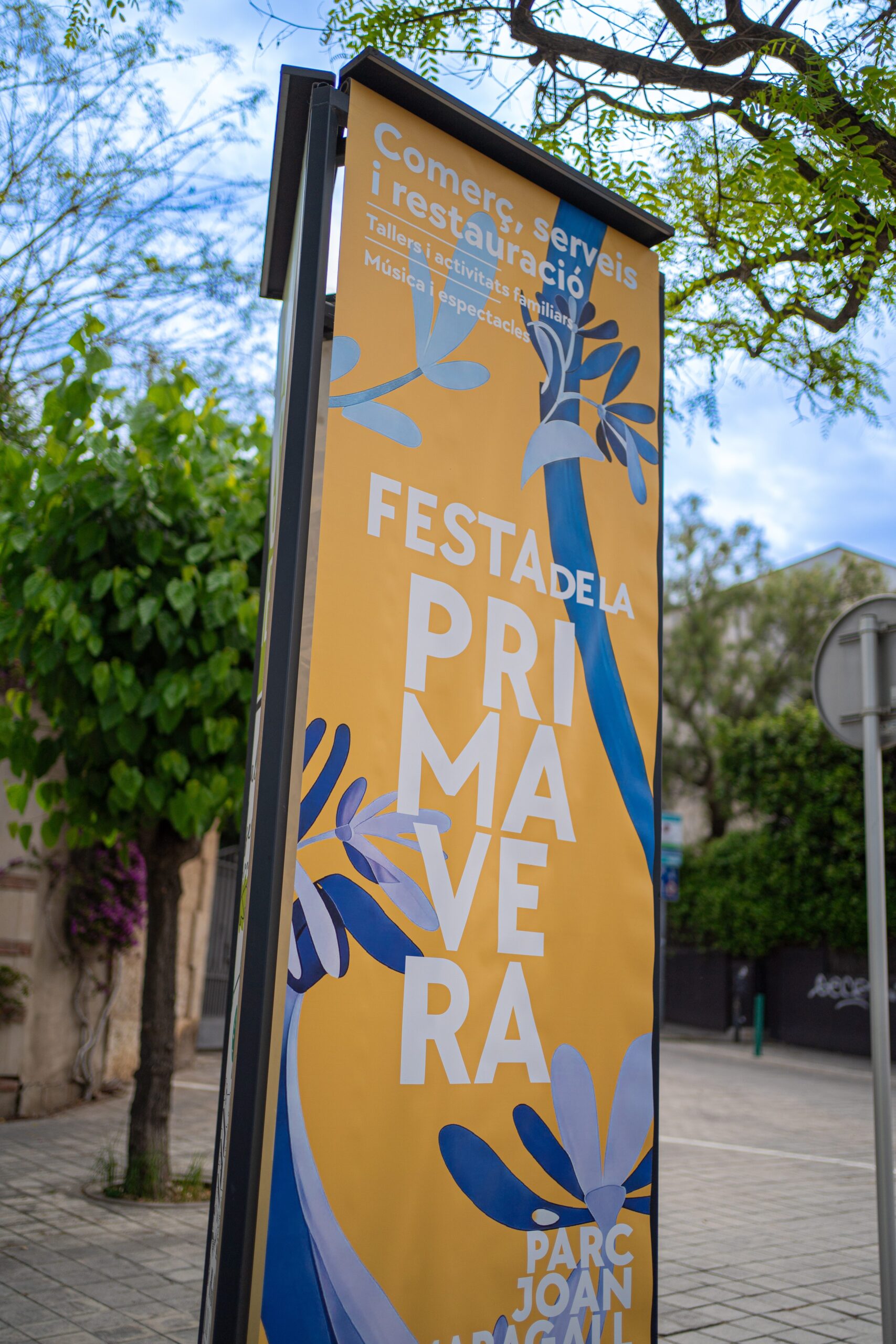
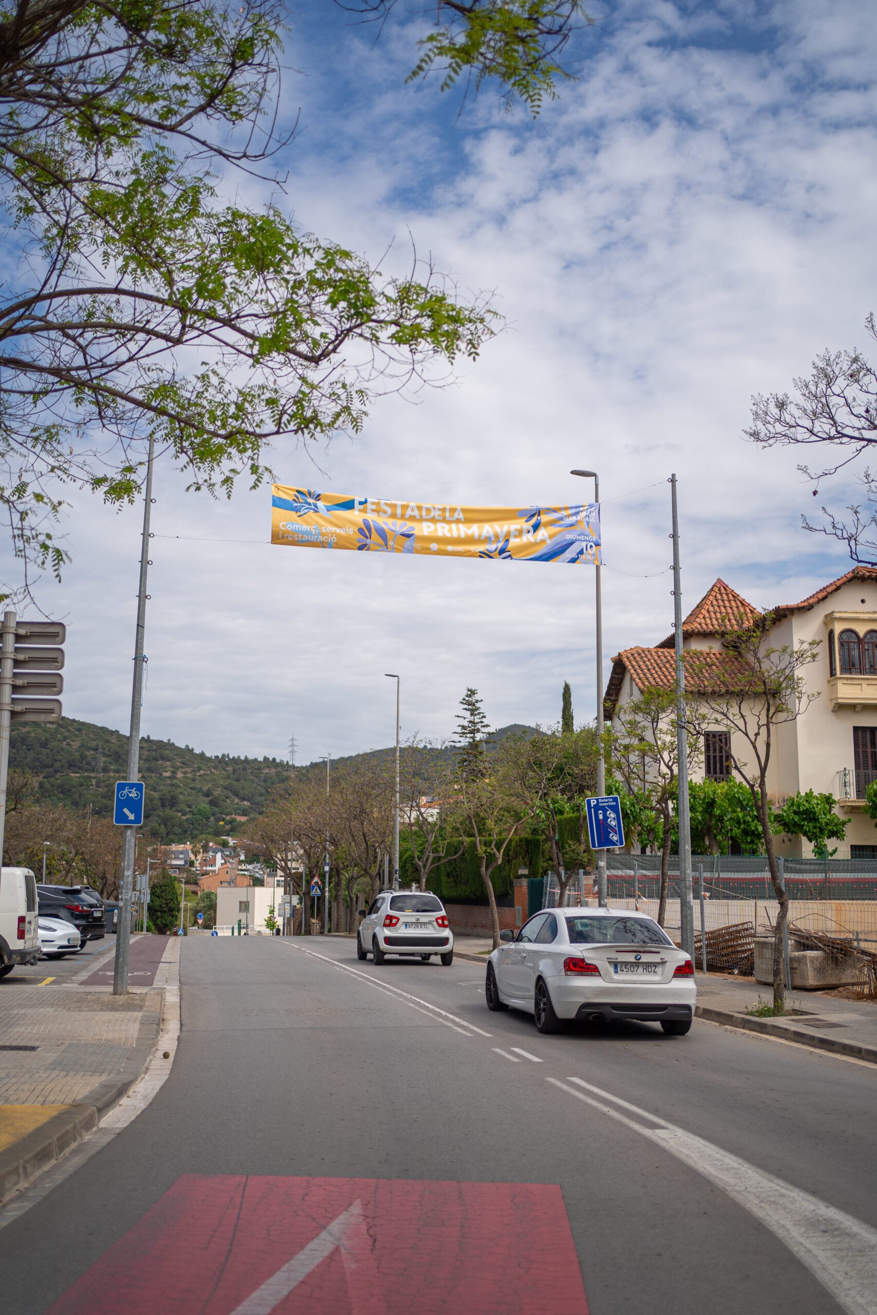
Banners and totems share the same graphic elements in different formats. These photographs show the pieces installed in public space.
"From the giant totem sign to the flyer… the same festival."Art direction
Want a result like this for your project?