
Memfer
One blue that reads clean.
The brief
Memfer has been buying, selling, manufacturing and distributing industrial machinery, tooling and cleaning products from Cerdanyola del Vallès since 1990. It sells to schools, companies and institutions, and its brand still looked like a warehouse’s: no system, no versions, no colour rules.
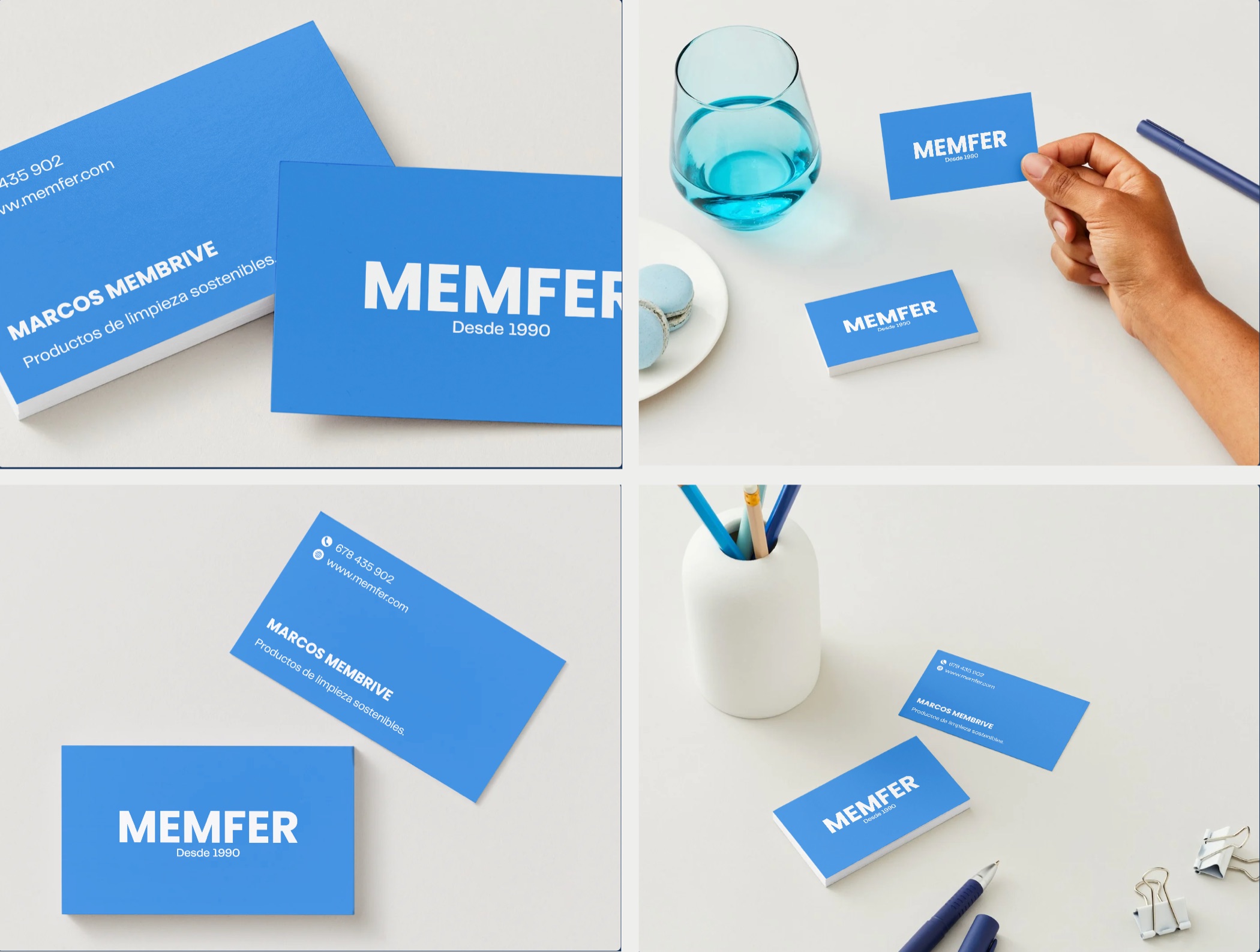
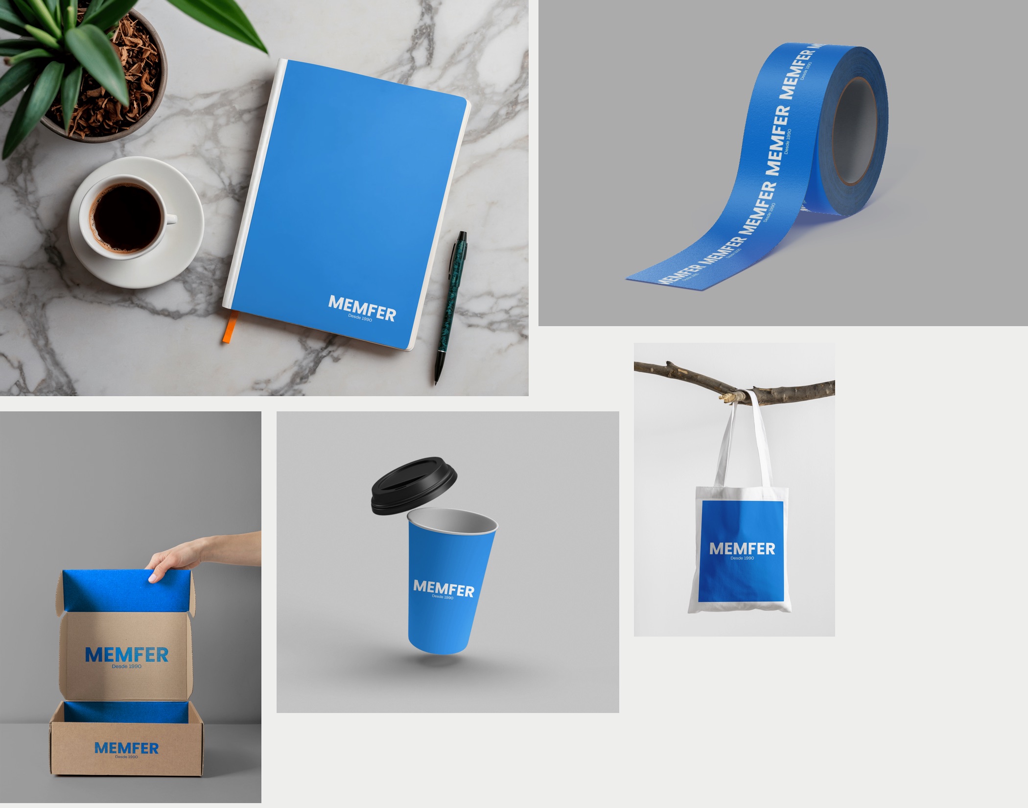
The brief was a complete rebranding that said what they do — cleaning and hygiene, seriously — and that the team could apply on its own: on a business card, on packing tape or on a box, without calling anyone.
What we did
We started with the brand, not the logo. We wrote down mission, vision and seven values (quality, commitment, hygiene and safety, sustainability, professionalism, adaptability and innovation) and turned them into a rule: everything we designed had to read clean, safe and unadorned.
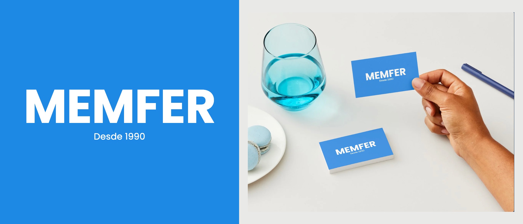
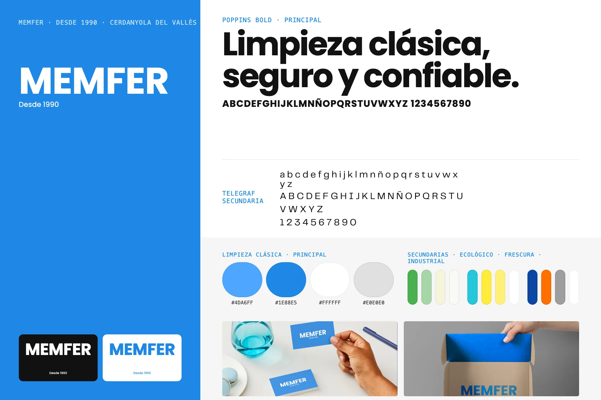
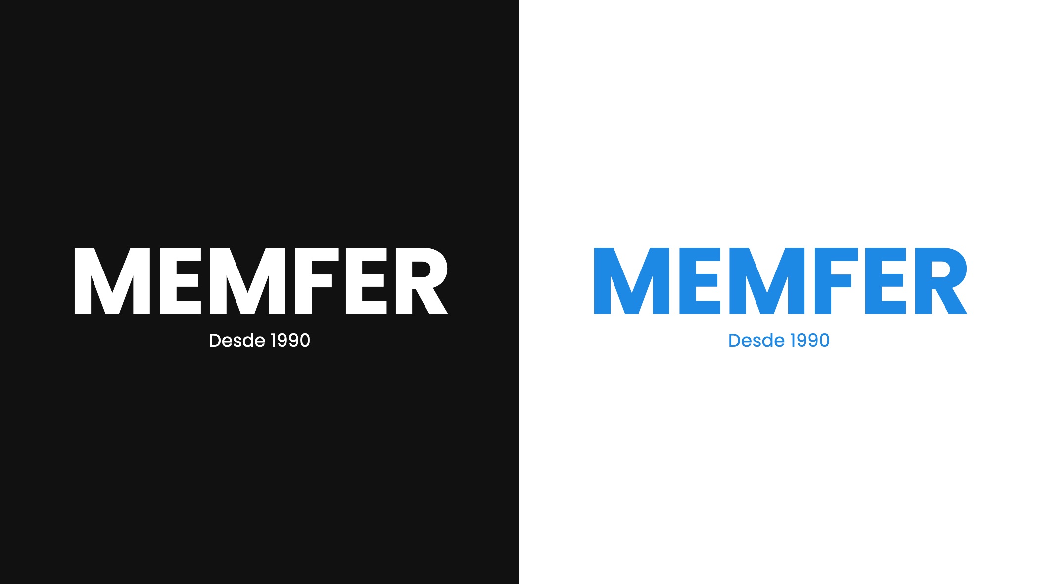
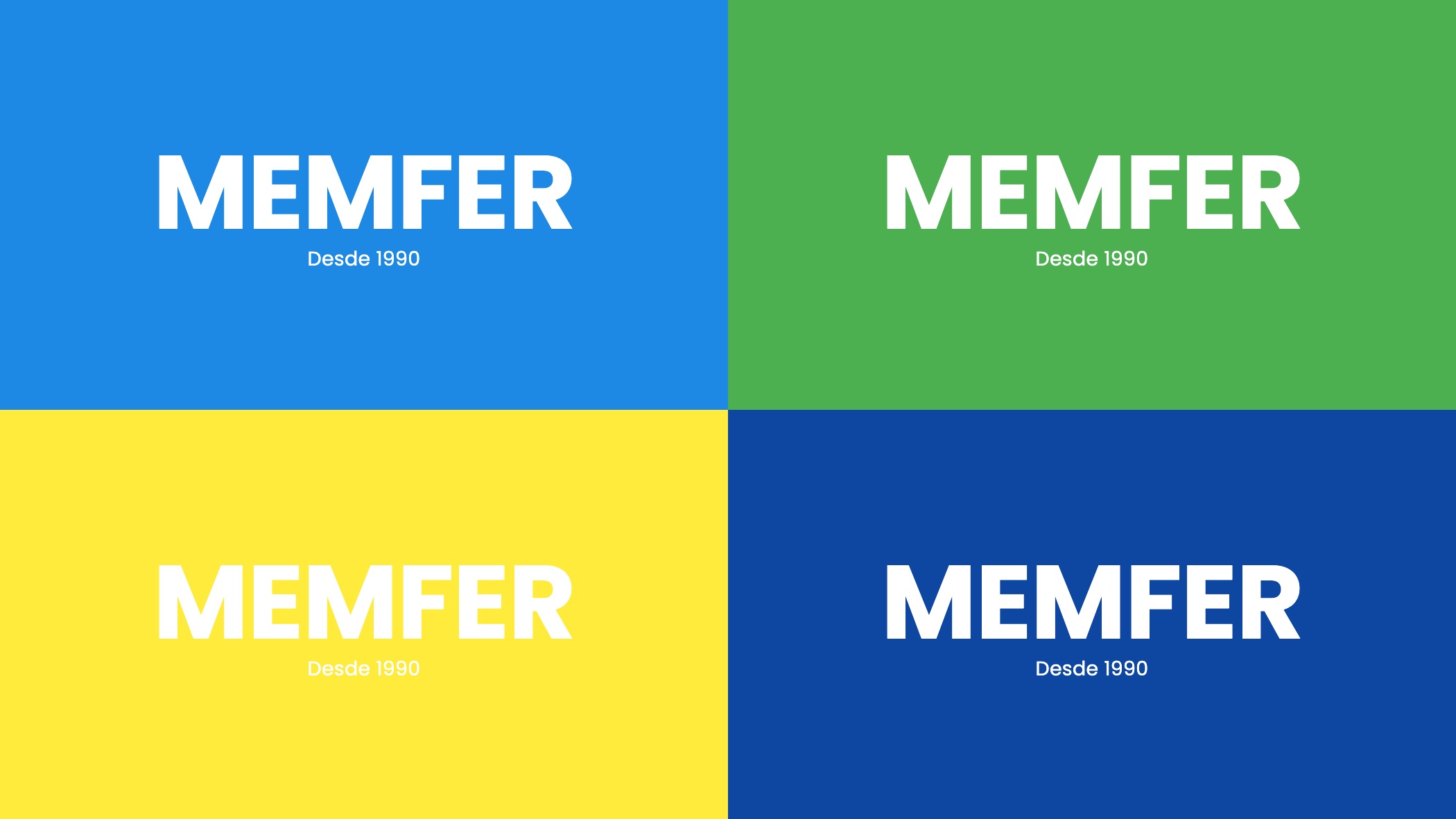
An uppercase wordmark and its versions. MEMFER, in Poppins Bold, with the line “Desde 1990” that conveys heritage without saying it. Primary version in white on blue and blue on white; secondary versions in black and white for when colour is not available.
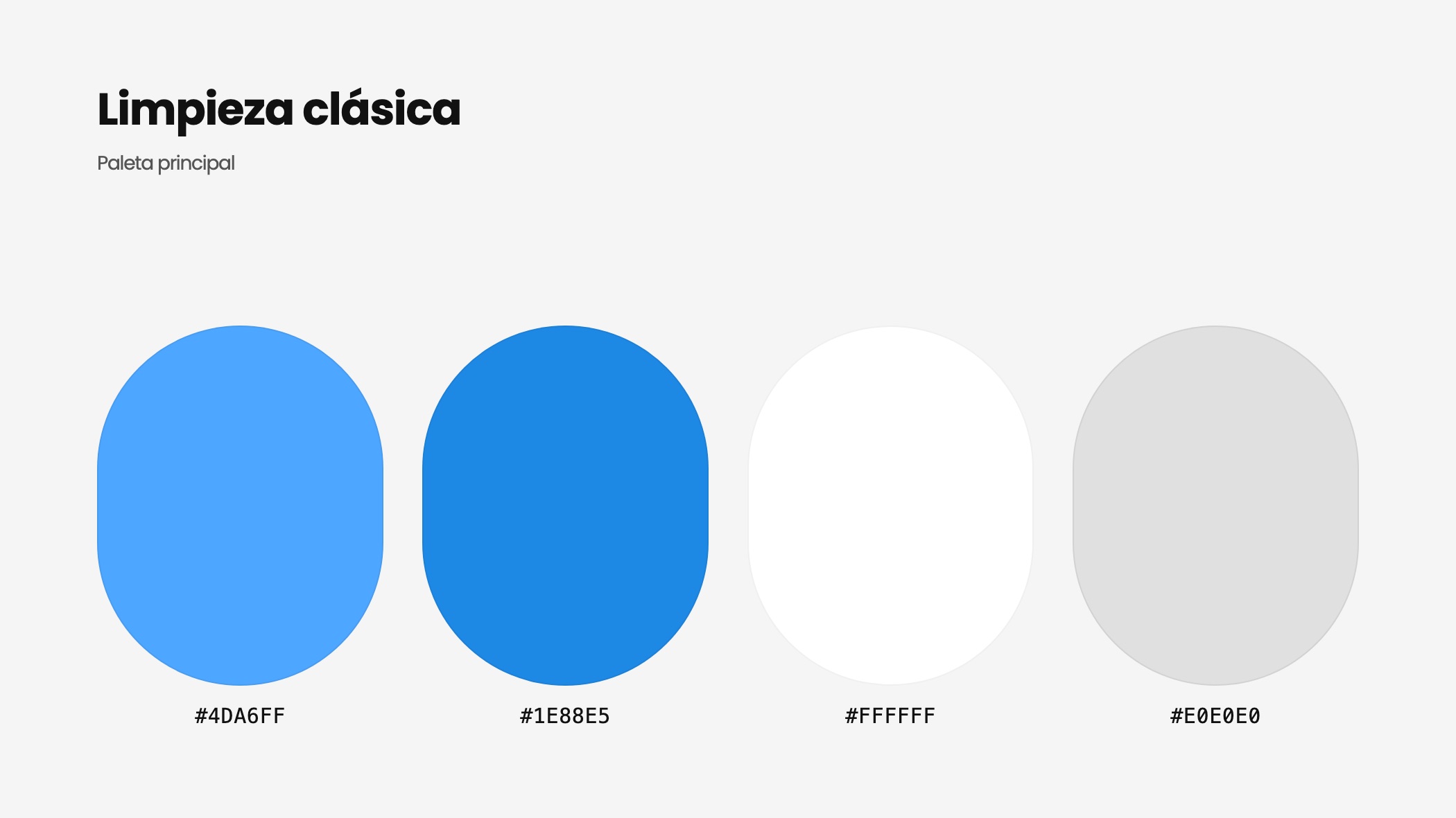
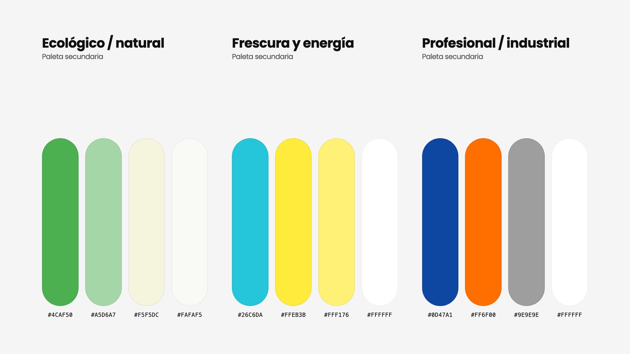
A colour system, not a colour. The primary palette is classic cleaning: light blue (#4DA6FF), blue (#1E88E5), white and soft grey. And three secondary palettes to tell product lines apart: ecological (leaf green and cream), fresh (turquoise and yellow) and professional (dark blue and orange) for industrial-grade products.
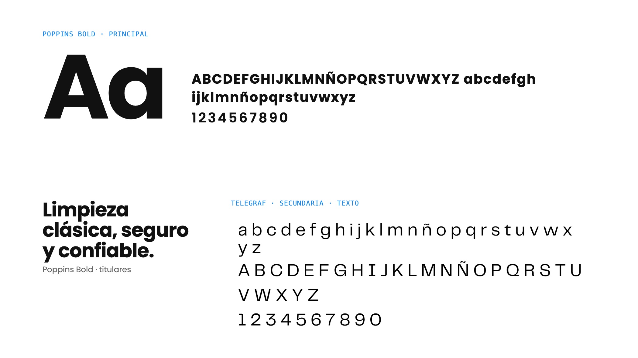
Typography and applications. Poppins Bold for headlines and Telegraf for running text. And the system applied to what Memfer actually uses: business cards, packing tape, boxes, cups, bags and notebooks. All gathered in a brand book so the team can apply it.
Colour says “hygiene” before anyone reads a word.
One blue that reads clean; everything else is system. A cleaning company does not need a brand that shouts: it needs to be recognised from a metre away in a warehouse and reproduced correctly by any supplier the first time. That is why the wordmark is a single uppercase word and colour does the job of saying “hygiene” before anyone reads a thing.
How the system works
The primary palette is the brand: the blue of classic cleaning, which conveys trust without explaining itself. The three secondary palettes are not decoration: they are a way of organising the catalogue. An ecological product appears in leaf green and cream; a shine product in turquoise and yellow; a professional or industrial one in dark blue and orange. The wordmark does not change; the background does.
That rule lets Memfer differentiate product lines without designing a sub-brand each time, and lets every new label be born inside the system. Poppins Bold labels and Telegraf explains; neither does anything the other could do better.
The brand book gathers the wordmark versions, the hex values of every palette, the typefaces and the application mockups, so the team and its suppliers work by the same rules.
How it went
Gallery · the project in pictures (click to enlarge)
The logo, in uppercase
One word in Poppins Bold and a line that states the company’s age. Versions for every background and every product line.
Four palettes, four product lines
The primary palette leads; the three secondary ones tell eco, fresh and industrial apart without changing the logo.
In the hand and on the box
Cards, packing tape, box, cup, notebook and bag: the system applied as documented in the brand book.
"Classic cleaning: safe and reliable."From the Memfer brand book
Credits · the people behind it
Want a result like this for your project?