DalecandELA — identity project
Evolving what brings people together.
The brief
DalecandELA already had a recognisable voice: its handwritten call, the rider, burgundy and gold. The identity project builds on that heritage to document it, organise its use and extend it across new formats.
The manual addresses a practical question: how volunteers, printers, campaign designers and interface teams can work with the same brand. This case presents the project and its proposed applications; the website development is documented in a separate case study.
What we did
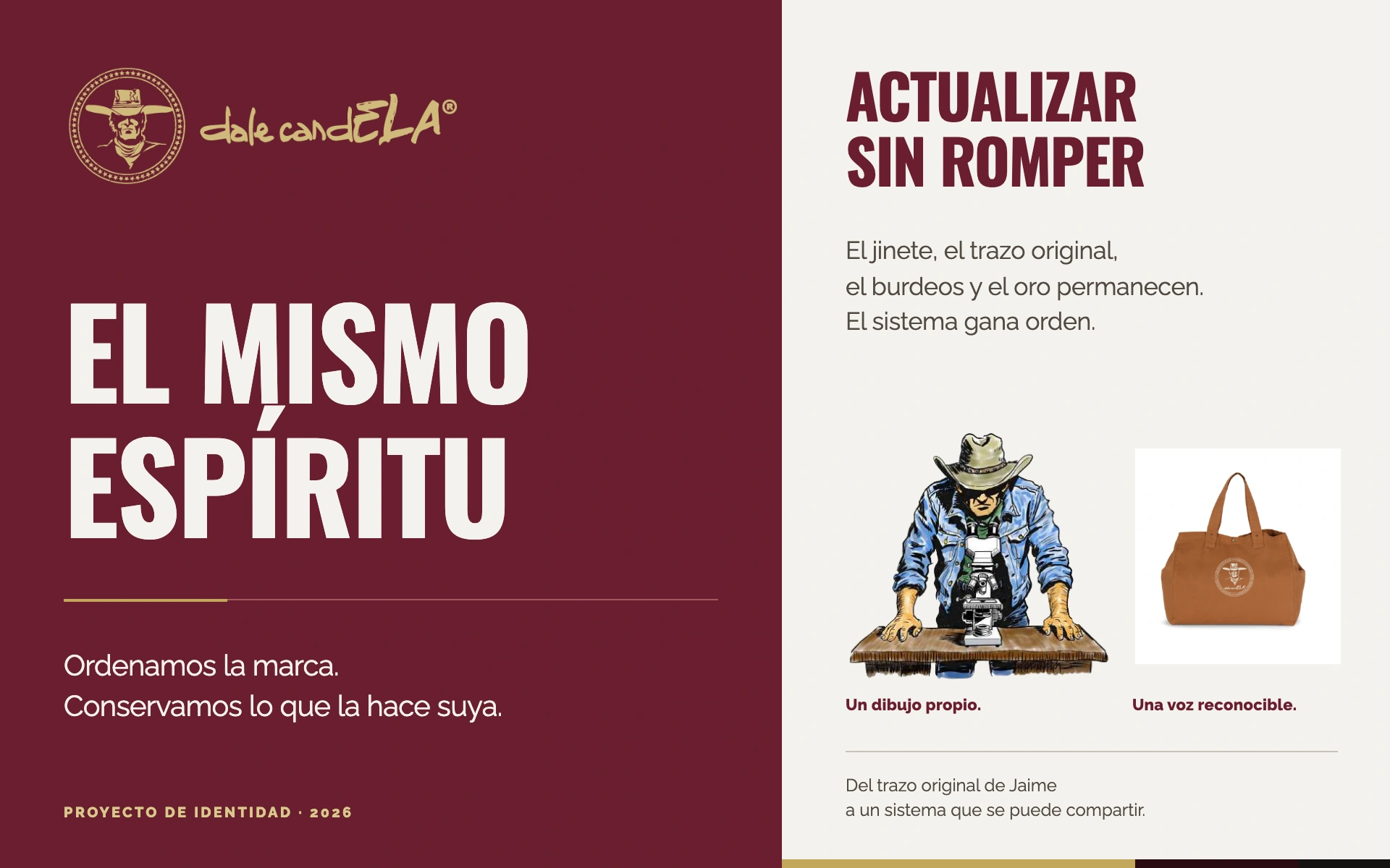
Preserving the original identity. Jaime’s lettering and the emblem remain the source assets. The work documents versions, proportions, clear space, partner branding and incorrect uses; it does not claim a new origin for the logo.
Giving every element a role. Burgundy provides the foundation, gold adds emphasis and paper creates space for reading. Oswald structures headlines; Raleway handles body copy and interfaces. Documentary photography keeps people at the centre.
Turning principles into tools. The brandbook brings together composition, photographic treatment, voice and applications. The design package adds original assets and styles that carry these principles into everyday work.
Keep the spirit. Grow the system.
The identity does not start from scratch. The project turns familiar elements into a shared system. Its value appears when an individual piece becomes part of a family of materials: the format changes, the voice stays recognisable.
Identity project · In development · 2026
The same voice, at a different scale.
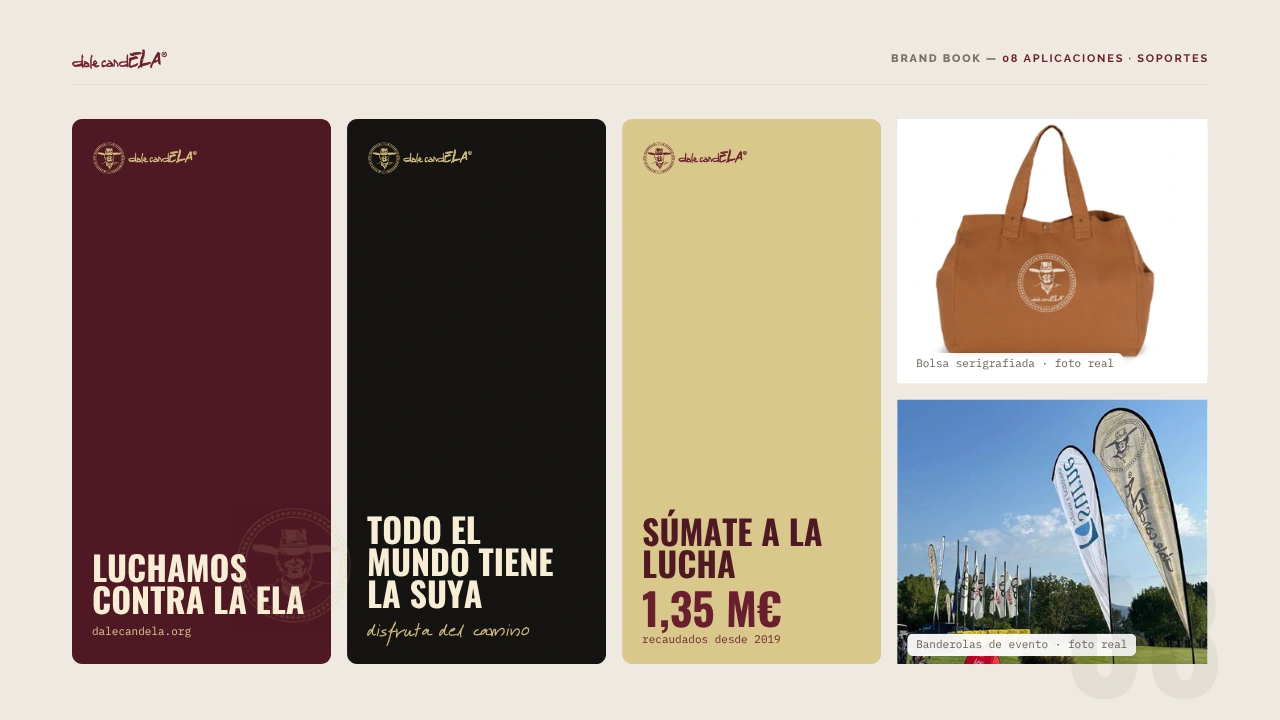
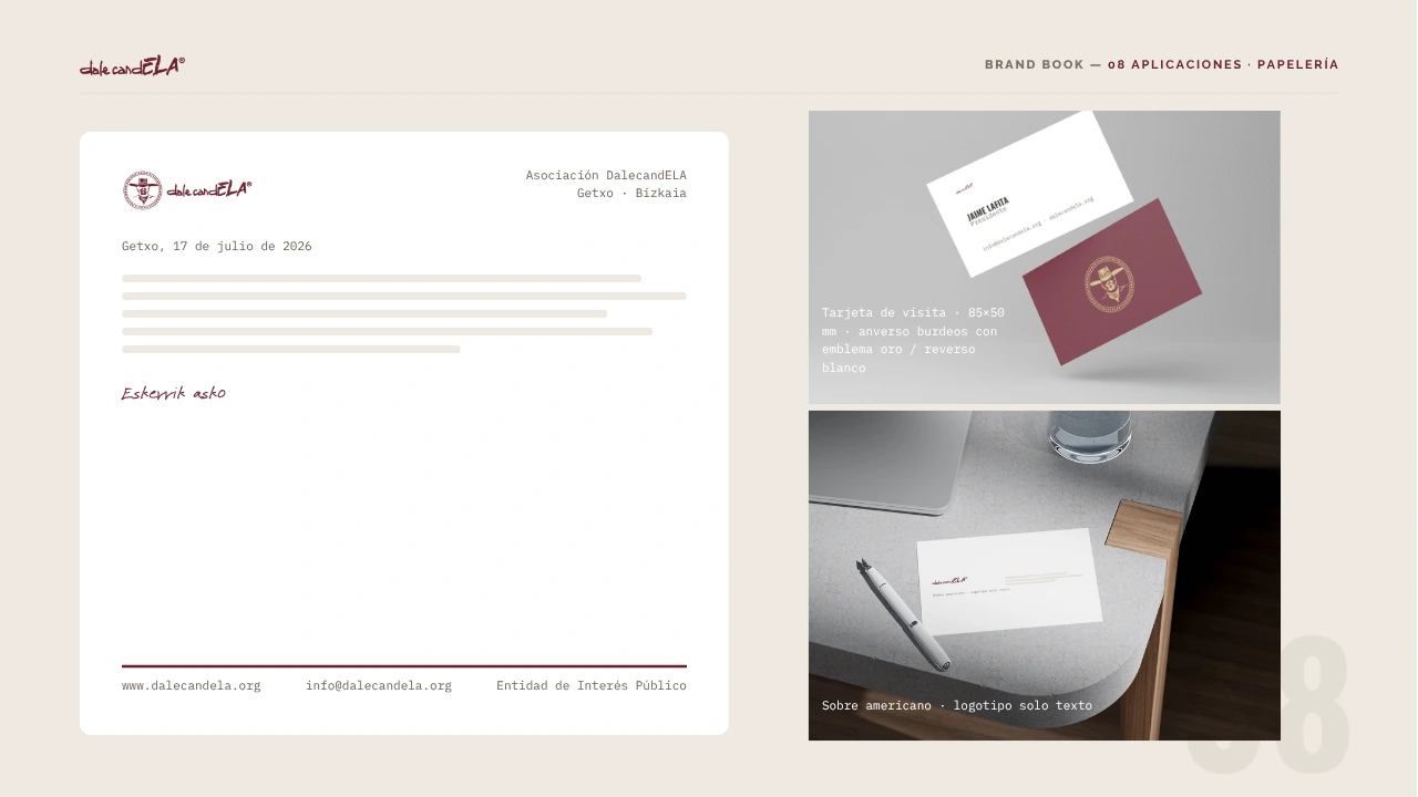
Six selected applications explain three decisions: making the brand recognisable at a distance, carrying it into everyday use and bringing its voice to screens. The proposal preserves Jaime’s original lettering.
01Recognisable, even from a distance.
A phrase, a contrast and a signature. The roll-up concentrates the message; stationery shows what remains as the scale changes.
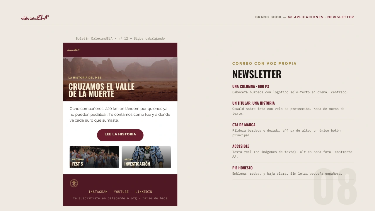
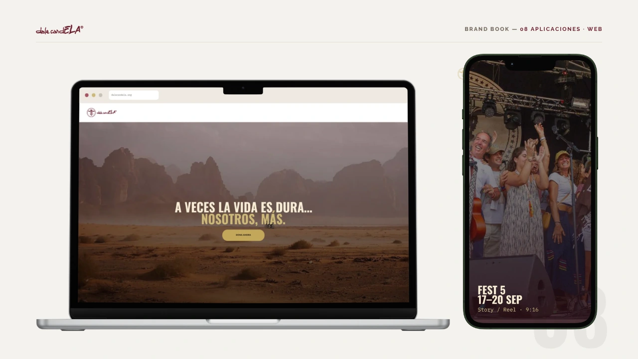
02A voice moving from paper to screen.
Photography opens the story. Typography guides reading and the invitation to participate. Newsletter and website share the approach without repeating the composition.
03The change becomes clear side by side.
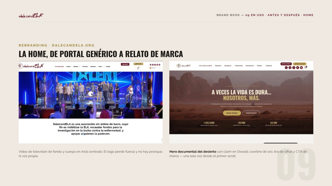
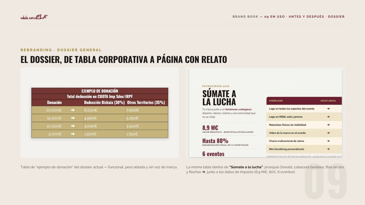
Two comparisons from the guide: the website entry point and a dossier. The work lies in hierarchy and storytelling while keeping a recognisable identity.
Gallery · the project in pictures (click to enlarge)
One identity, a family of elements.
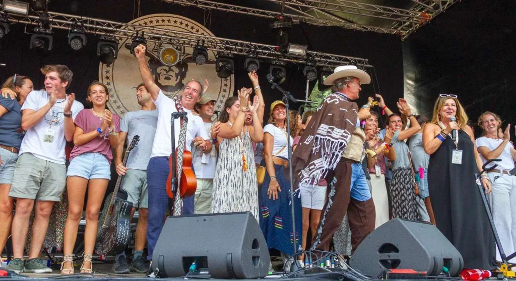
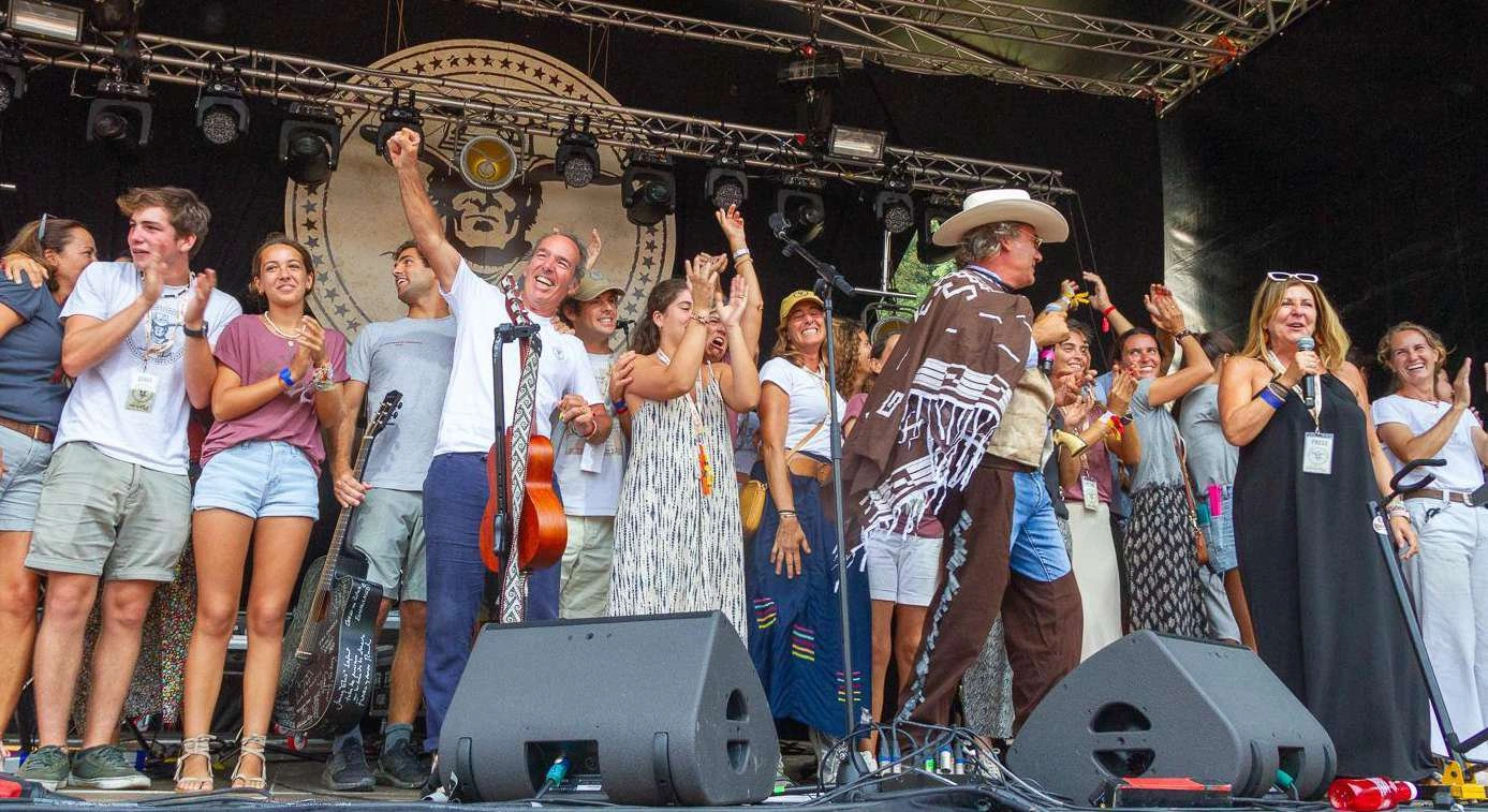
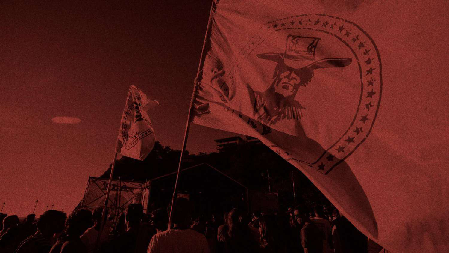
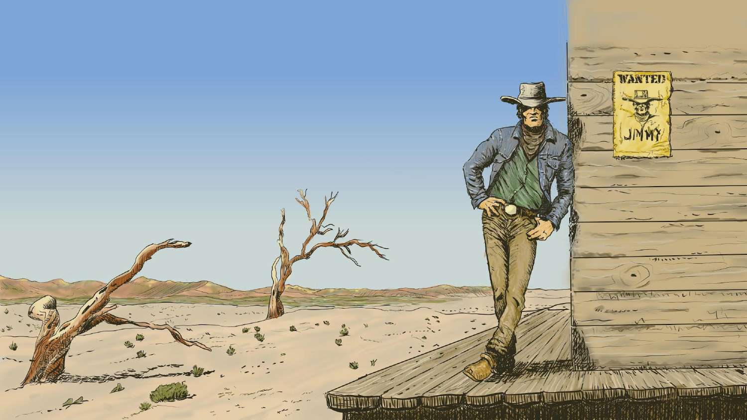
Original material from the brand package. The photographs show the association’s context; the manual’s applications explain the proposed system.
Credits · the people behind it
Want a result like this for your project?