DalecandELA
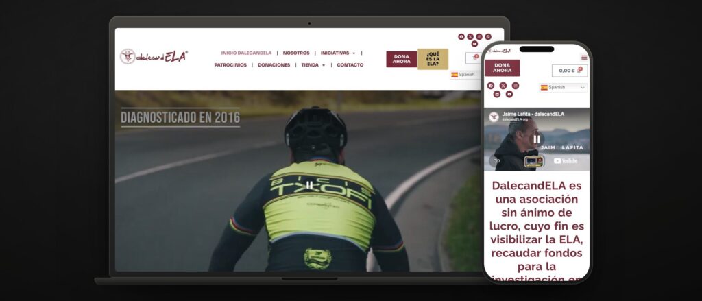 dalecandela.org · donate, buy, sign up
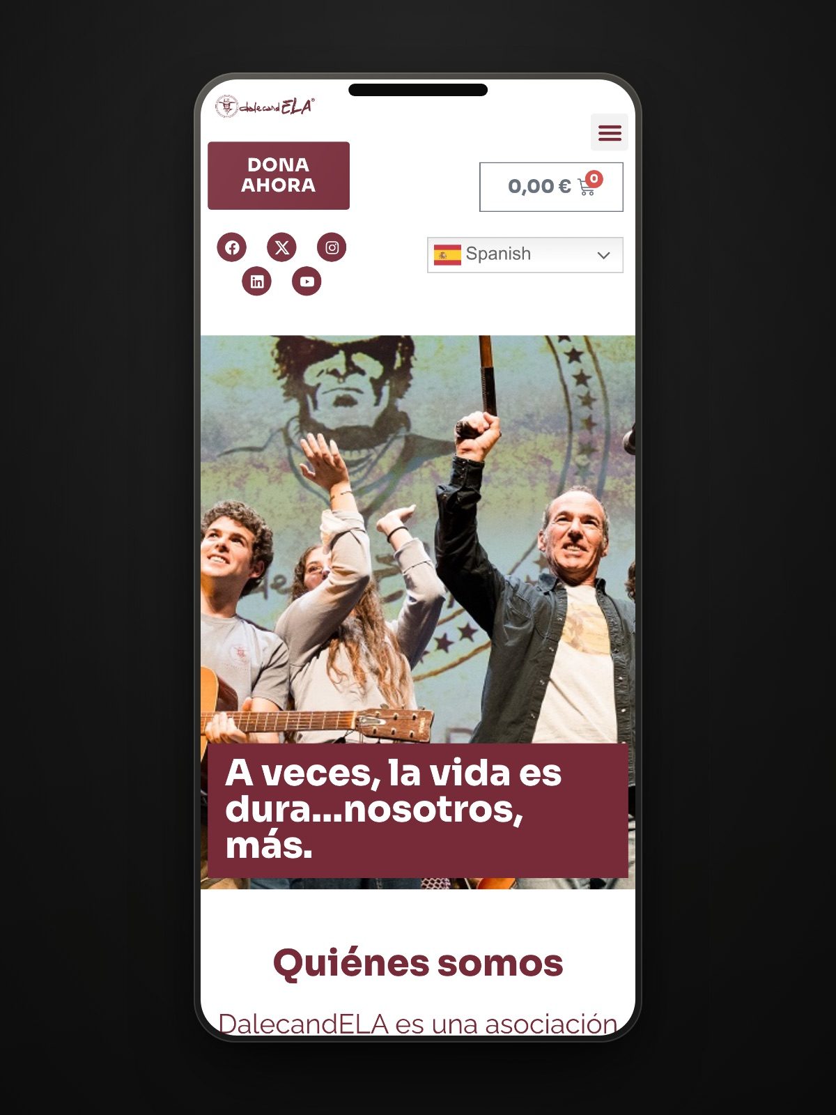
 DalecandELA is an association fighting ALS with an energy that spreads: festivals, races, tandem challenges, golf tournaments, documentaries, a cookbook. They needed a digital presence to match all that activity, not an «about us» website with a donate button lost somewhere on it.
The brief: a modern, practical platform for raising funds, spreading the word and connecting even more with their community, with everything an association needs and that usually ends up scattered across five different tools.
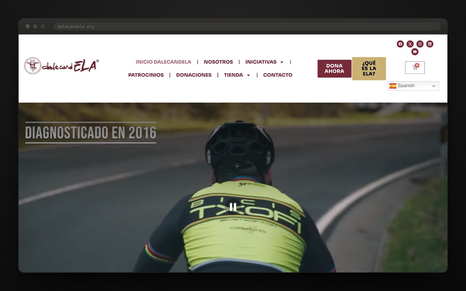
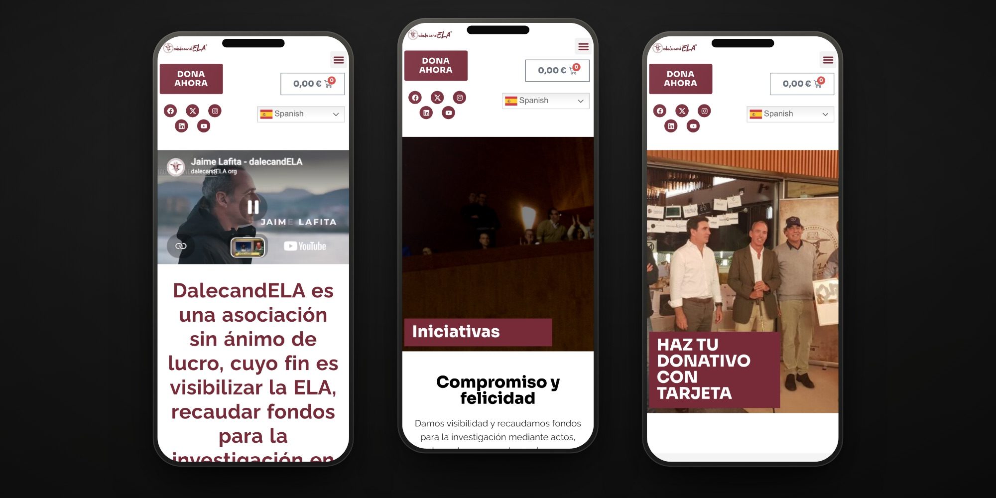
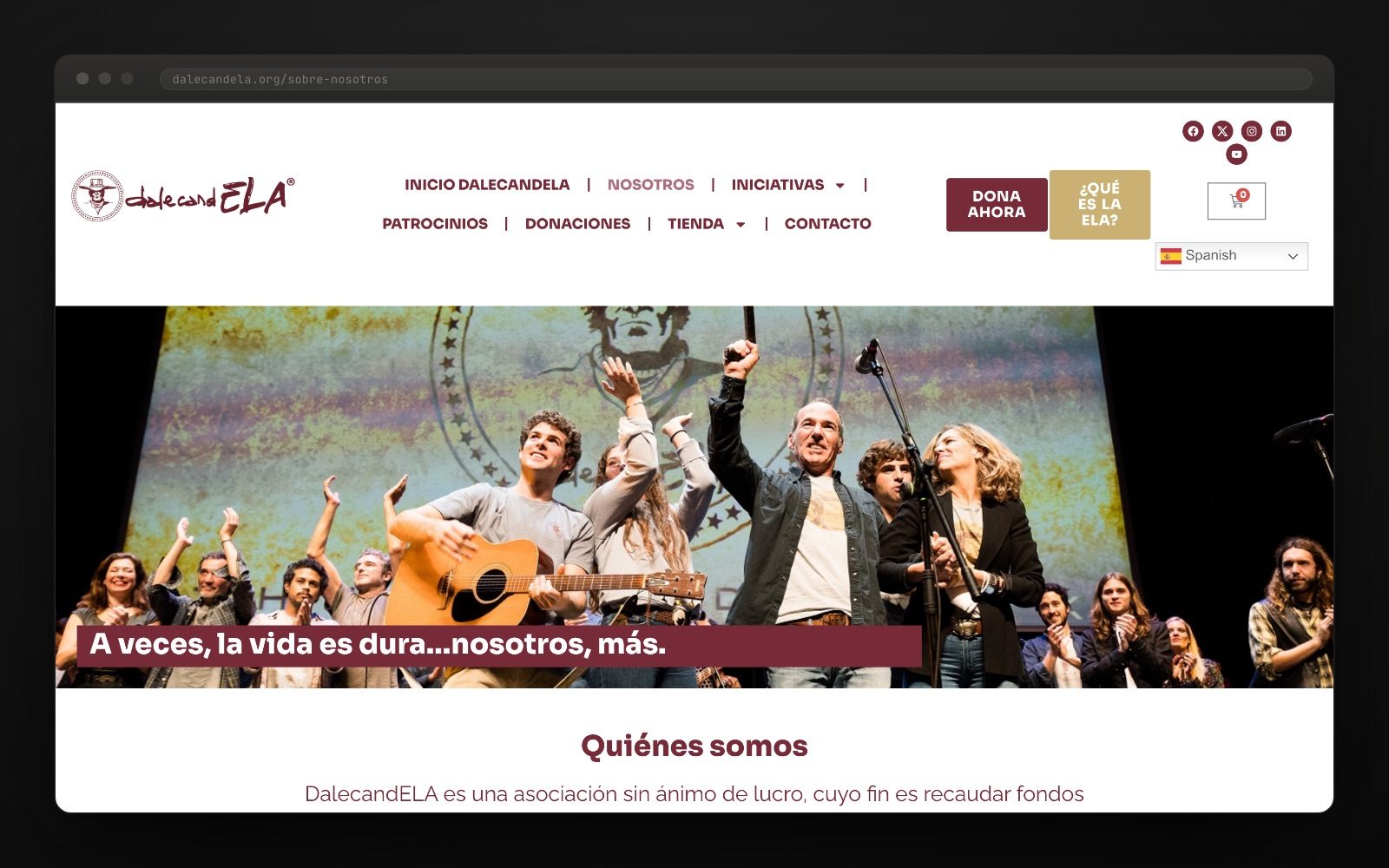
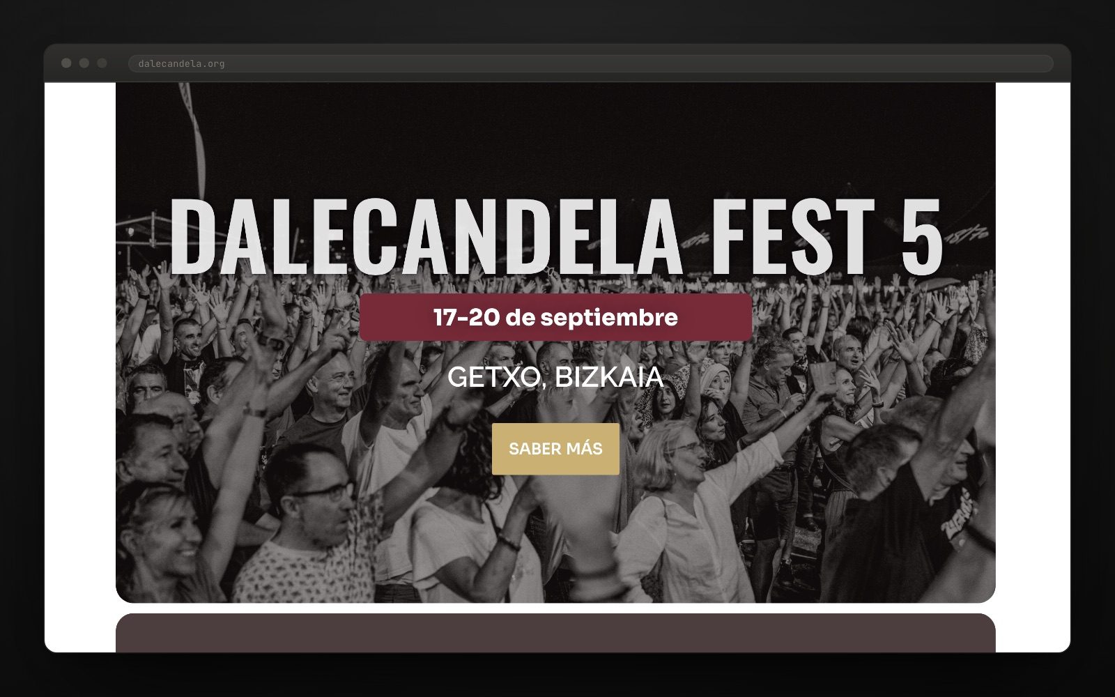
We designed a custom WordPress website with a fresh look and an accessible, intuitive experience. The first thing anyone sees is the thing that matters: Donate now. The second is what is happening this year.
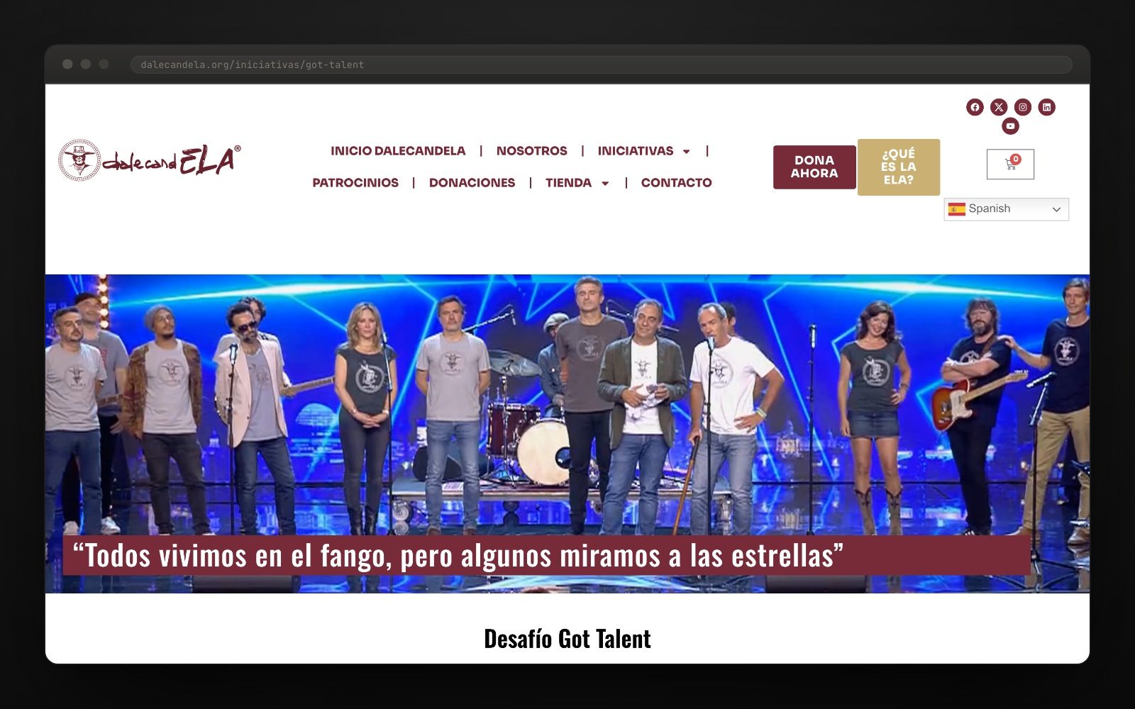
We sorted out six years of initiatives. Got Talent, The ELA Fest, TropELA Bira, TeidELA, Death Valley in tandem, Brainlab, the scientific symposium… Each initiative has its own page, grouped by year, so the association’s history reads at a glance and new editions have somewhere to live.
We added a solid online shop to raise money selling their own products, with a catalogue for men, women, kids, cycling and records: stock, payments and shipping logistics all sorted. Plus the essentials any association needs: online donations, an events calendar and volunteer sign-ups.
We scaled the infrastructure so the traffic from a festival or a campaign would not bring anything down. A charity website has the worst traffic pattern there is: nothing for months, then everyone at once on the day of the event.
An association does not need «a website»: it needs people to donate, buy, sign up and find out, in that order. The key was designing for those four verbs and getting everything else out of the way.
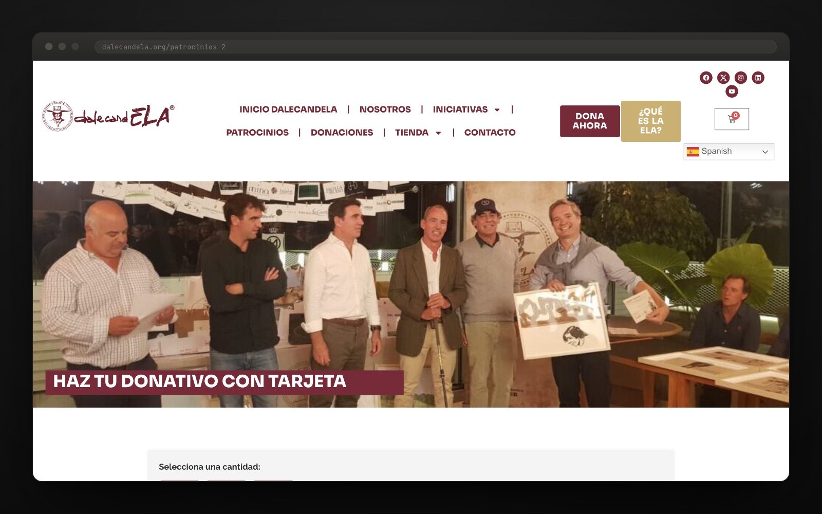
Every association website wants the same things and almost none of them have them in order. Donate: a visible button on every page and a payment that does not ask you to register. Buy: a real shop, with stock and shipping, because a charity T-shirt is a donation with a souvenir attached. Sign up: volunteers and participants, with a form that actually reaches someone. Find out: a calendar and initiatives by year, so this year’s do not bury last year’s.
What shows most over time is not the design, it is the structure: the site now holds initiatives from 2021 to 2026, each in its place, and the association publishes them without touching code. A charity website is measured in editions, not in launches.

"Technology can push a good cause along too."The project team
Want a result like this for your project?