AFA Baix Llobregat · identity
A new identity for better support.
The starting point
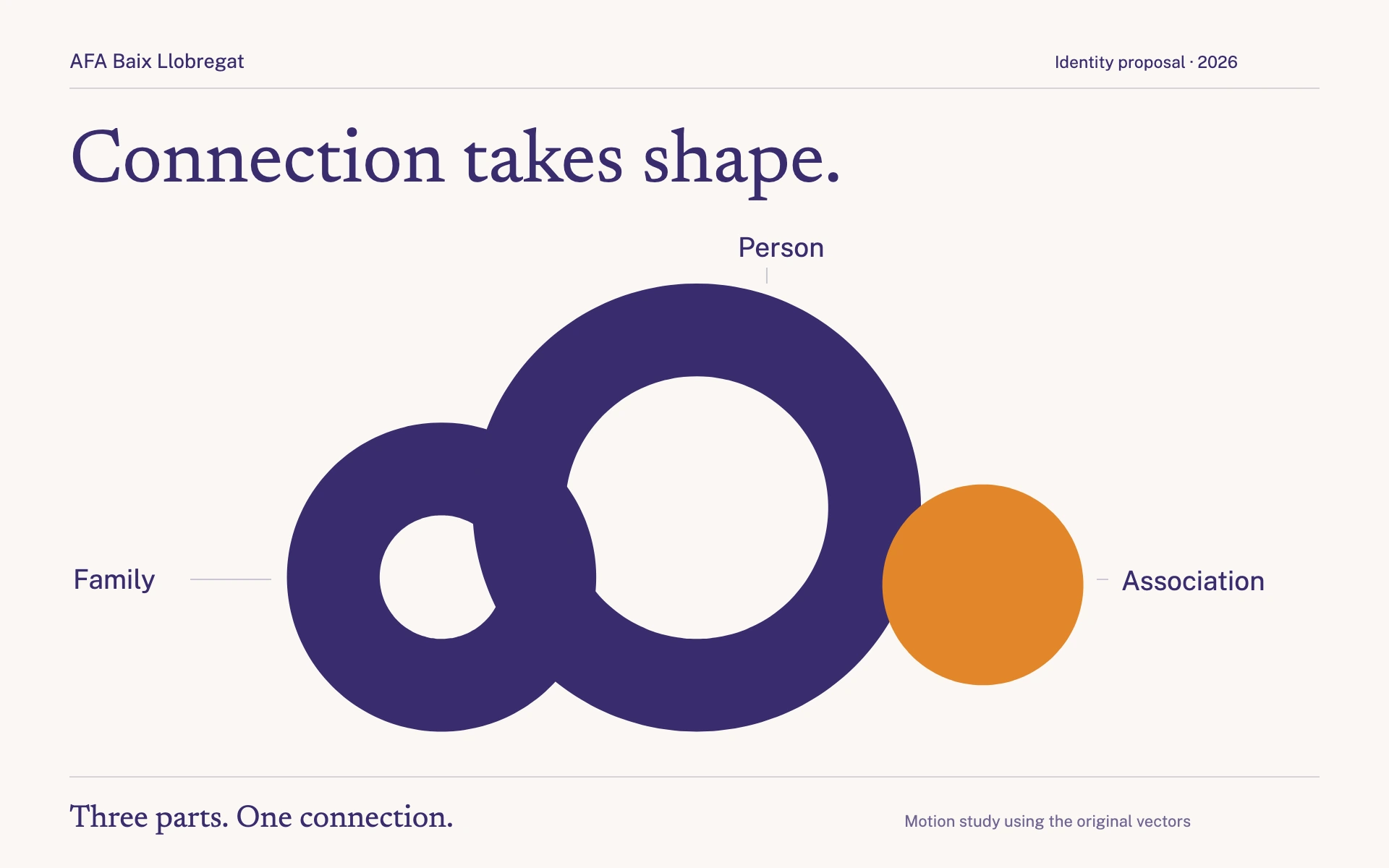
The working document proposes an evolution of AFA Baix Llobregat’s identity. It keeps the idea of bubbles and turns it into a clearer, more prominent system of circles that can work across applications.
This is a separate 2026 workstream that followed the historical website project and remains in development.
The proposal
Three connected circles. They represent the person, family and association. A shared baseline expresses equal value and moving forward together.
A clearer mark. The proposal removes the drop, makes the profile more subtle and gives the circles, AFA initials and more legible typography greater prominence.
A monolithic architecture. Centres and programmes keep the AFA mark; the service name and location act as descriptors, while colour distinguishes each area.
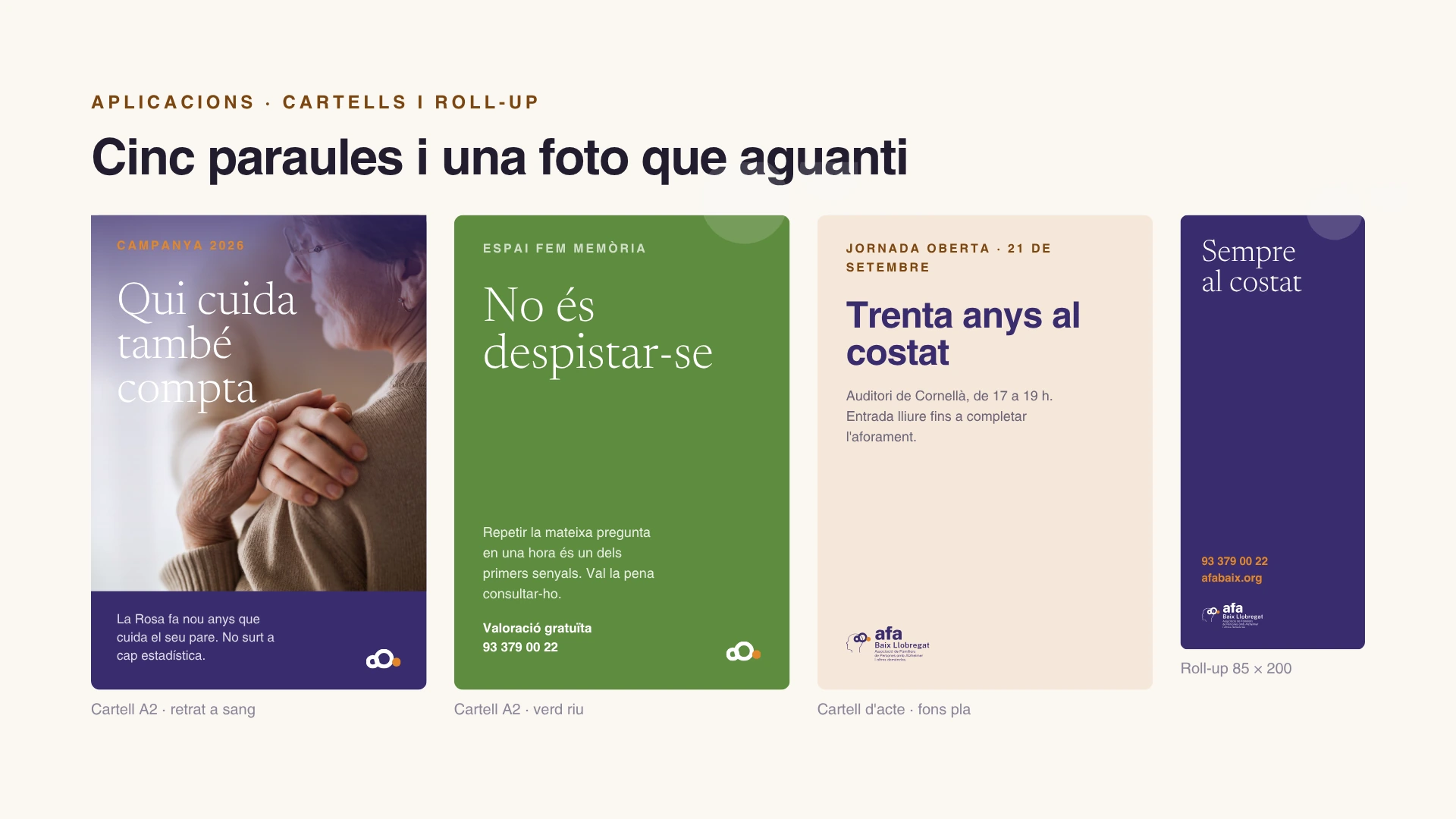
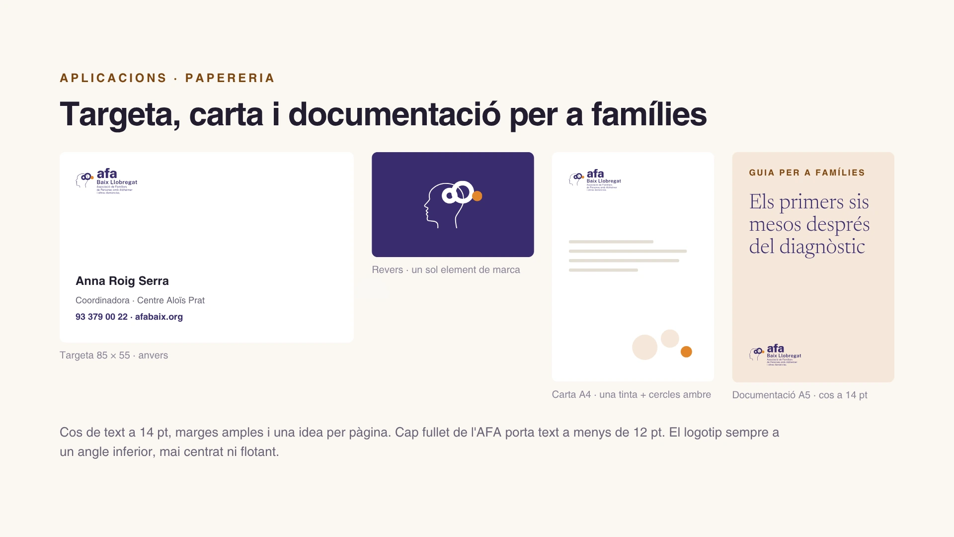
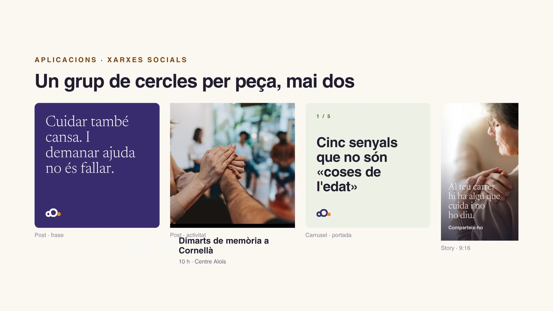
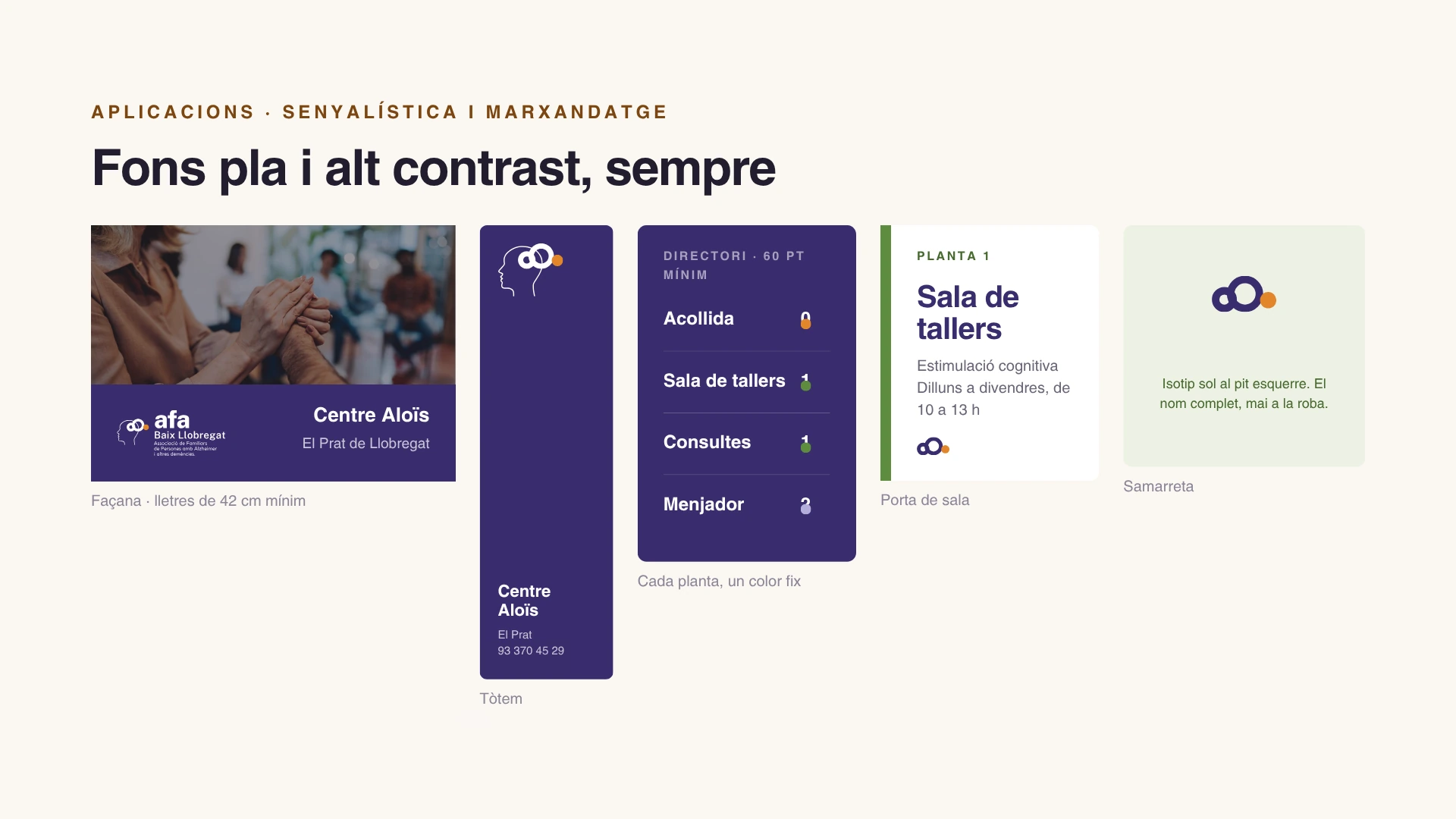
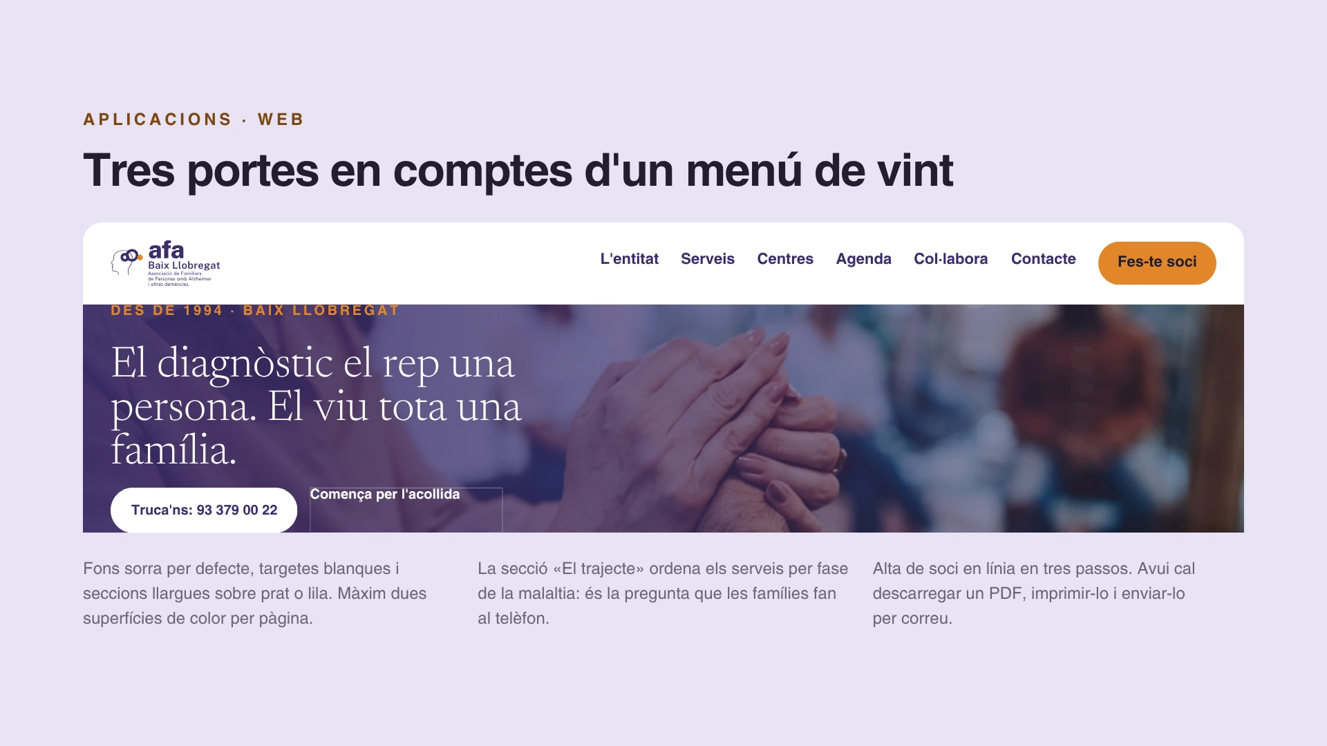
A system tested across formats. The guide explores posters, print, social media, wayfinding and web to show how the identity behaves in different situations.
Person, family and association. Three parts of one connection.
The identity does not speak about the illness. It speaks about the association’s position: alongside the person and family throughout the journey. The system turns that relationship into three connected circles.
Three forms, one relationship.
The person, the family and the association share one foundation. The identity changes scale; the connection remains.
01 · The relationship
The identity starts with a relationship of support.
Three precise forms, joined on the same baseline. Each part keeps its meaning.
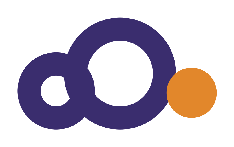
- PersonThe centre of the activity.
- FamilySupport and connection.
- AFAThe association and its support.
02 · The identity
The circles lead. The profile supports them.
The proposal keeps a simplified profile as a secondary element. The relationship sits at the centre of the identity.
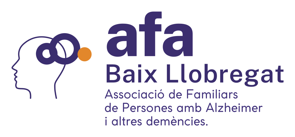
The circles carry the meaning; the profile preserves recognition.
03 · The services
Different services, one shared identity.
A monolithic system: each service has its accent, while the parent identity stays the same.
Parent identityCentre Aloïs
Day centres. Daily, professional and continuous care.
Violeta Baix · #3A2D6EEspai Fem Memòria
Cognitive stimulation in the early stages.
Verd Riu · #5E8C3FAules de Memòria
Workshops open to municipalities across the county.
Amber · #E2872BColour distinguishes the services. The identity stays the same.
Identity proposal · In development · 2026
Support takes a visible shape.
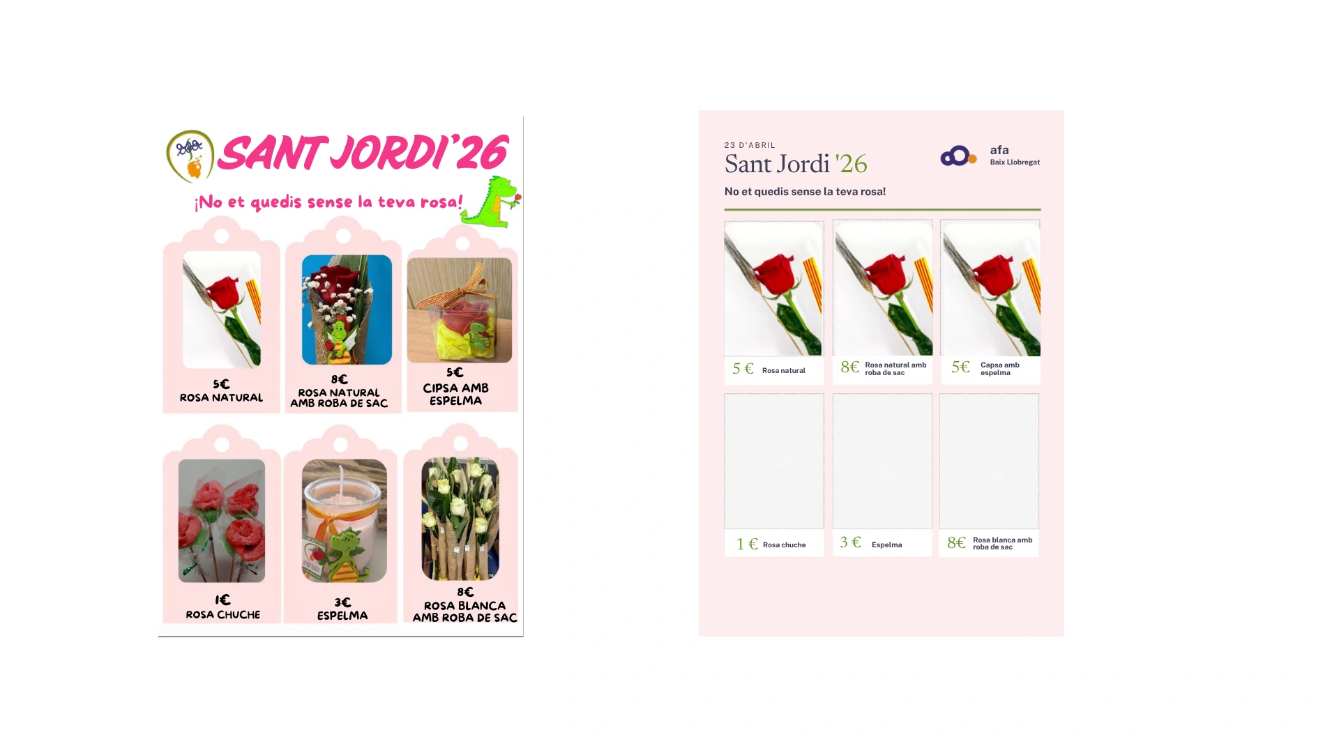
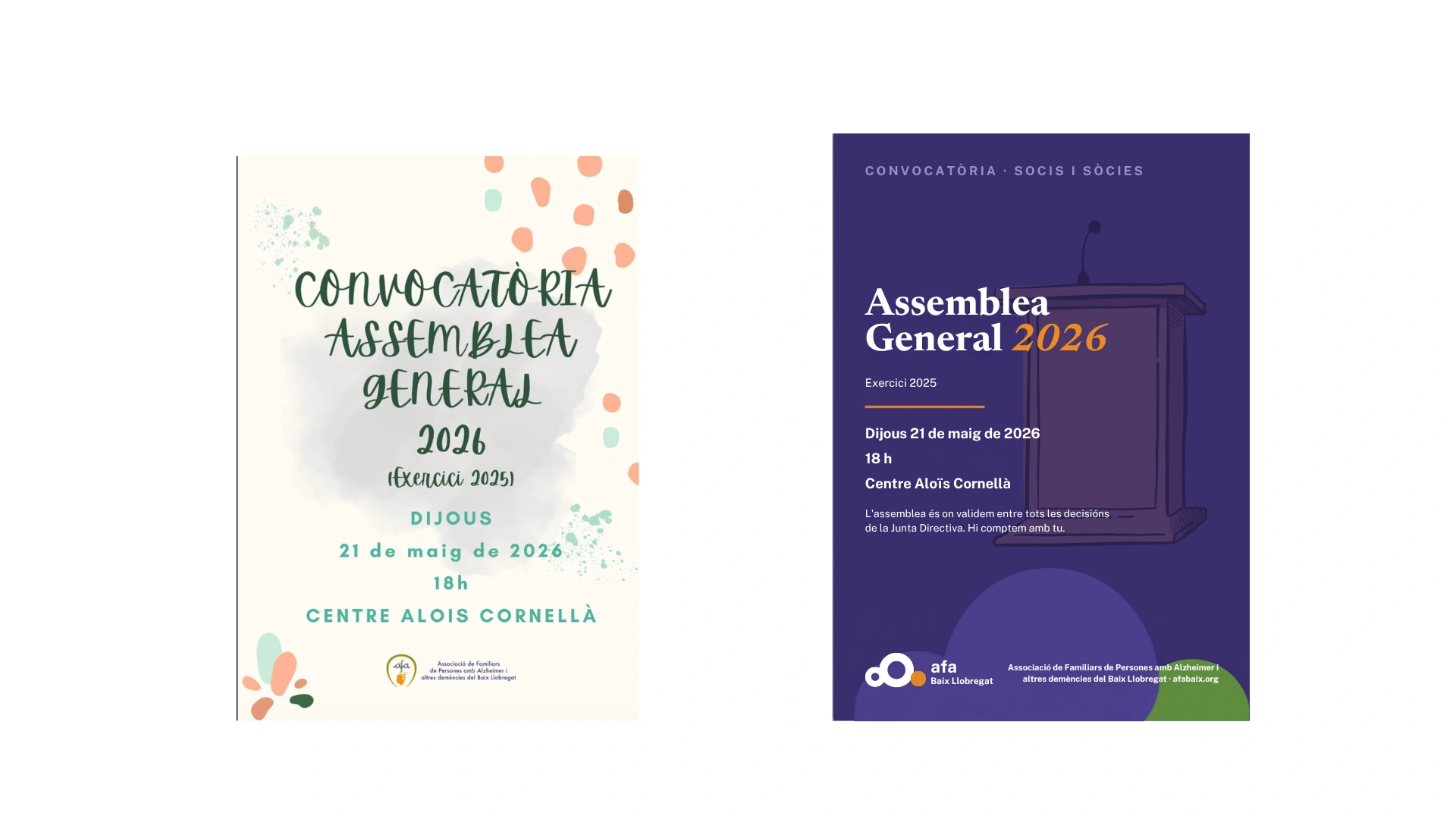
The system moves from the symbol into posters, documents and community centres. Applications from the guide and two comparisons with earlier pieces show how the new identity takes shape.
 Enlarge ↗
 Enlarge ↗
 Enlarge ↗
 Enlarge ↗
 Enlarge ↗
 Enlarge ↗
 Enlarge ↗
Want a result like this for your project?