Blaumarí Music
We created Blaumarí’s complete universe.

The brief
A new festival has no past, no logo, no website, nothing. Just an idea and a harbour. Blaumarí was born as a music festival and needed an identity of its own from day one: something recognisable, with character, ready to take the weight of a launch.
And a festival calendar is unforgiving: the moment the line-up is announced, everything has to exist already. Brand, website, tickets, social, street.
What we did
We started with the name. Blaumarí says it all: the colour of the sea at the harbour where it was born, and a sound you remember. From there, the whole visual universe: brand design, a visual system and a brandbook you can actually use, so the festival sounded the same at every touchpoint.
We built the website in line with the brand with one obsessive goal: a clear line-up and a ticket bought in two clicks. A festival site has one conversion and the rest is noise.
We took the brand to the street and to social: posters, banners, social pieces and the day of the festival itself. More than forty pieces, so that by the time the gates opened people already recognised it.
And we photographed it. The first edition was documented by Víctor Parreño and team: the material that sells the second one today.
Naming, identity, festival, web, digital and audiovisual.
A festival that is just starting has to look like it has been around for years. The key was building the whole identity before the first announcement — name, system, website and applications — so the brand and the line-up landed together and nothing had to be worked out on the way.
The project in numbers
A brand that sounds the same on every format
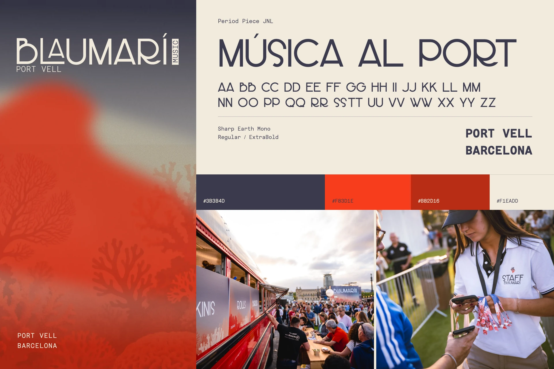
What makes a festival identity work is not the logo: it is the system. A palette that comes from the sea, a typeface that holds up on a three-metre banner and in a story, and composition rules that let every piece be different and all of them be Blaumarí. The brandbook exists so the festival can run the next edition without us and still look like itself.
The website applies that system with a single obsession: from home page to ticket in two clicks. And the first edition sold out. We’re not saying that was the brand; we’re saying the brand didn’t get in the way, which at a launch is already a lot.
How it went
One system, three distances
One identity, three scales
The same visual language has to remain recognisable on an object in your hand, a street display read in passing and a banner that fills the stage.

01 · In your hand
The wordmark holds at the smallest scale.
On the glass, the fine strokes and vertical “Music” block preserve the signature without competing with the object.

02 · At street level
Hierarchy makes the message readable in motion.
Identity, date and artist occupy clear levels; the coral band connects every portrait to the festival’s visual world.

03 · Facing the stage
Contrast turns the identity into architecture.
At large scale, white cuts across the dark structure while coral anchors the banner in the festival’s graphic landscape.
One event. Three ways to read it.
03.07
× BLAUMARÍ
PORT VELL DE BARCELONA
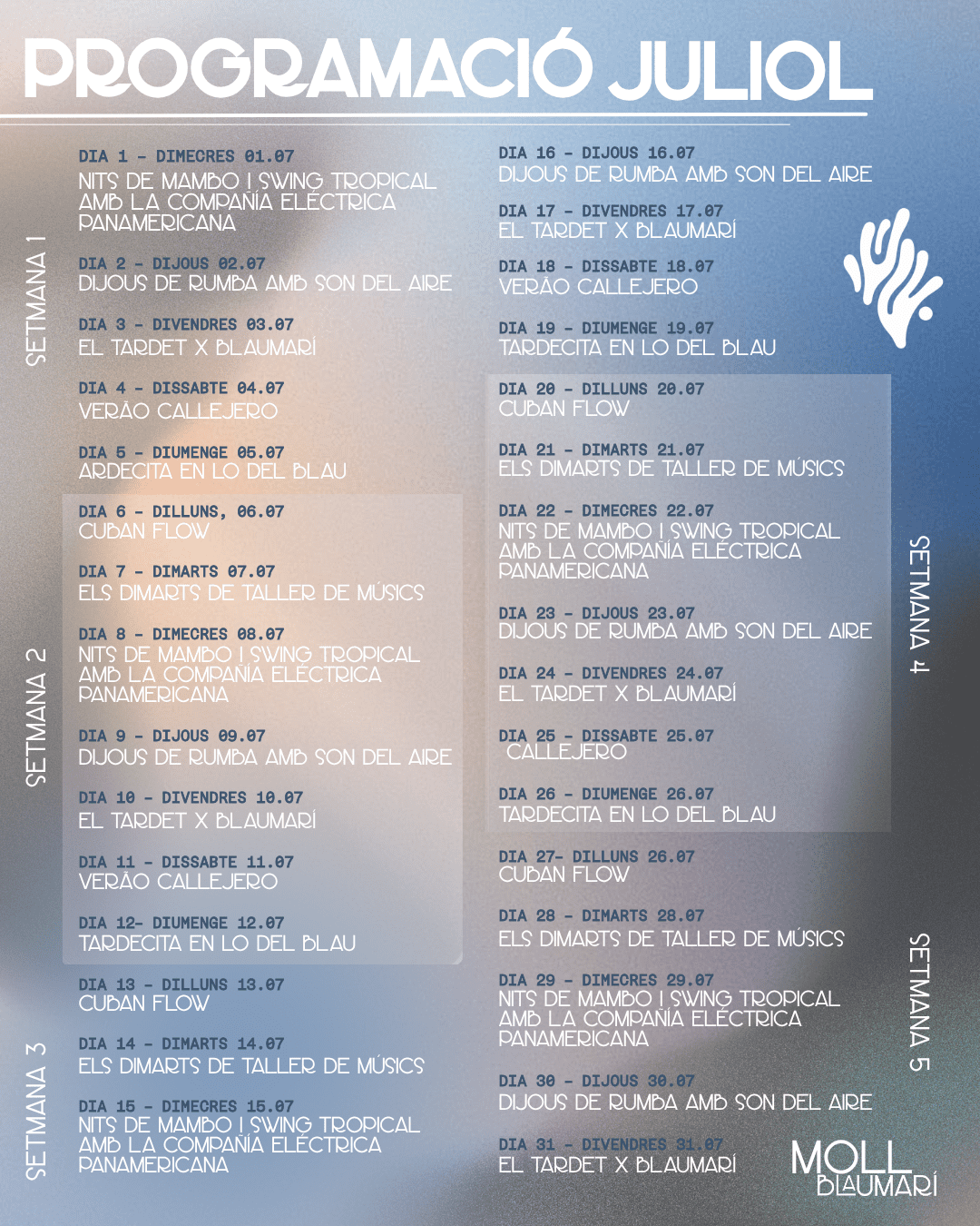
A layout demonstration: three new compositions using the content, typefaces and colours of the original programme. View the original programme
Gallery · the project in pictures (click to enlarge)
An identity at home in the harbour.
We created the name and identity and deployed the whole universe: posters and OPI, large format, stage banners, menus, signage, clothing, wristbands, web, digital pieces and audiovisual. The festival was not just an identity; it was a system that had to work at every touchpoint.


The festival begins in the street.
Posters, banners and the programme adapt to different viewing distances. Artist portraits, dates and the festival name retain a recognisable hierarchy.


Between concerts.
The identity also helps people find their way, choose what to eat and locate services. Menus, bars and entrances carry the stage’s coral artwork and contrast into everyday use.


An identity people wear.
Staff clothing, wristbands and cups carry the system into the objects that accompany visitors throughout the festival.


From discovering the line-up to choosing a concert.
The website turns the festival’s visual language into a clear journey: explore the programme, discover the artist and find the concert details. The recording shows the public website in September 2026.
- Explore the programme
- Discover the artist
- Find the concert
More images from the project 8 ↗


"Born in the harbour. With an identity of its own from day one."Festival management
Want a result like this for your project?