AFA Baix Llobregat, an organisation that cares for people and shows its accounts
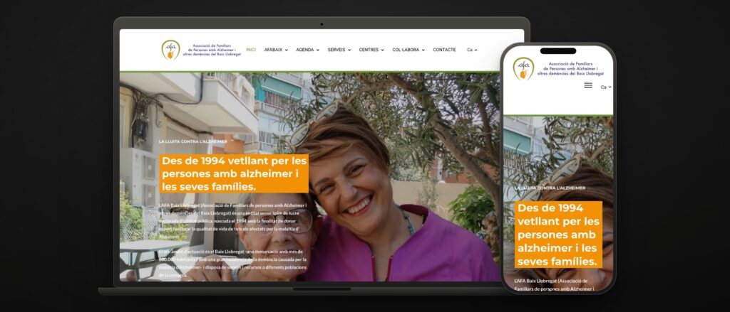 afabaix.org · since 1994 · 15 local branches · Catalan and Spanish
 AFA Baix Llobregat was born in 1994 as a branch of AFA Barcelona, and in 1997 it split off to go its own way. Today it is a registered public-benefit organisation that supports the families of people with Alzheimer’s across a county of more than 800,000 inhabitants: three Centres Aloïs, fifteen local branches, workshops, support groups and a diary that changes every week.
Its website was a static page from the early two-thousands. It had to do three things at once that have nothing in common: let a newly diagnosed family find someone to call, let the people who already come know what is on this week, and let a donor or a funder read the statutes and the accounts without asking for them by email.
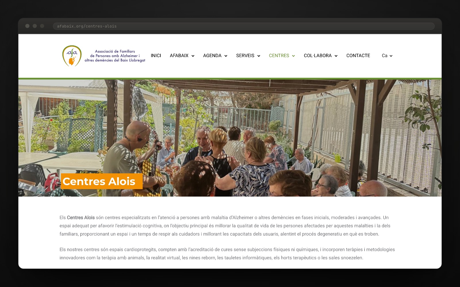
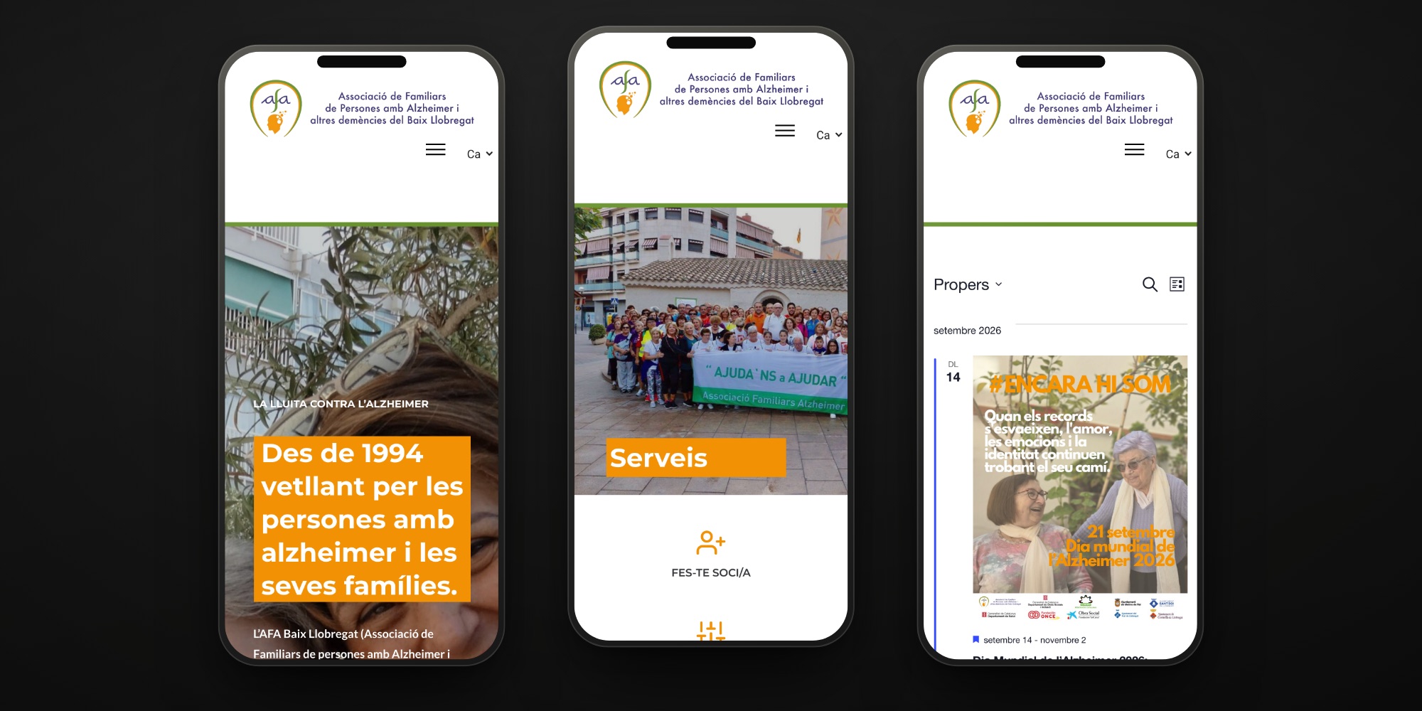
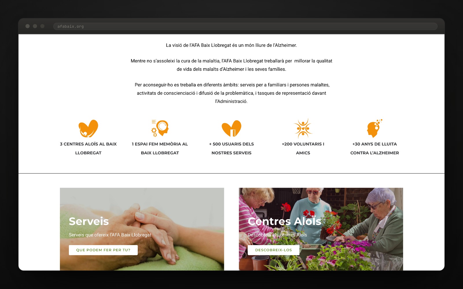
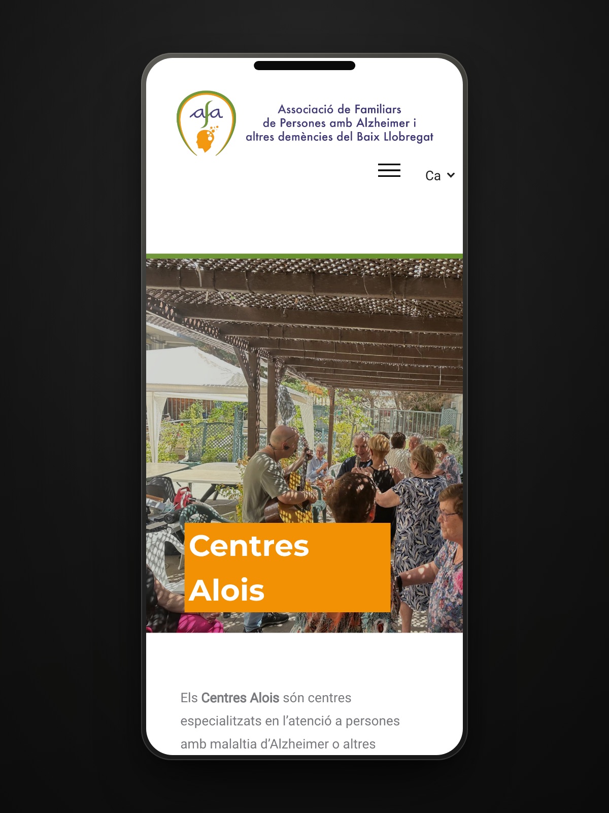
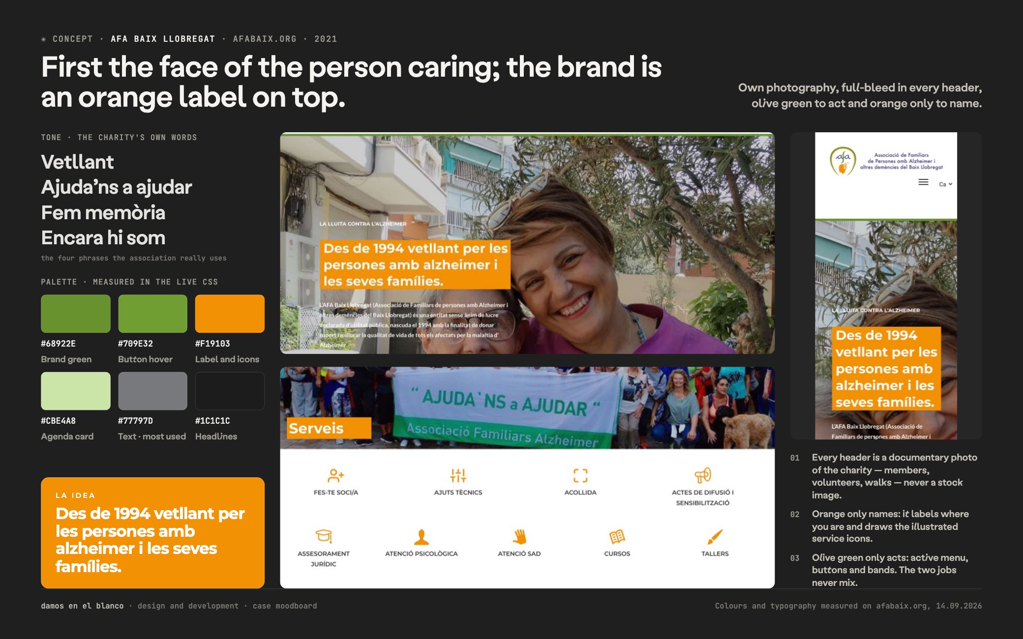
The organisation’s own photography up front and the brand on top of it. No stock images: the faces on the home page are the service users, the volunteers and the staff of the house, full bleed and in natural light. The name of each section sits in an orange label over the photo, and the olive green is kept for whatever you click.
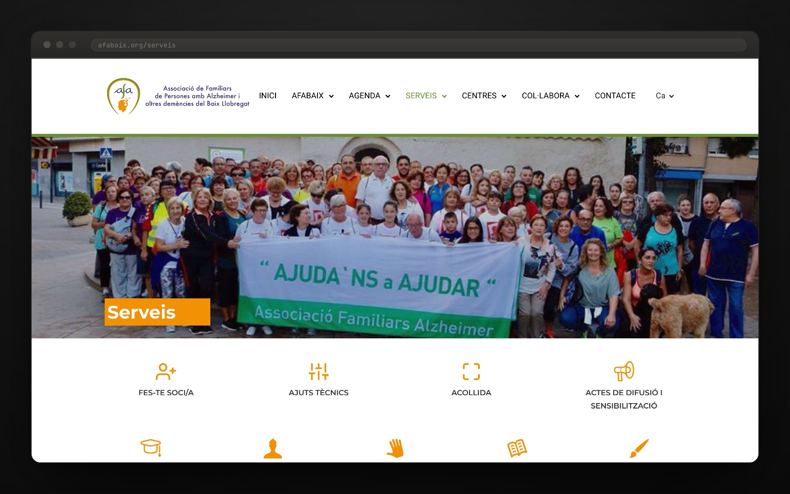
We drew a set of icons of our own. Orange line work, one per service and per type of centre. It is what lets the figures band on the home page and the services page be read at a glance, without reading them, and it is the part of the digital identity that shows most and gets reused most.
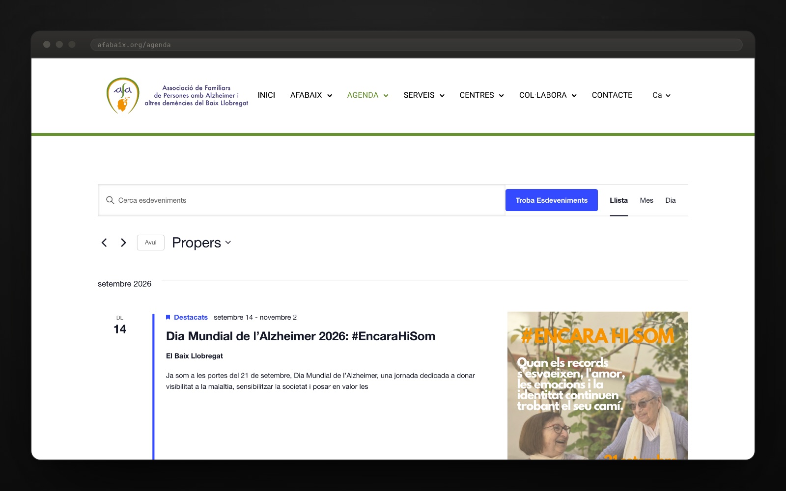
We built the diary as a tool, not as a list. List, month and day views, an event search and a page per activity with its map. It is the only part of the site that gets touched every week, so the organisation had to be able to run it without calling us.
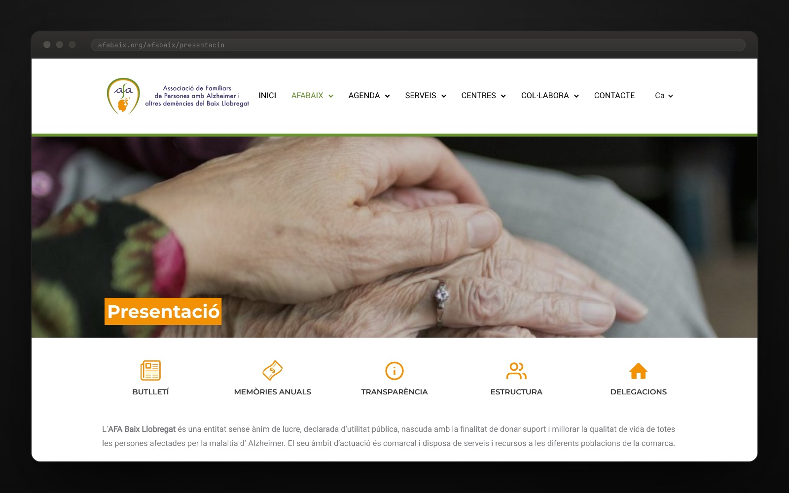
Transparency in the same house, not in a drawer. Statutes, annual accounts, register entries and annual reports, the last of these in a viewer you leaf through like a book. Seven sections, Catalan and Spanish, and membership, volunteering and donation forms. Design, website and development from scratch.
A third sector organisation has two audiences with nothing in common: the family that has just had a diagnosis, and whoever decides whether to give it money. Instead of choosing one, we put the care and the accountability on the same website, with the organisation’s own photography as the bridge. Orange names things, green acts, and there is no third colour.
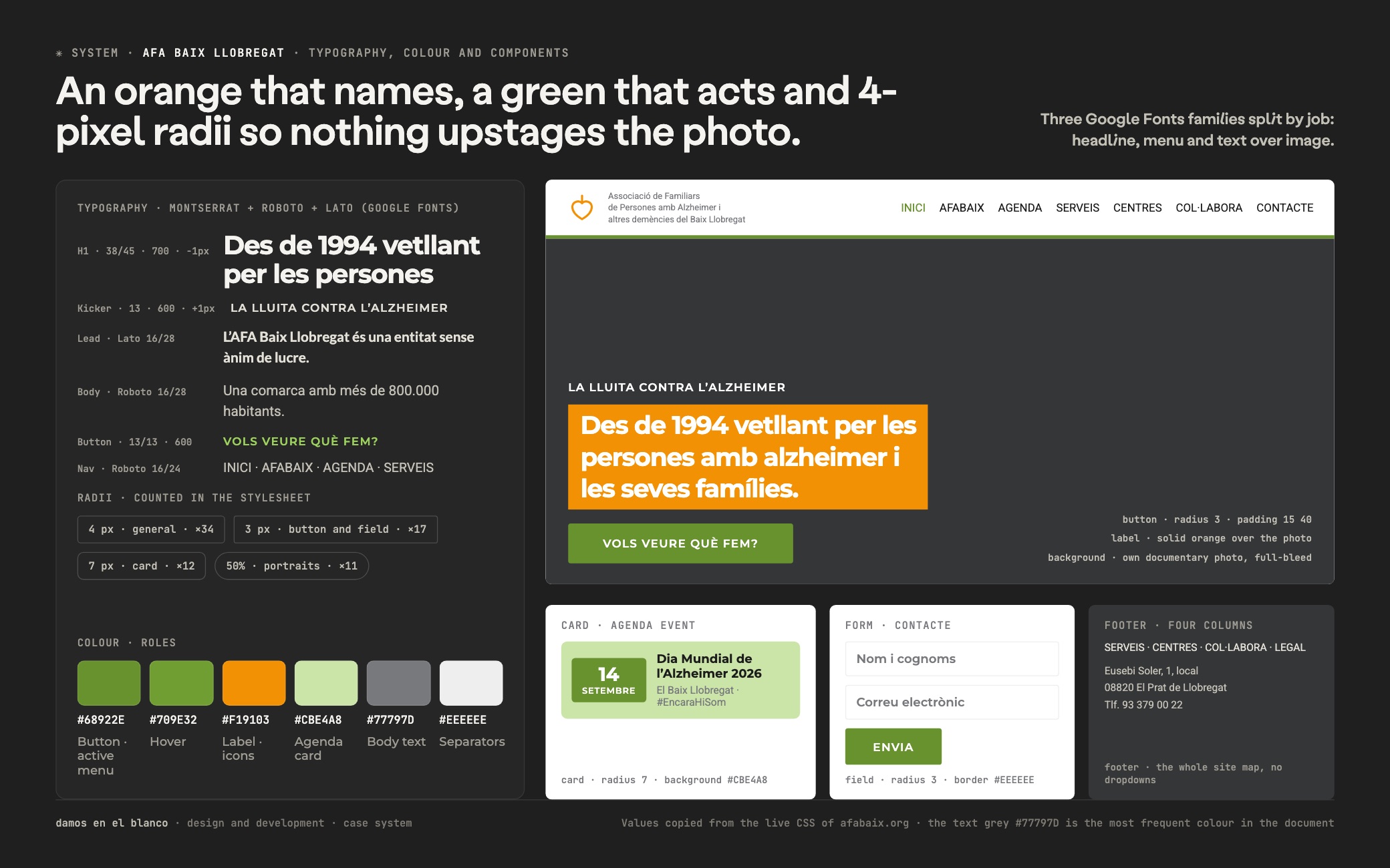
The type system hands out three families by function rather than by whim: Montserrat for headings and buttons (38/45 with a point of negative letter-spacing), Roboto for the menu and body text at 16/28, and Lato for the pull-outs that sit over photography. It is more than a manual would ask for, and it holds up here because each family always turns up in the same place.
Colour runs on strict roles. The olive green #68922E acts — active menu, buttons, bands — and appears one hundred and forty-one times; the orange #F19103 only names: labels over photos and illustrated icons. The grey #77797D is the most frequent colour in the document, with almost a thousand uses, because it is the text. The radii stay at 3 and 4 px on purpose: the site does not compete with the picture.
Underneath, the site is more of an application than it looks. An events calendar with three views and a search, a paginated PDF viewer for the annual reports, membership, volunteering and donation forms, Instagram and Facebook walls, page caching and WPML with Catalan and Spanish declared in hreflang. Five years on, the seven-section structure is still the same.
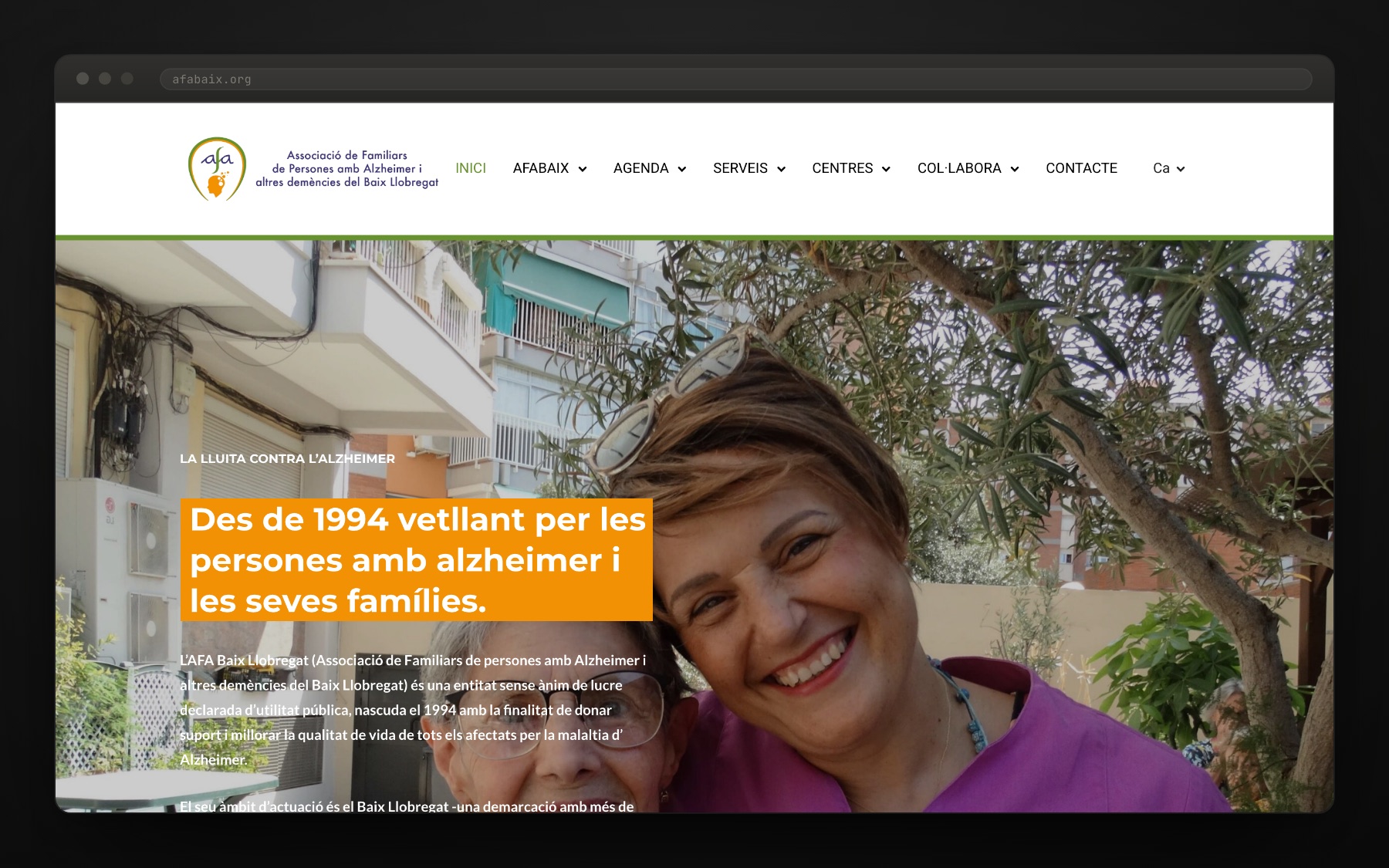
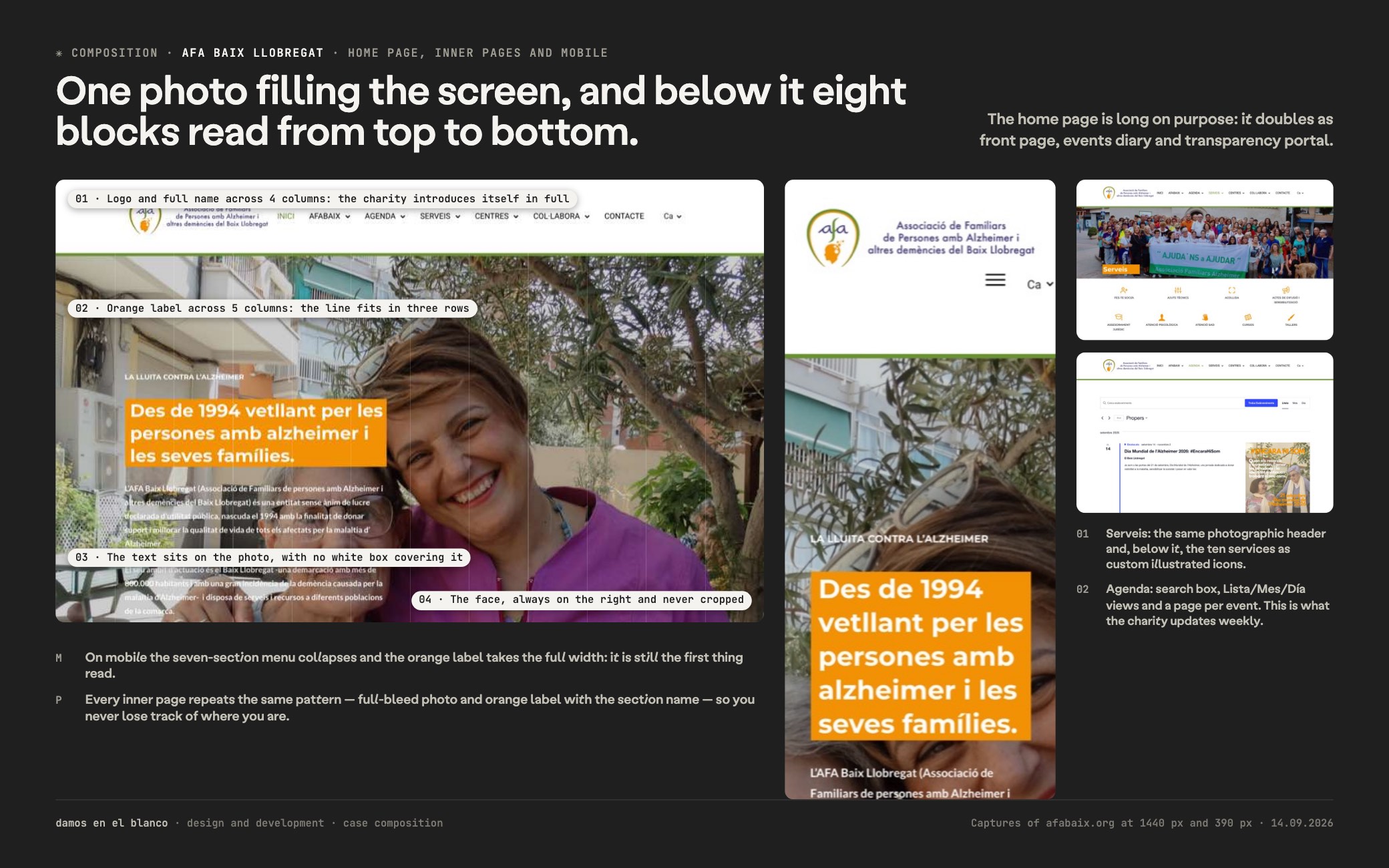
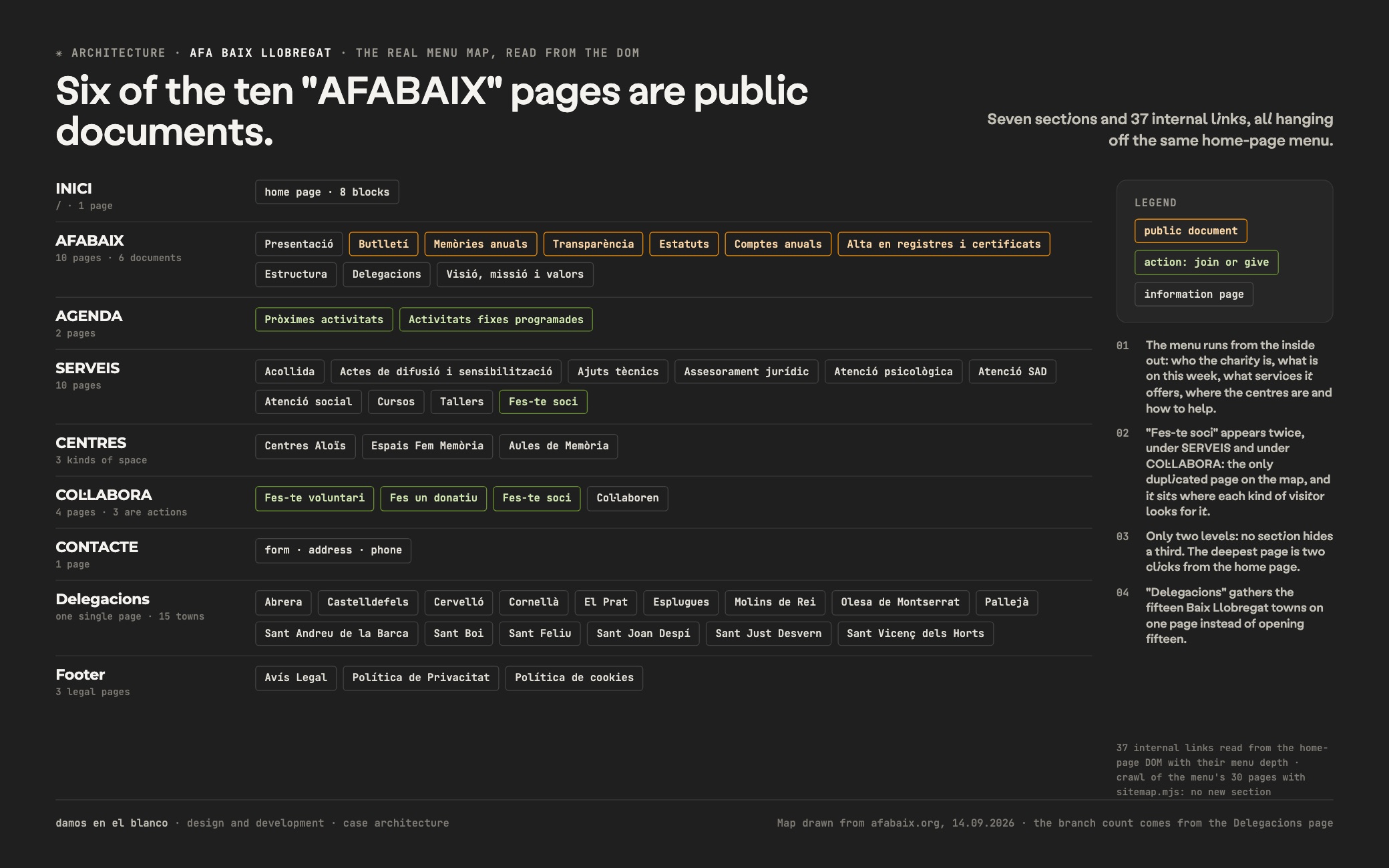
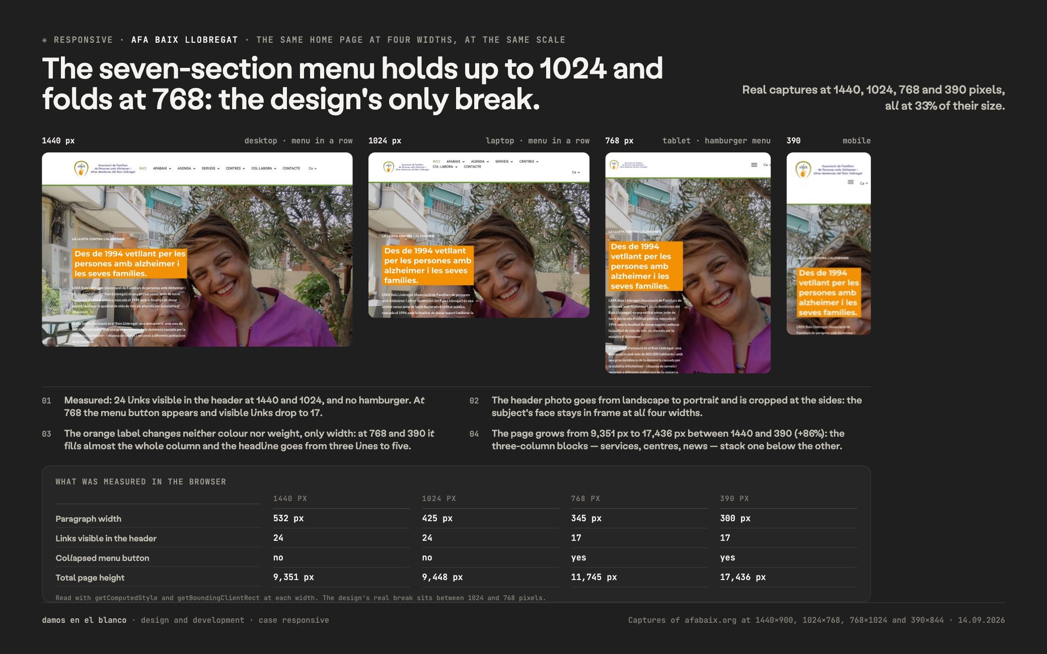
"Des de 1994 vetllant per les persones amb alzheimer i les seves famílies."afabaix.org
Want a result like this for your project?
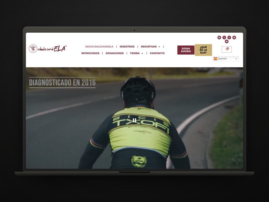
DalecandELA
We empower the fight against ALS with technology and design.
View case study →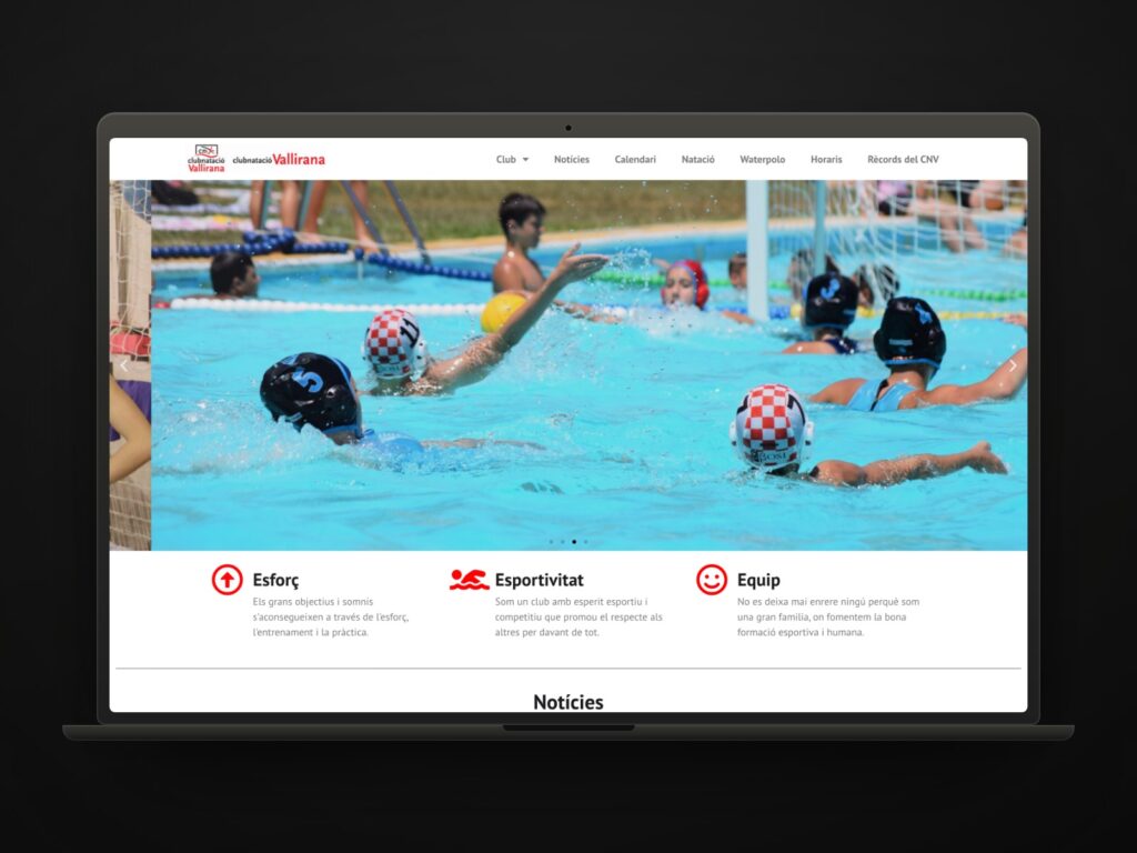
Club Natació Vallirana, the noticeboard of a club its own committee keeps up to date
A club does not need a brochure: it needs a noticeboard that is always current.
View case study →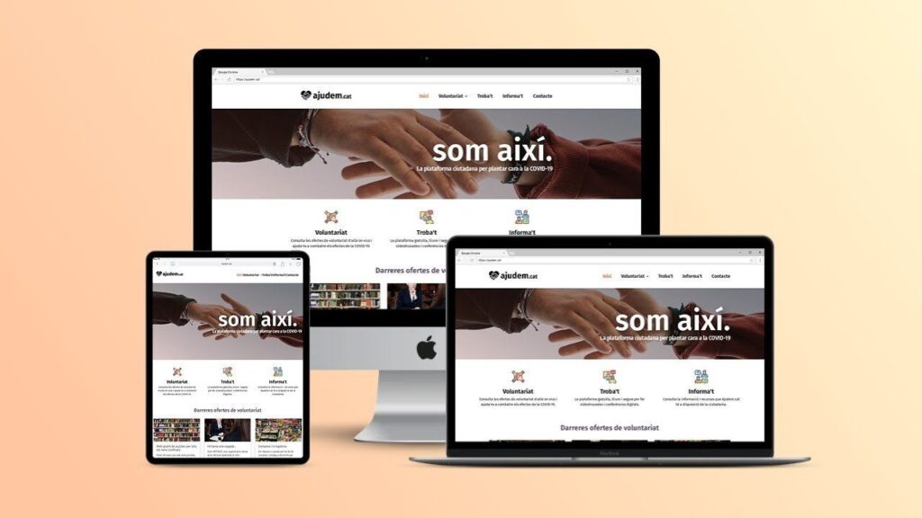
Ajudem.cat, the volunteering platform that won Hackovid
Our first project came out of a lockdown. It’s still standing.
View case study →