Barcelona Horse Tours, a trilingual site that sells the city seen from a horse
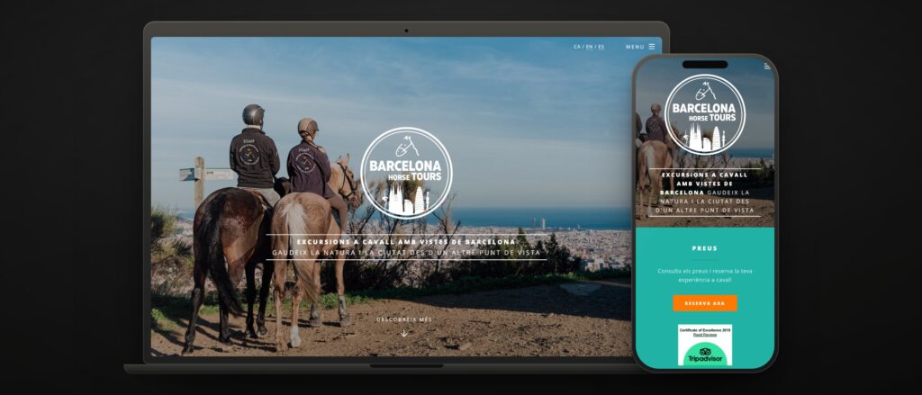 barcelonahorsetours.com · three languages · Collserola 20 min away
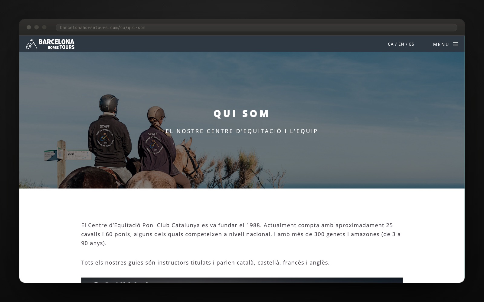
 Centre d’Equitació Poni Club Catalunya has been teaching people to ride in the Vall de Sant Just since 1988. With twenty-five horses, sixty ponies and qualified guides who speak four languages, it had a product that was not for its own students: a horse ride through the Collserola Natural Park, with Barcelona and the sea in the background, twenty minutes from the city centre.
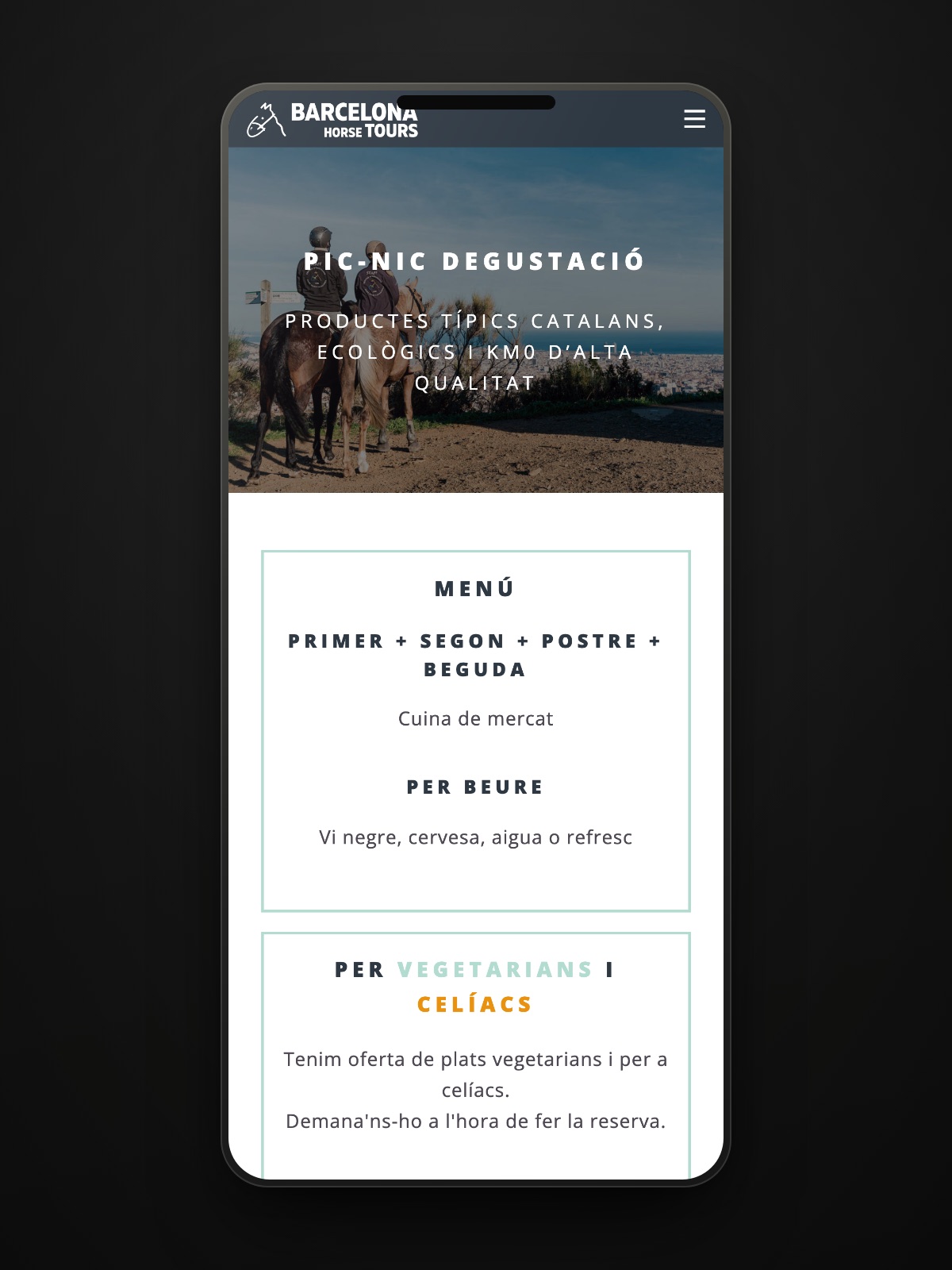
The audience for that ride is a tourist who has never been on a horse. The site did not have to explain riding: it had to convince people in three languages that it is worth getting on, and leave the booking one click away.
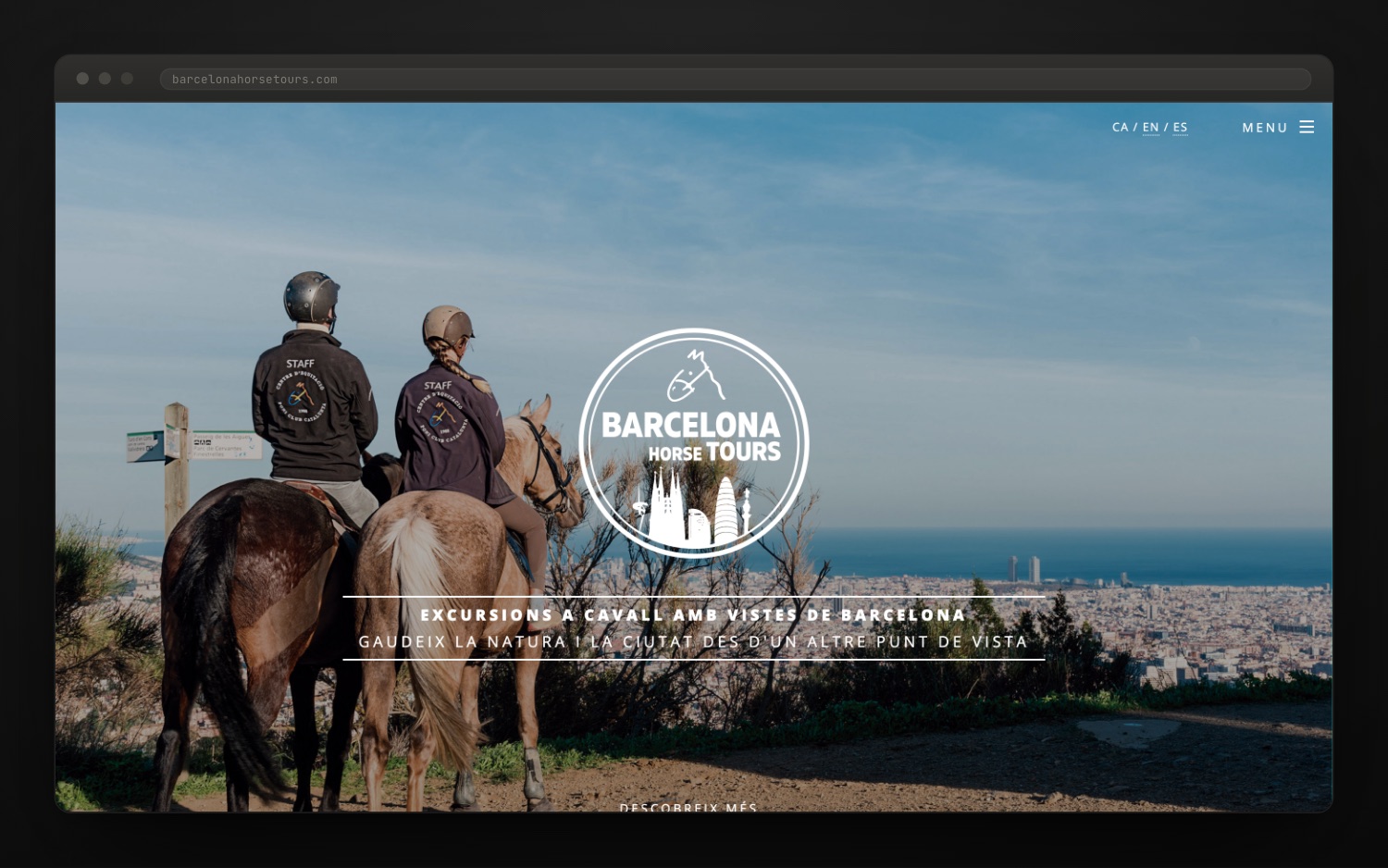
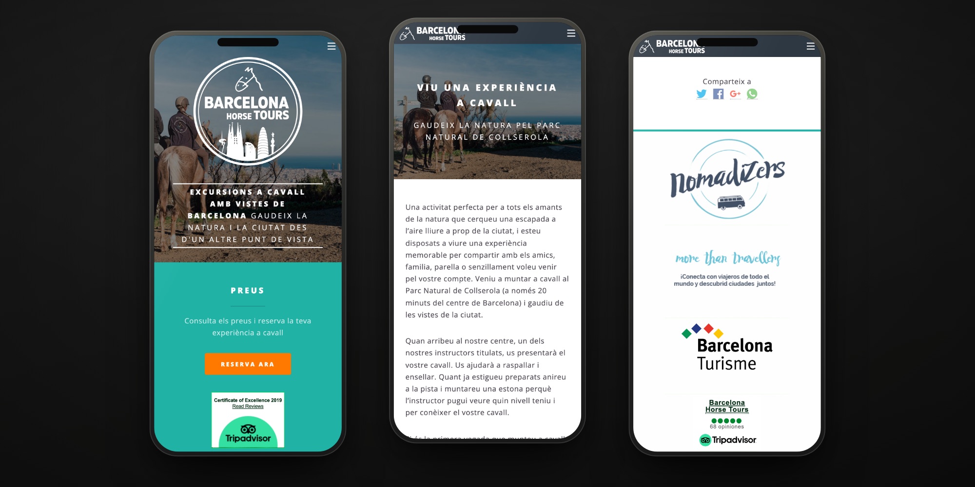
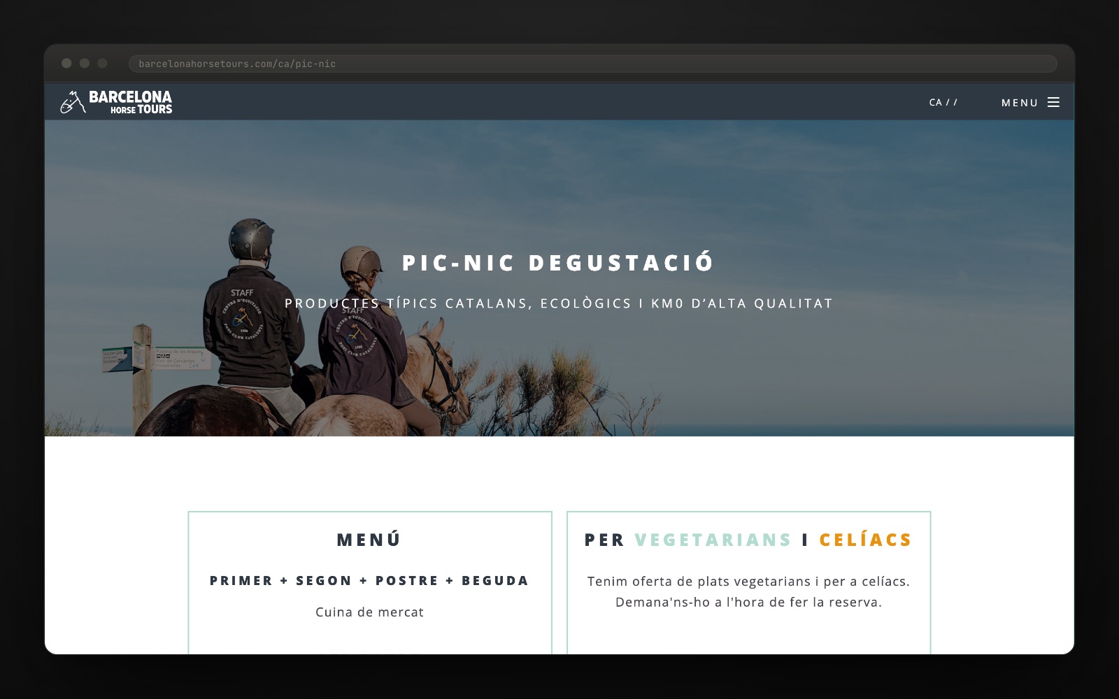
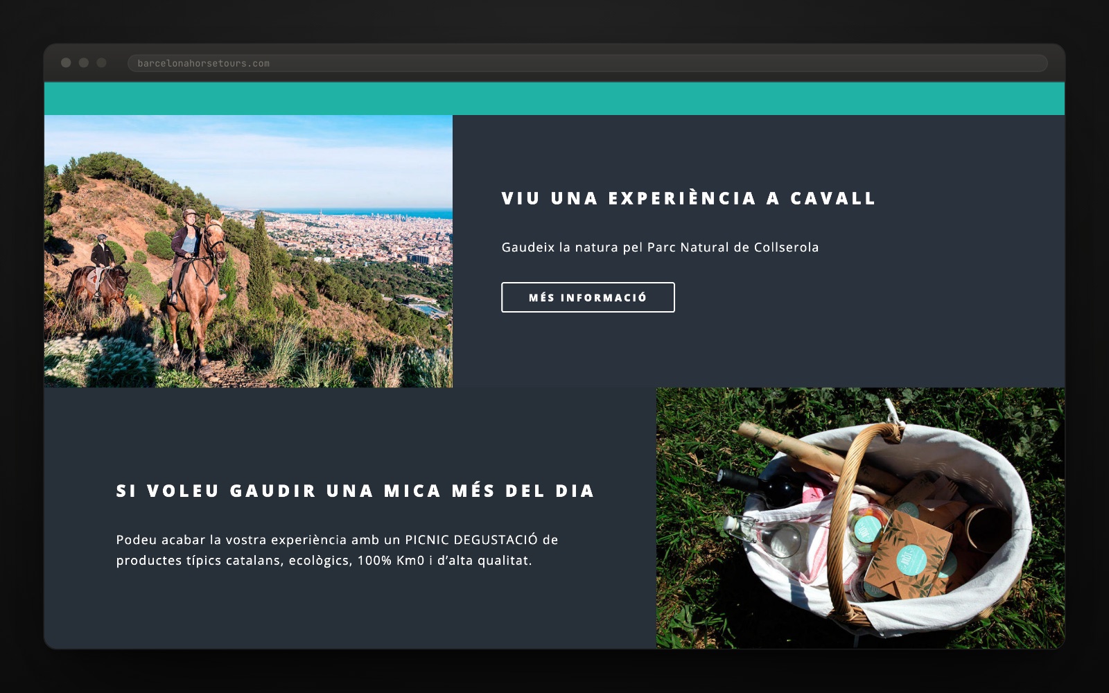
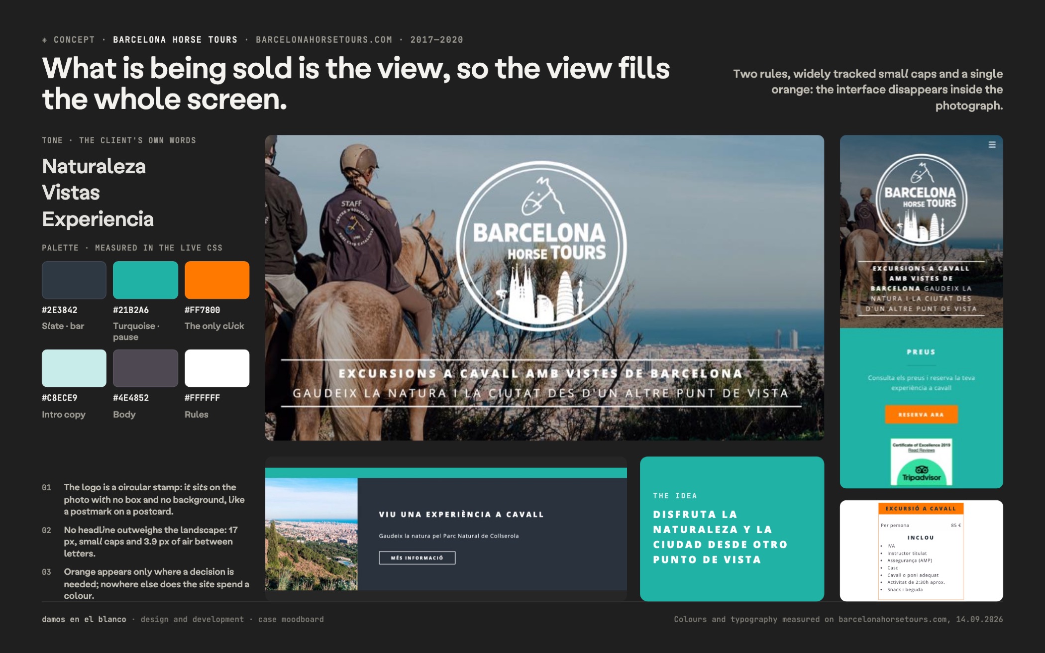
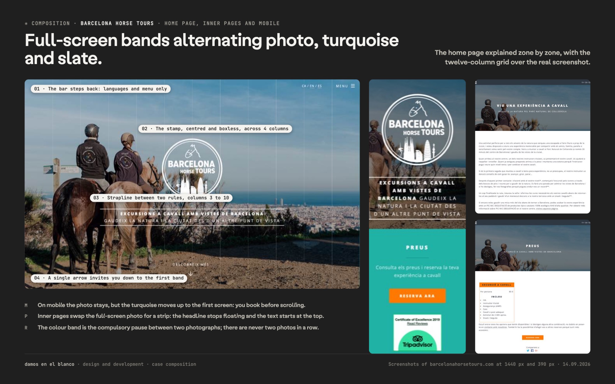
We put the photograph full screen and took everything else away. Anyone thinking about going up to Collserola does not need us to explain anything: they need to see the city from above. The hero fills the whole screen and the only text is two lines between two white rules.
We ordered the digital identity around the circle. The logo with the horse and the Barcelona skyline runs in two versions — large and centred over the home page, small in the bar — and the rest of the brand online is type and colour: Open Sans in two weights, with 3.9 px of letter-spacing that turn every heading into a trail sign.
Three languages, each with an address of its own. Catalan, English and Spanish live at /ca/, /en/ and /es/, with seven pages per language and a fixed switcher in the header. There is no machine translation: there are three complete sites kept up at the same time.
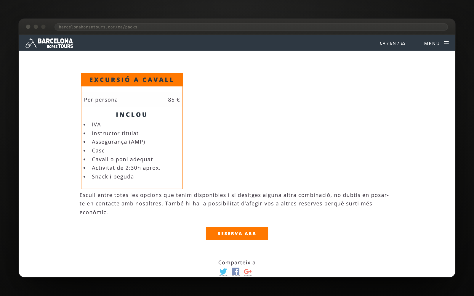
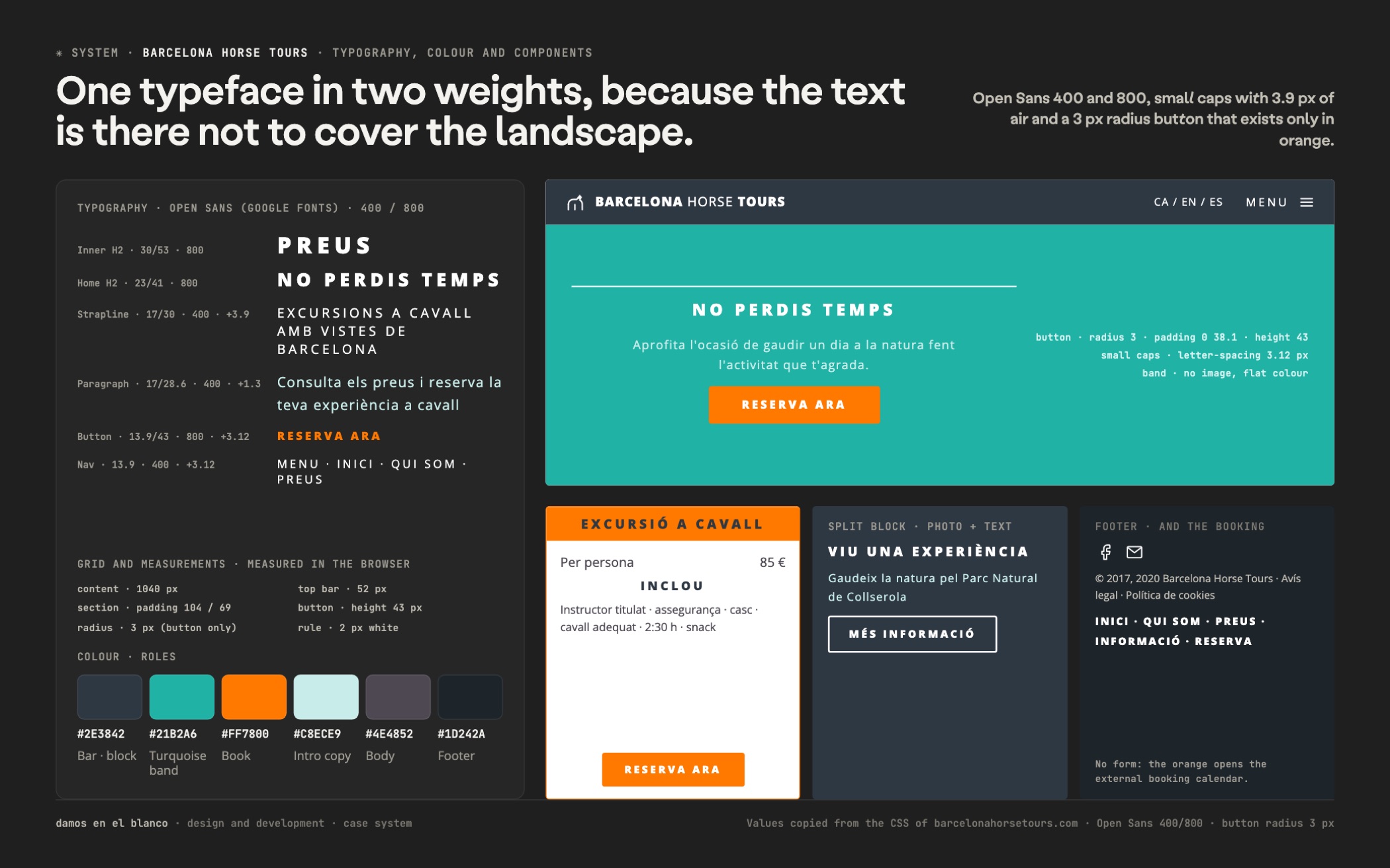
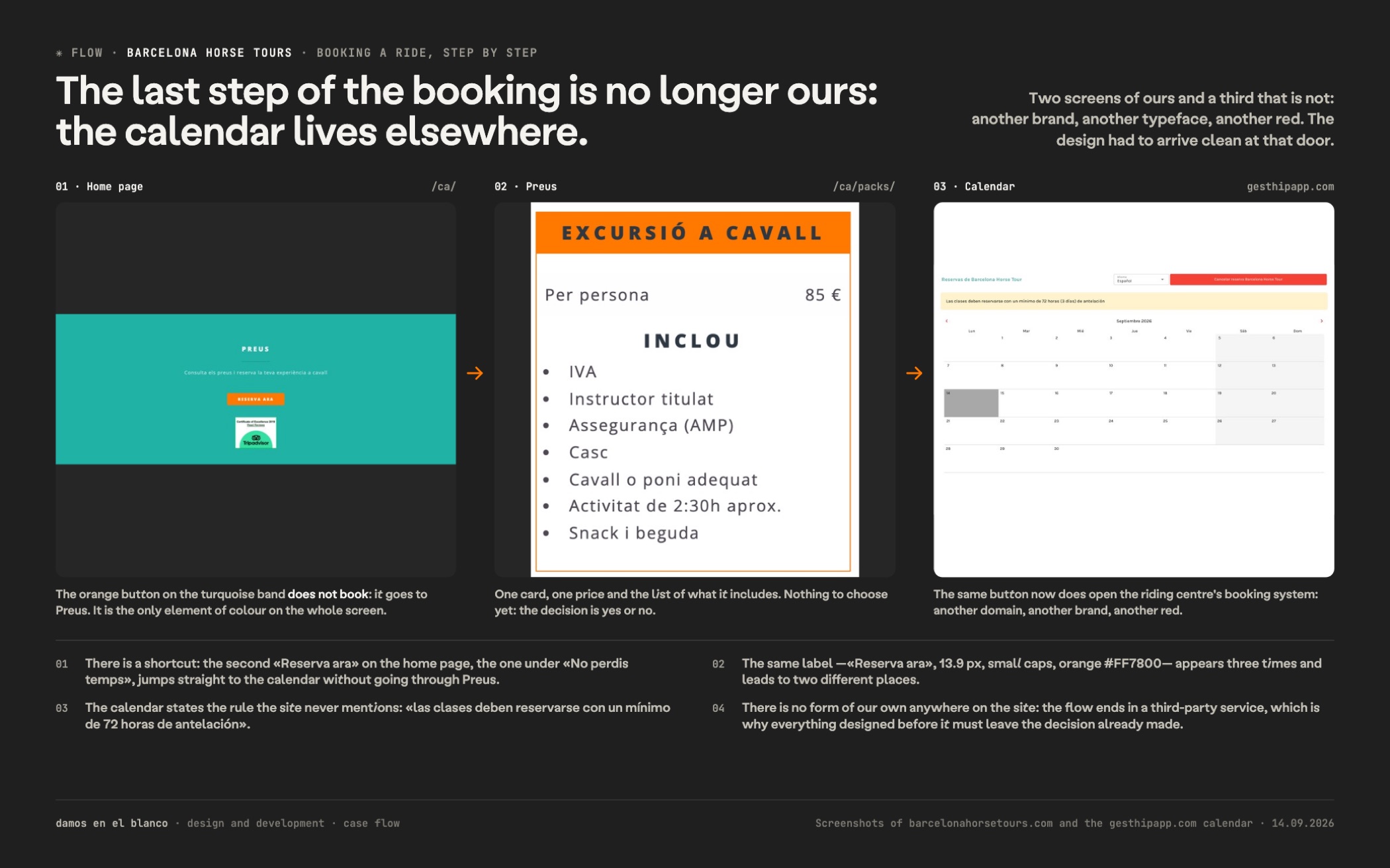
One orange button, and it leads to the calendar. The site has no form: the button opens the riding centre’s own booking calendar. Turquoise for the bands, orange only for the action, 3 px radius on the buttons alone and not a gram of CMS. In 2019 we went back in to bring prices, badges and content up to date.
The client already had the best sales argument and it was not his: it was the landscape. The decision was not to compete with it. A single type family, two white rules, a band of colour when the text needs one, and a button. Everything on this site that is not photography is designed to last ten seconds on screen and then disappear.
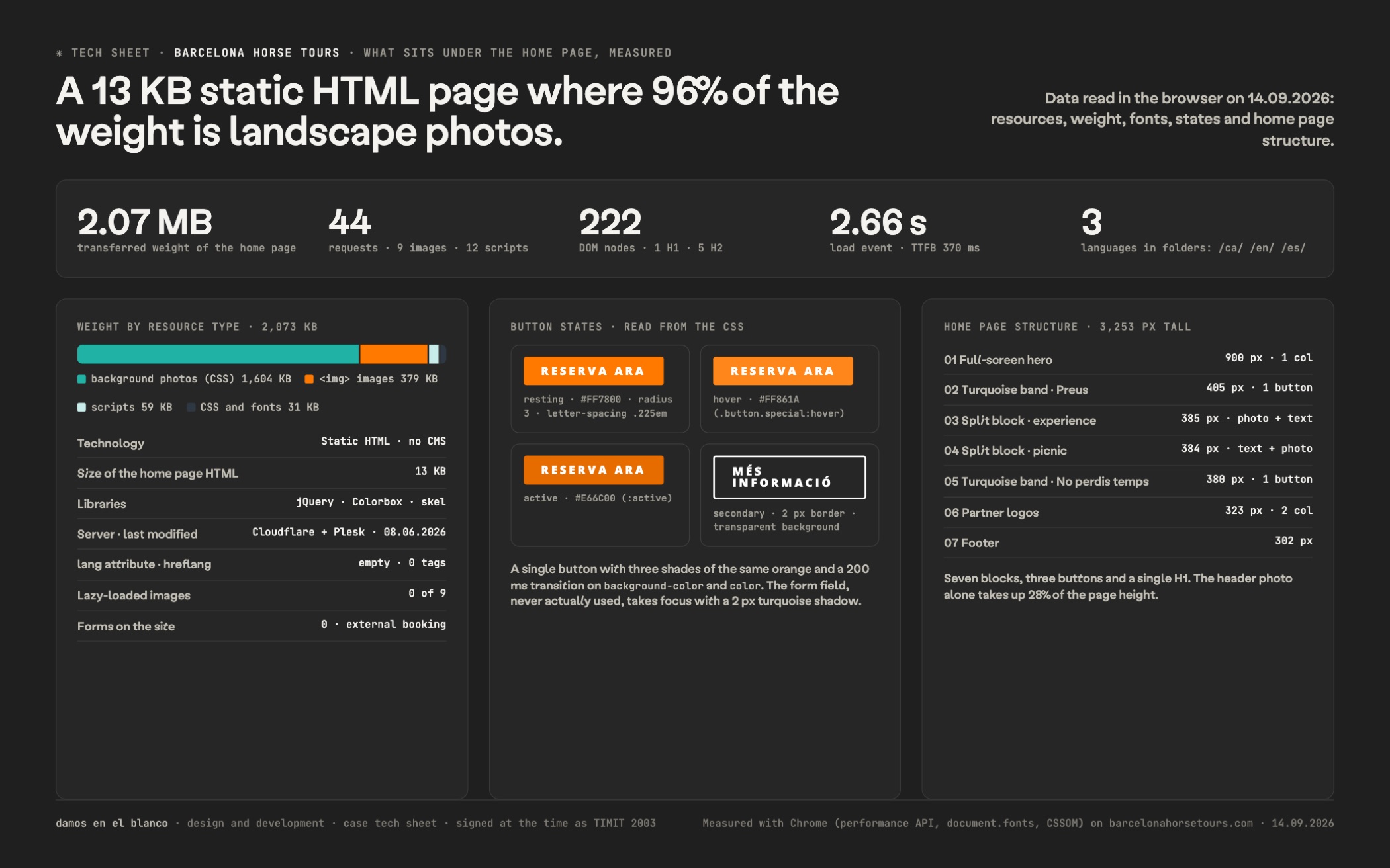
There is no CMS underneath: it is 13.6 KB of static HTML with our own CSS, jQuery and little else. That is a decision about the site, not a shortfall: a page you check on one bar of signal halfway up a hill cannot depend on a database. The container runs at 1,040 px, the sections breathe 104 px above and 69 below, and the only radius on the site is 3 px on seven buttons.
The type does all the brand work. Open Sans in two weights — 400 and 800 — always in capitals in the headings and with 6.8 px of letter-spacing in the inside H2s, 3.9 in the banner strapline, 3.1 in the buttons and 1.3 even in running text. The palette is short and functional: #21B2A6 for the section bands, #FF7800 for the action and nothing else, slate grey #2E3842 as the general background and white over photography.
The rest is light integrations: a lightbox gallery, a cookie notice, share buttons and the riding centre’s booking calendar, which takes every click on the orange button. From the earliest archived copy, in August 2018, the structure and the stylesheets are the same as today’s. The only thing that has changed in nine years is the content: from four packages down to one.
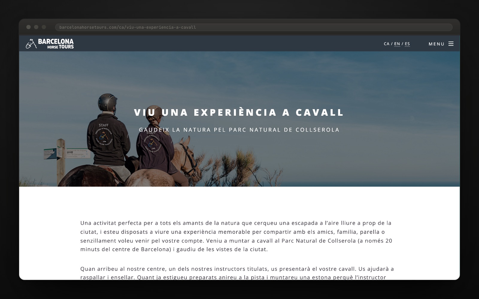
"Excursions a cavall amb vistes de Barcelona."barcelonahorsetours.com
Want a result like this for your project?
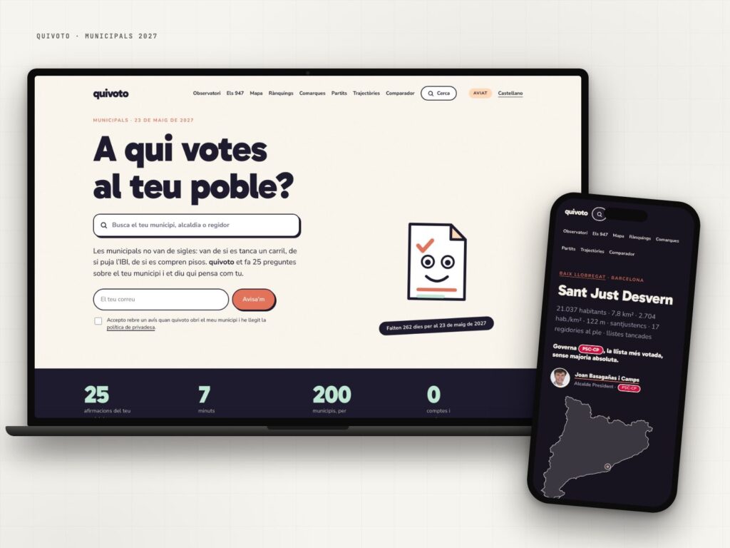
quivoto, the voting compass that starts with your municipality
Municipal elections are not about party labels: they are about what happens on your street.
View case study →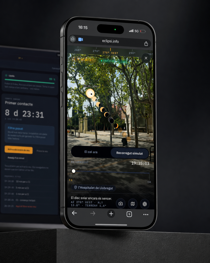
eclipsi.info, the tool that calculates what you’ll see from your exact location
The map tells you where. This tool tells you what you'll see.
View case study →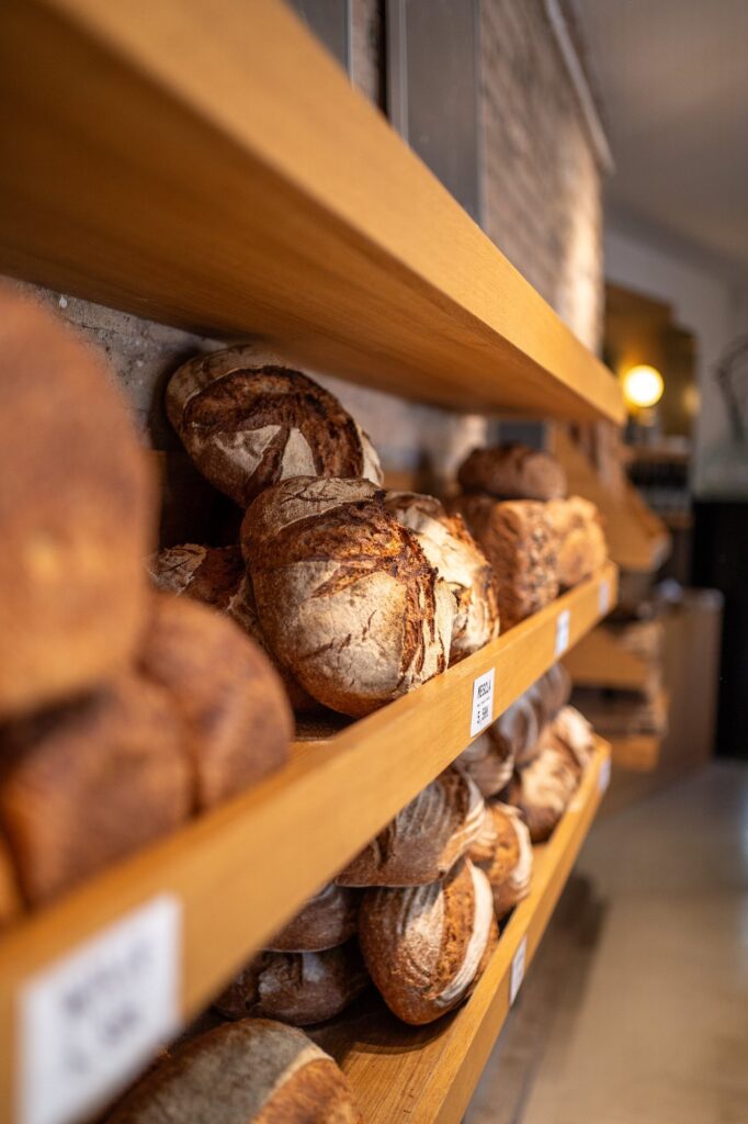
Modèlic, a sourdough bakery with its own voice on social
Real bread. And a feed that smells just as good.
View case study →