Sandra Dachs, a website that steps aside so the work can be seen
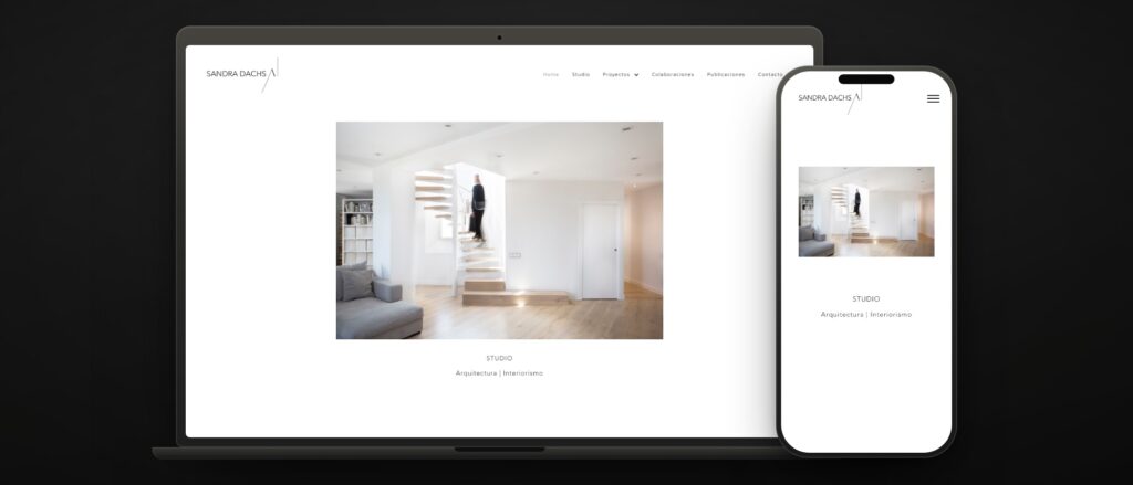 sandradachs.com · 20 years in the trade · homes, shops and hotels
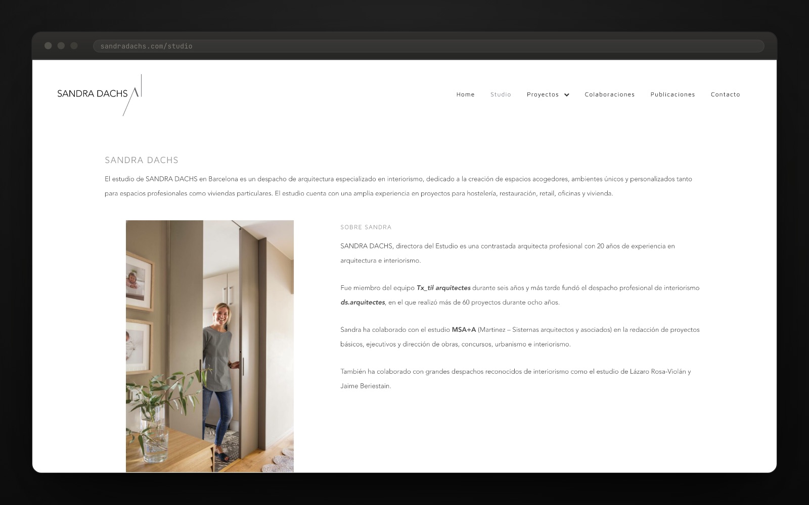
 Sandra Dachs has spent twenty years doing interior design in Barcelona: six of them with the Tx_til arquitectes team, and more than sixty projects across the eight years of ds.arquitectes before opening her own studio. Homes, commercial spaces, offices and the interiors of three Le Méridien hotels.
What she did not have was anywhere to show it. The brief was not to explain a method: it was to get the work seen with nothing standing in front of it, and to let a hotel client and a flat owner each find their own without digging.
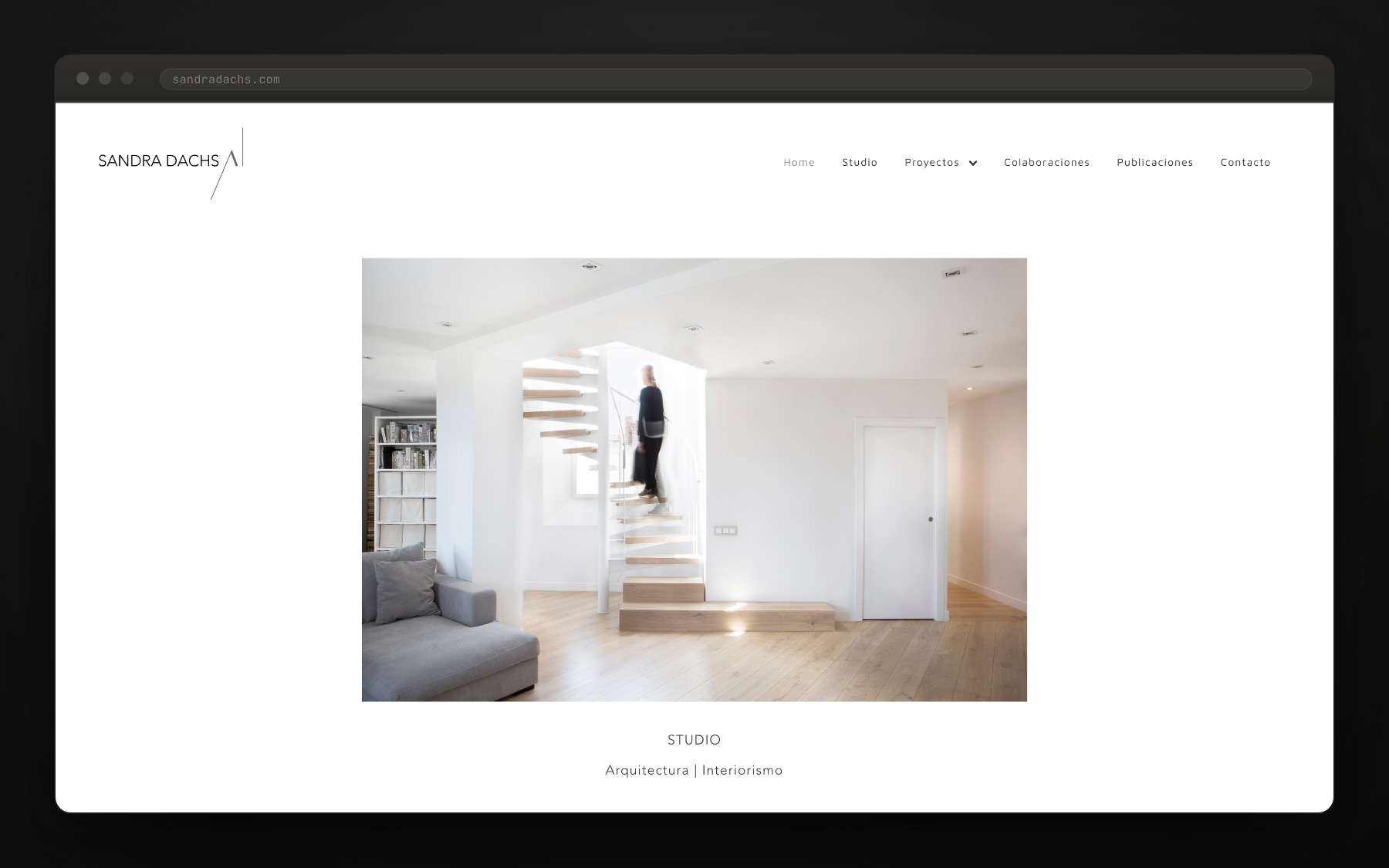
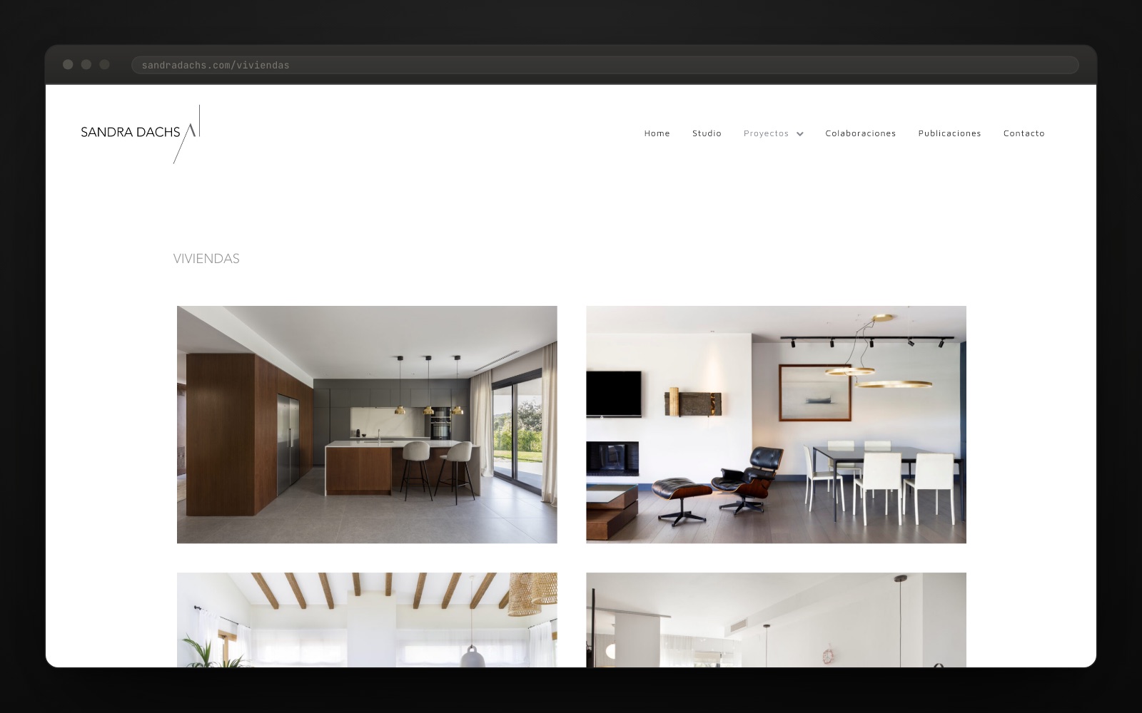
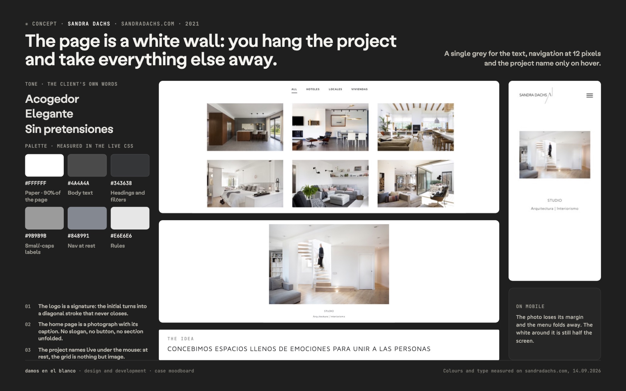
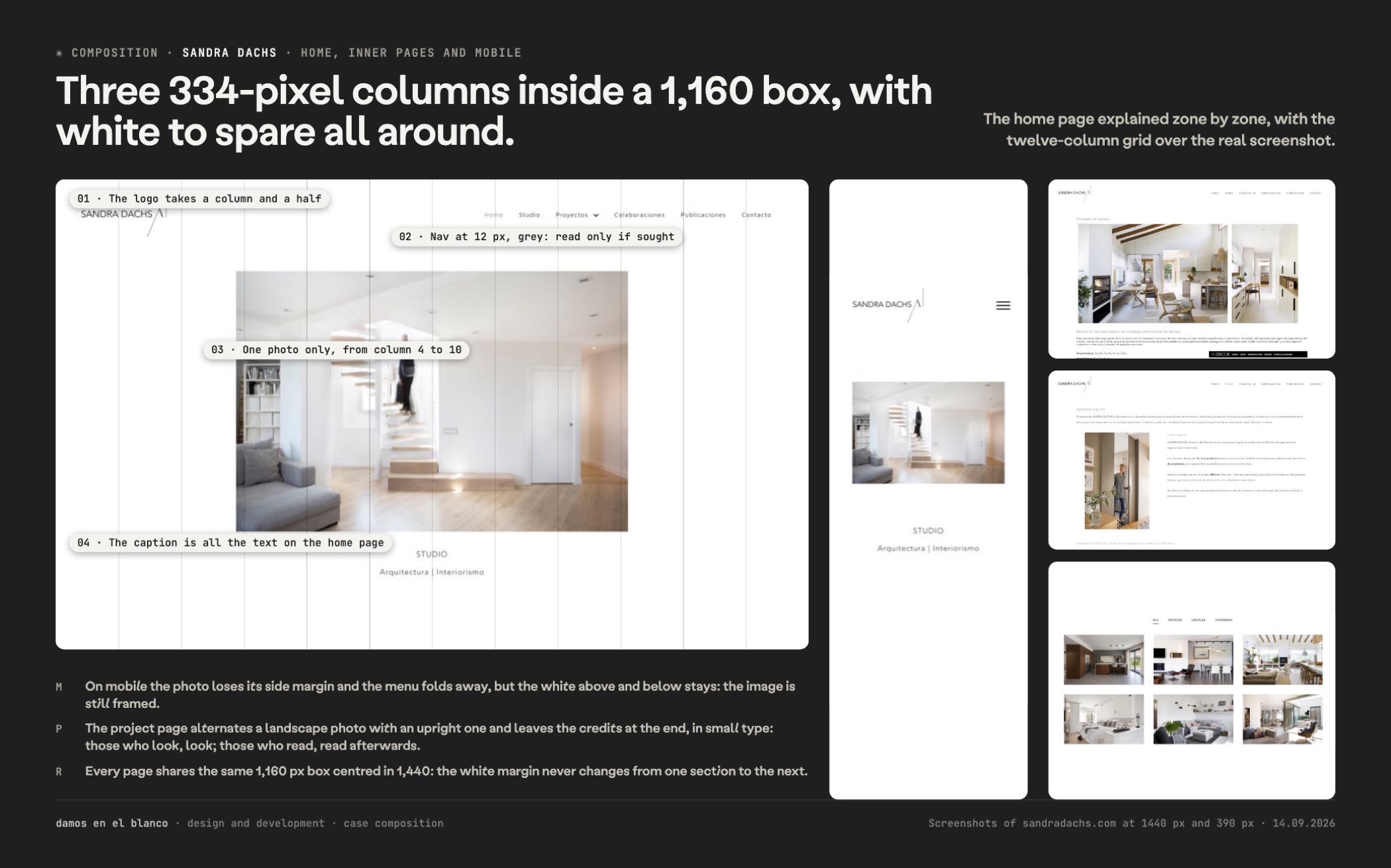
We designed the site as a gallery wall. An interior design studio gets hired for what can be seen, not for what it says about itself, so we took everything else away: 12 px navigation in grey, a single text grey, absolute white and not one brand colour anywhere in the house.
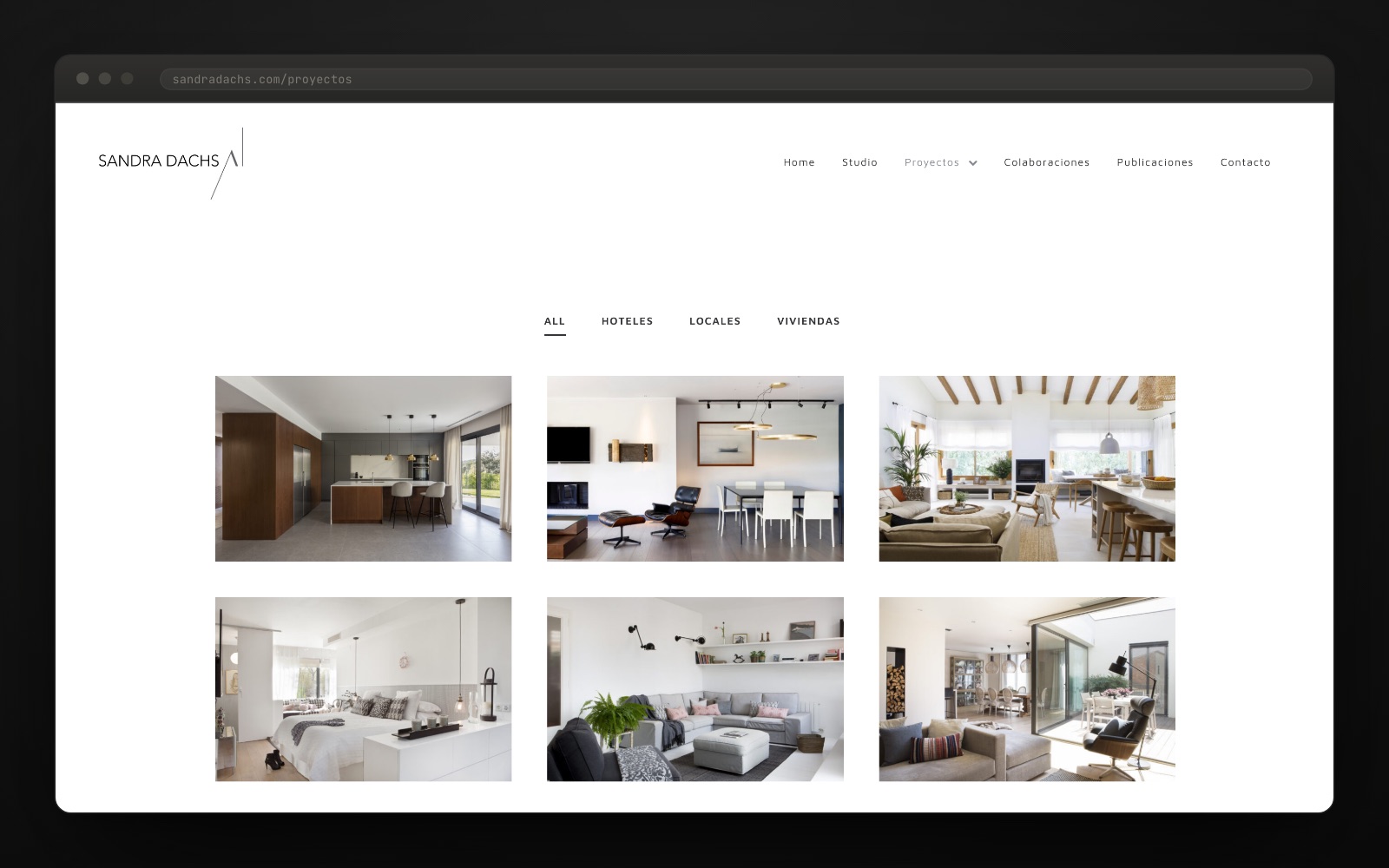
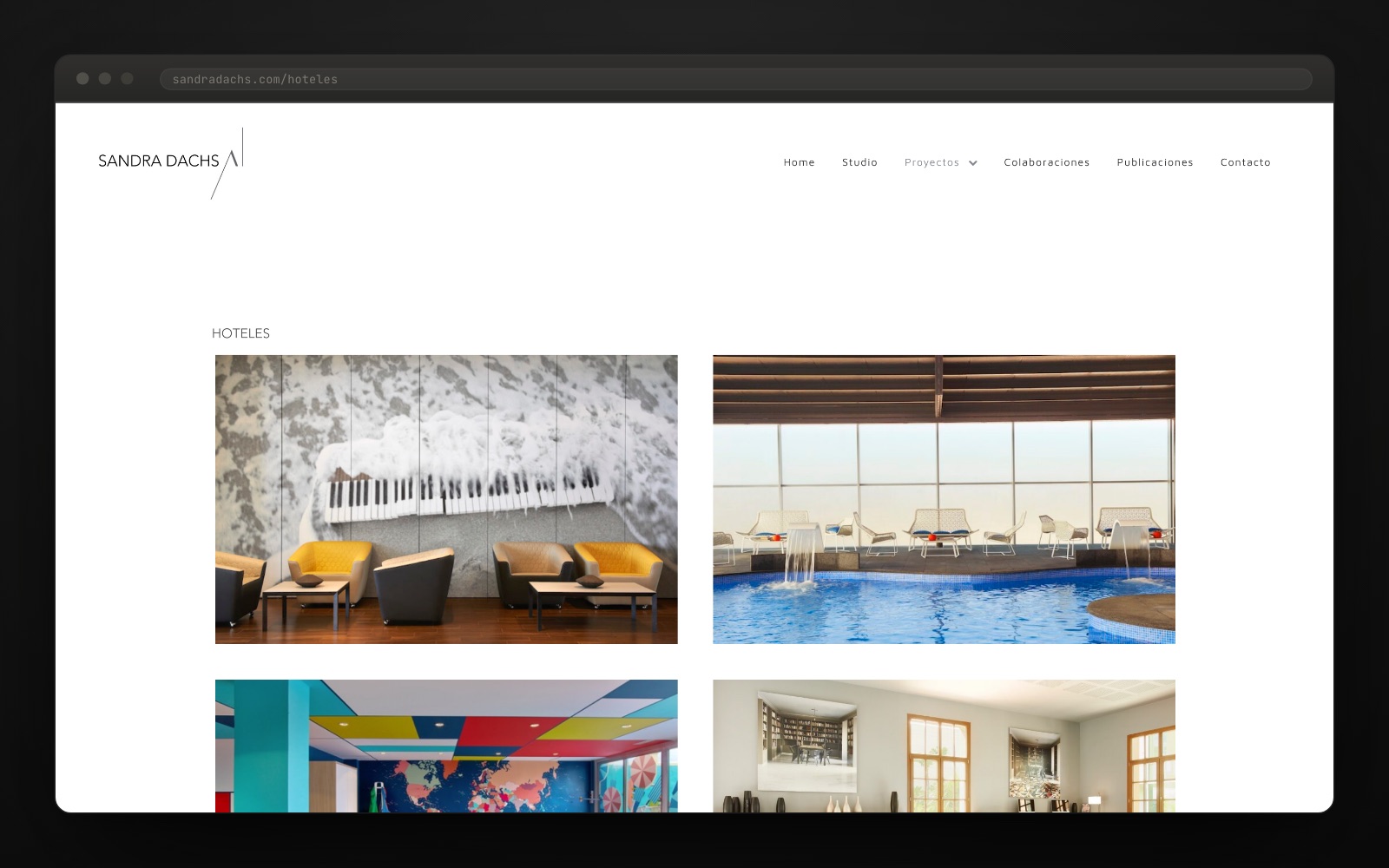
We built a portfolio that filters in one click. Homes, commercial spaces, hotels and competitions share one three-column grid, with 334 × 209 px thumbnails and a 40 px gutter. Project names only appear on hover: at rest, the grid is pure image.
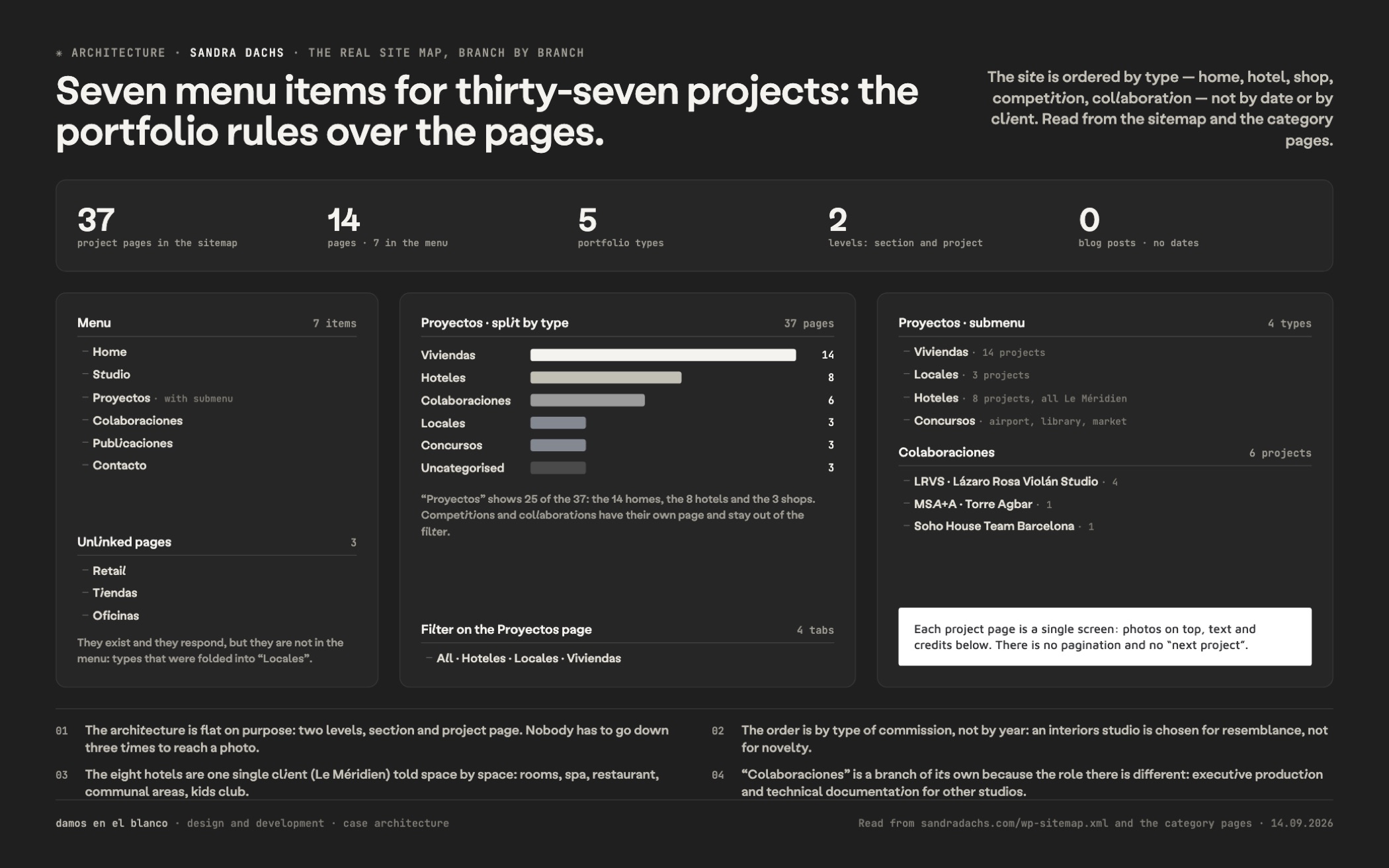
We ordered the work by typology, not by date. Someone looking to refurbish a flat does not want to see a hotel reception, and someone coming from hospitality does not want to see a duplex. Each typology has its own page and its own menu entry; the Le Méridien hotels and the fourteen homes stop competing in the same list.
We put the whole site up in one go, in May 2021. Design, development and programming from scratch on WordPress: a single-screen home page with a carousel, studio, contact, press and our own cookie notice. In March 2026 we went back in to reorganise the portfolio.
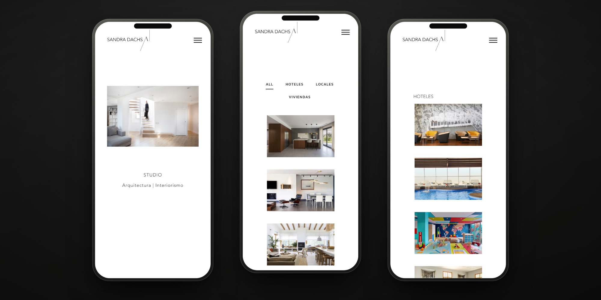
An interior design studio competes for attention with magazines and with Instagram. The decision was to take away: no brand colour, no captions over the photos, no home page explaining anything. The home is a single screen — the carousel and two lines of text — and the design work is in everything you do not see.
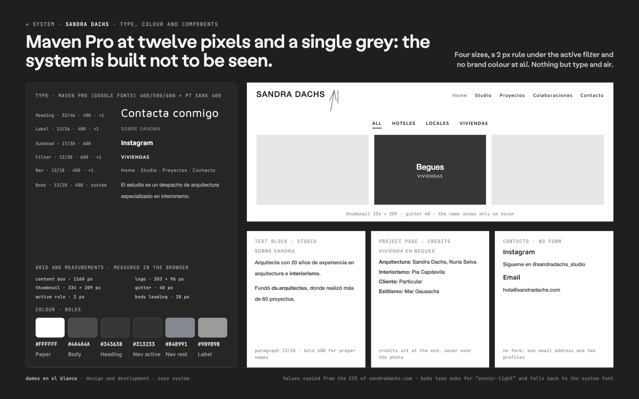
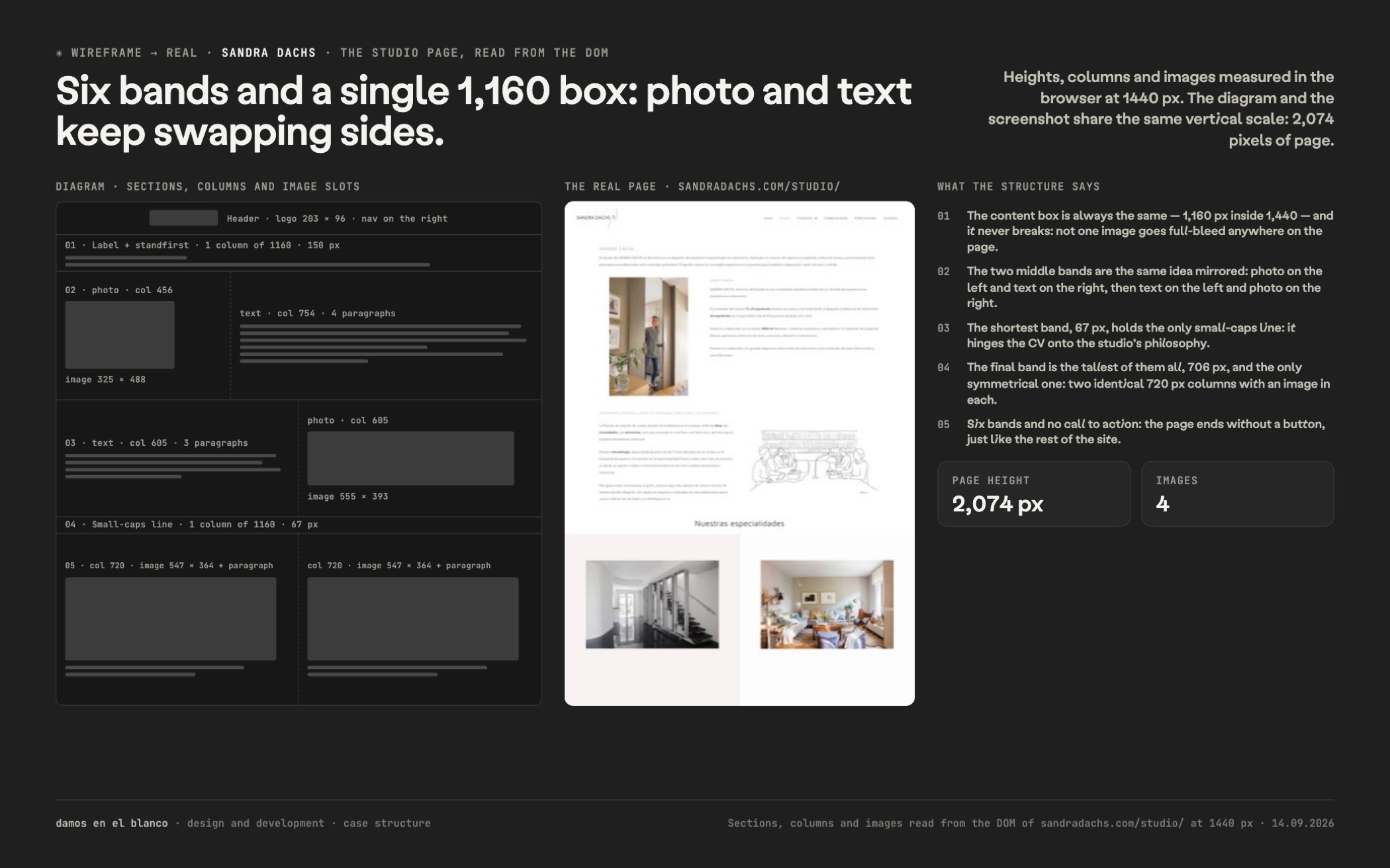
Underneath there is a WordPress with a short, disciplined grid: a 1160 px content box, 334 × 209 thumbnails in three columns, a 40 px gutter and 0 px radius across the whole site. Type runs in two registers: Maven Pro at 12 px with one point of letter-spacing for the navigation and the filters, and body text at 13 / 28. The grey #4A4A4A appears in more than two hundred nodes; in practice it is the only colour on the site.
The portfolio filter is the component that takes the most work: it marks the active state with a 2 px rule under the label and reorders the grid without reloading the page. Project names live in the hover state, at 24 px in white over the photo, and vanish the moment you leave.
The rest is hygiene: compressed, lazy-loaded photography, our own cookie notice and a two-level menu that unfolds the four typologies. Five years on, the site has only asked for a content reshuffle.
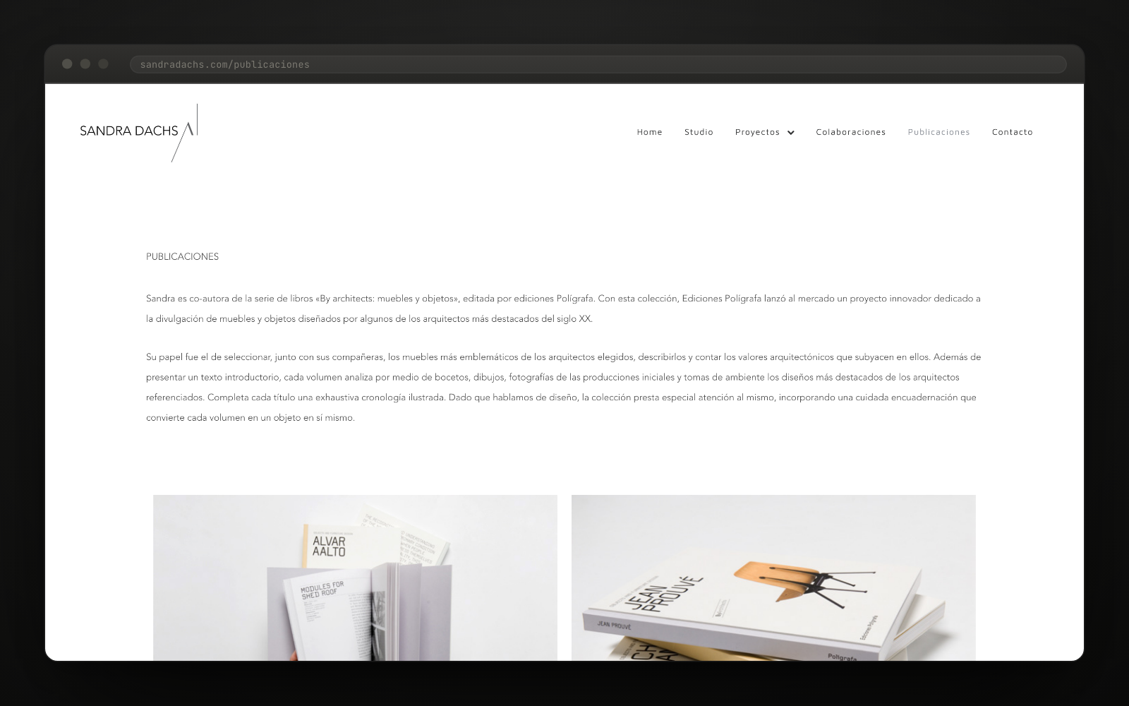
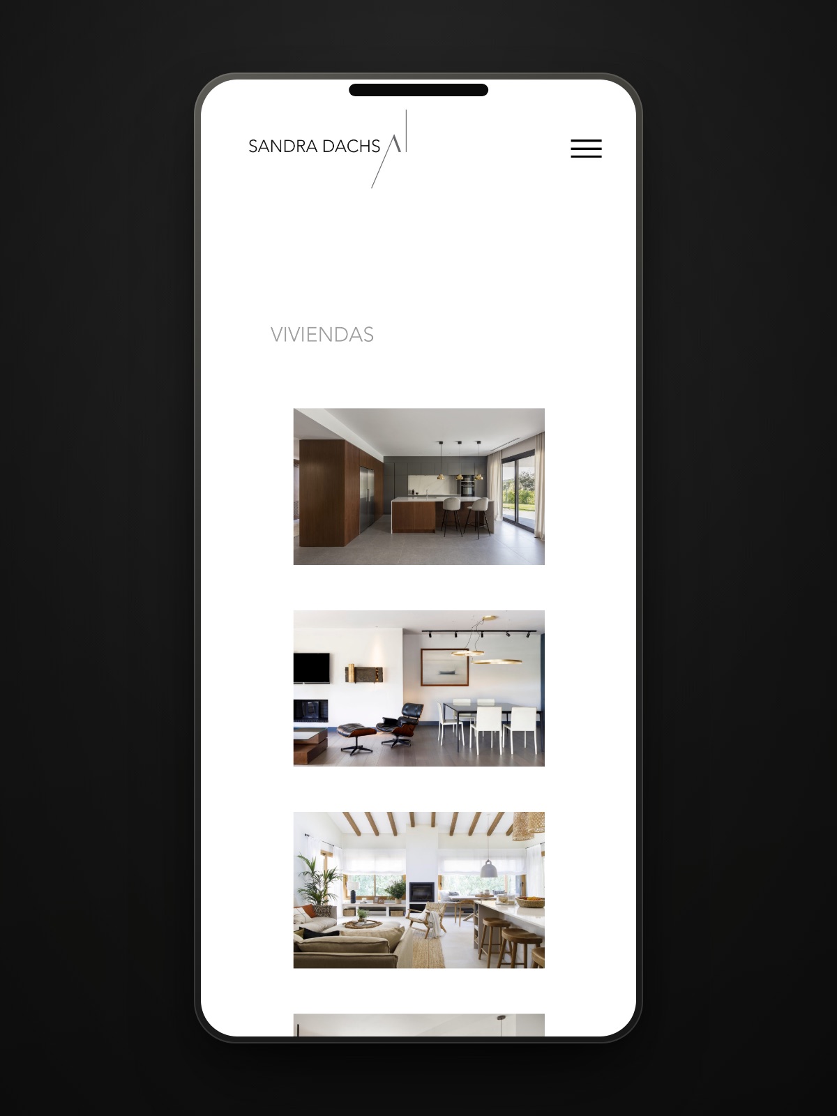
"El estudio de Sandra Dachs en Barcelona es un despacho de arquitectura especializado en interiorismo."sandradachs.com
Want a result like this for your project?
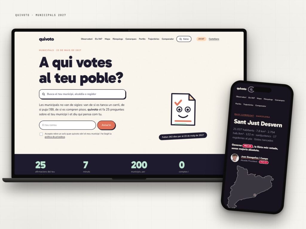
quivoto, the voting compass that starts with your municipality
Municipal elections are not about party labels: they are about what happens on your street.
View case study →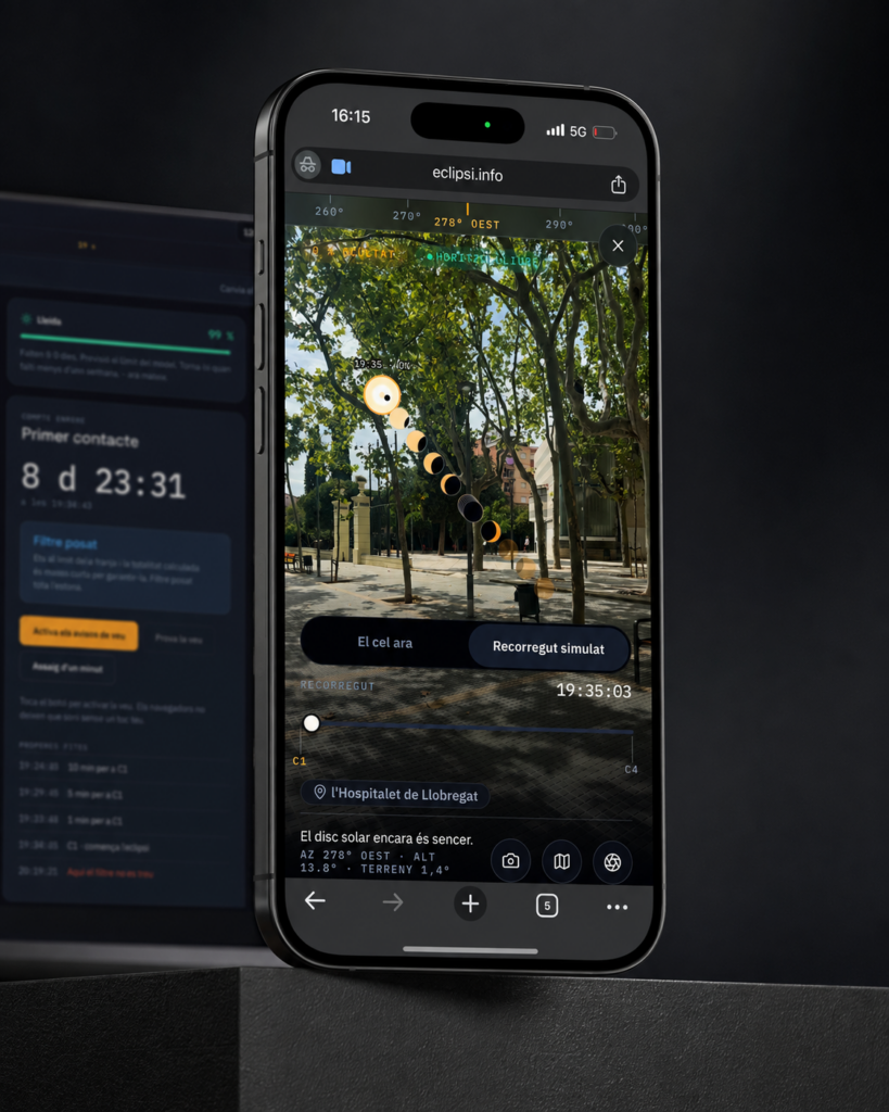
eclipsi.info, the tool that calculates what you’ll see from your exact location
The map tells you where. This tool tells you what you'll see.
View case study →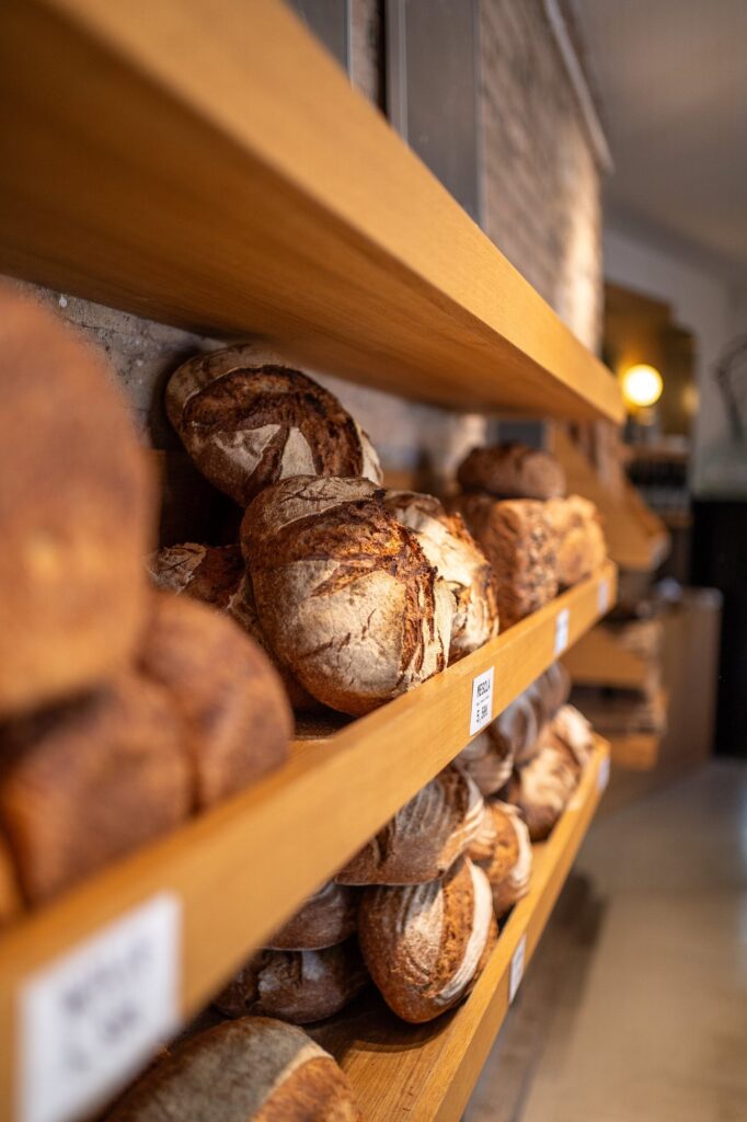
Modèlic, a sourdough bakery with its own voice on social
Real bread. And a feed that smells just as good.
View case study →