Clínica García & Quiroga, a website where the doctors are the ones who show their faces
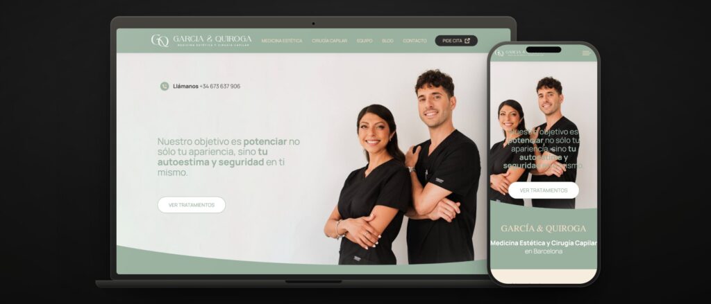 clinicagarciaquiroga.com · Barcelona · 4 specialities
 Clínica García & Quiroga opened on Gran Via with two doctors and two specialities: aesthetic medicine and hair surgery. Treatments people search for at night and do not mention at the office. Patients arrive embarrassed and afraid of the result, and a website can make both worse in two seconds.
They gave us the whole project, from scratch: digital identity, design, website and development. With one condition underneath: that the clinic should look like what it is — two doctors who see patients themselves — and not a touch-up centre with a seasonal offer.
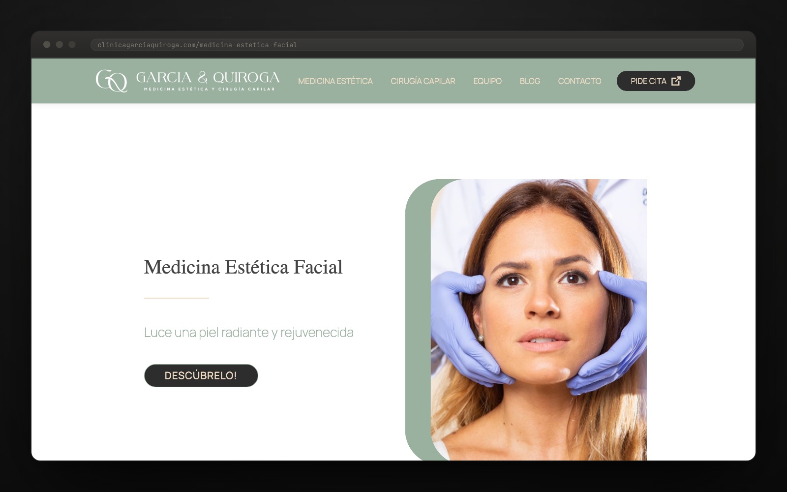
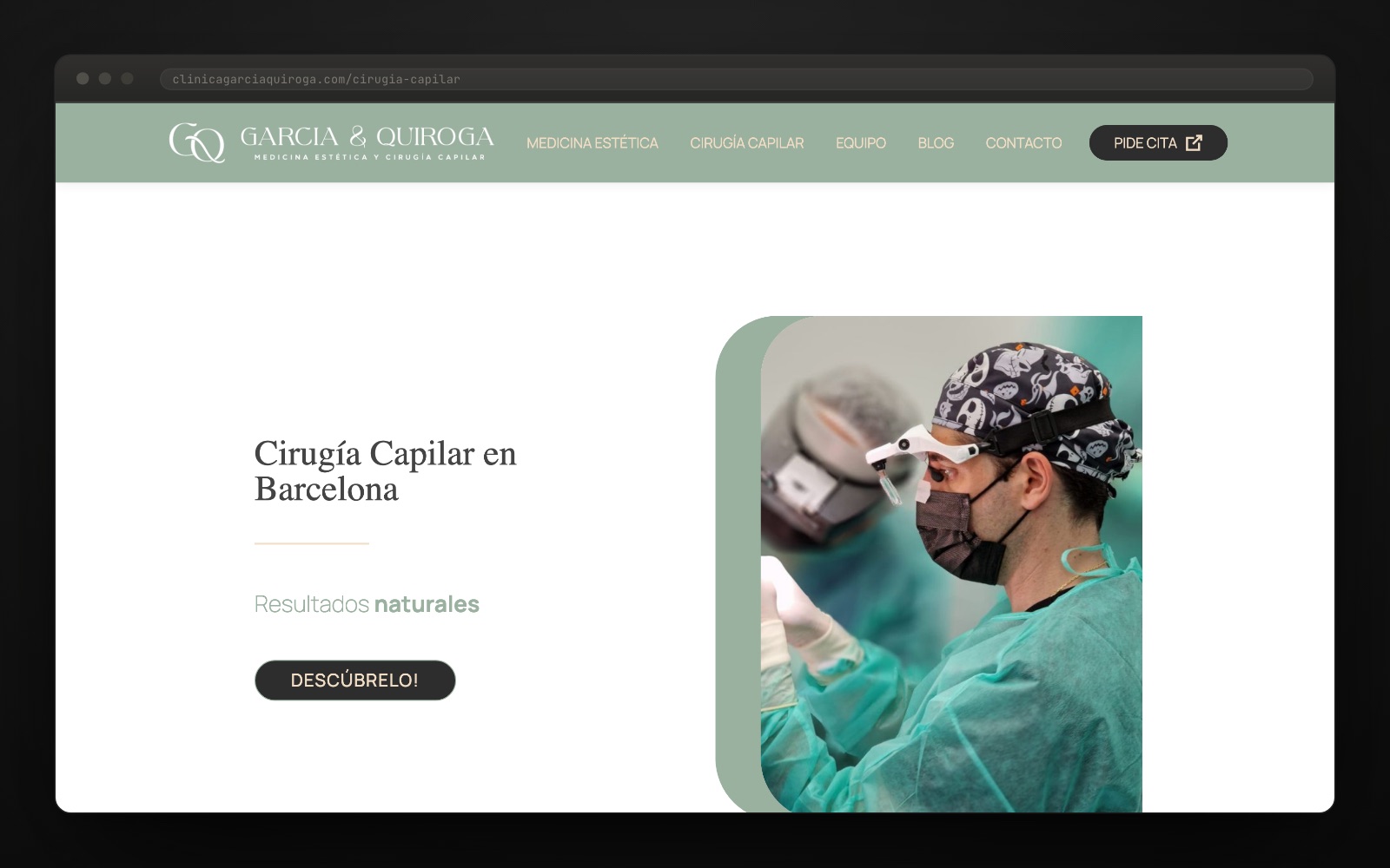
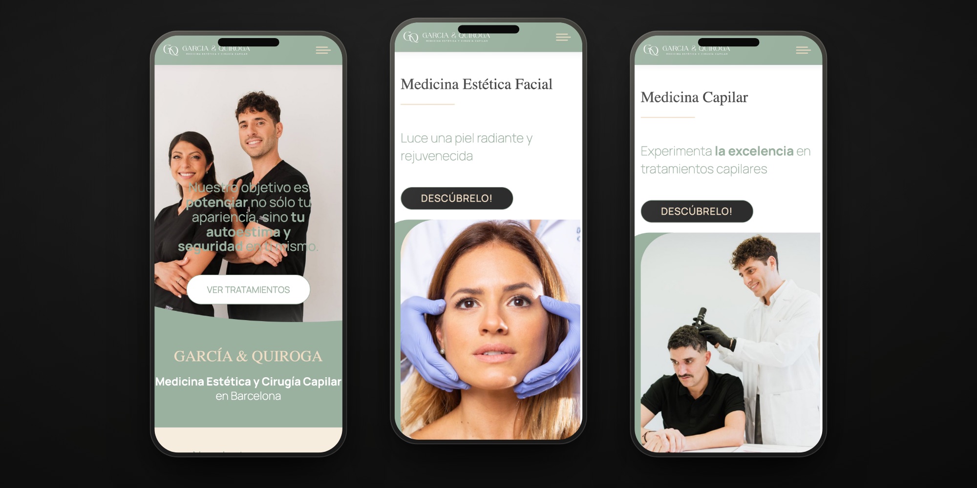
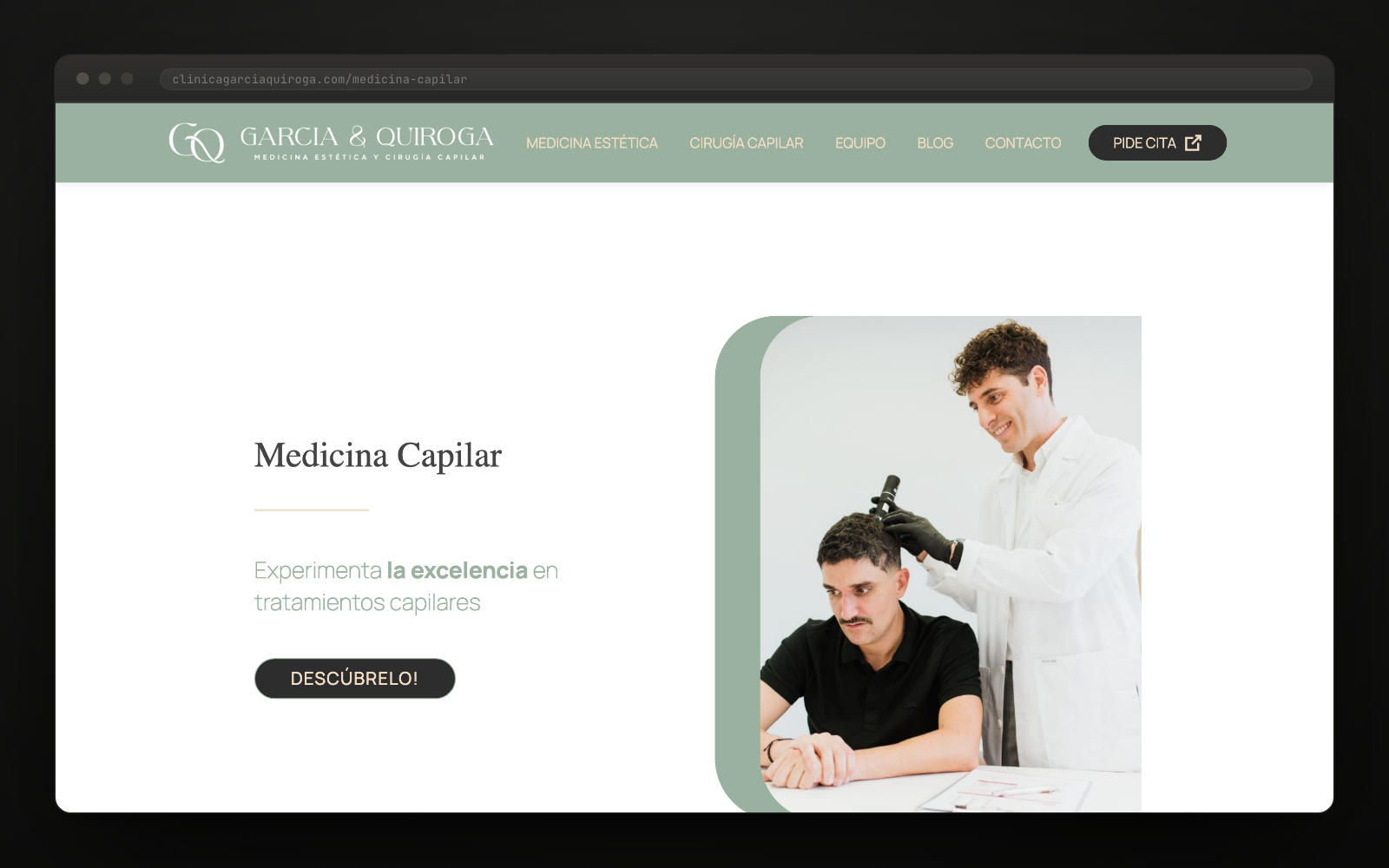
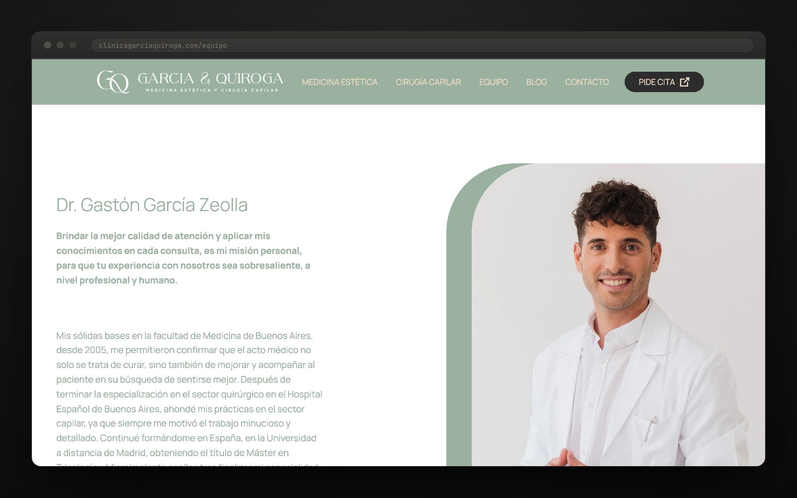
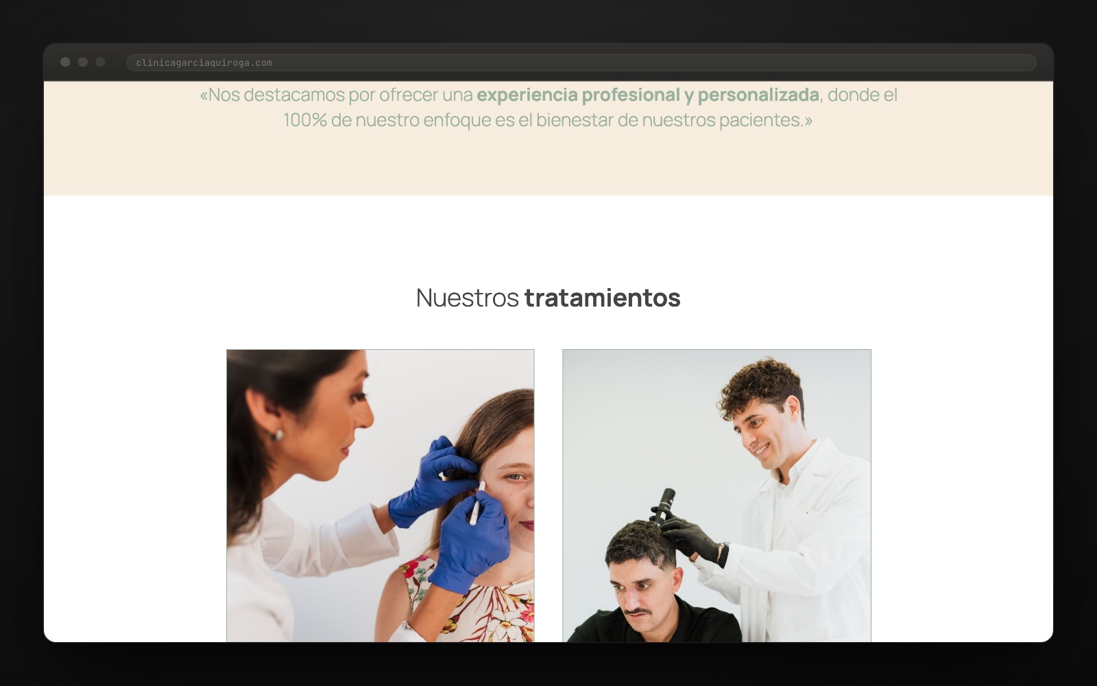
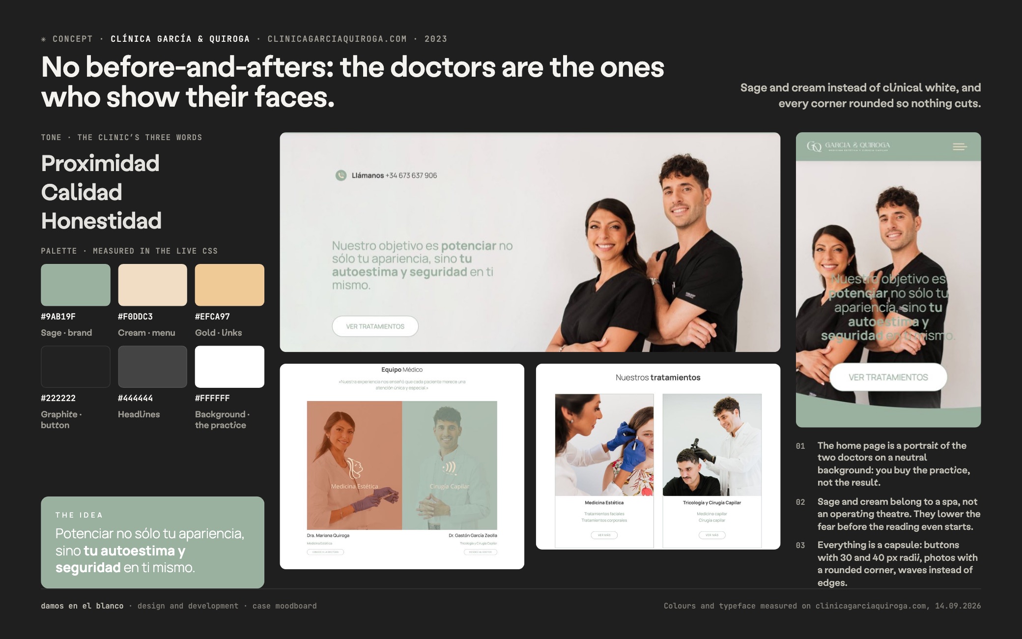
We took out the before-and-afters. There is not a single one on the site. In aesthetic medicine that photo is the automatic move, and it is what turns a patient into a case. We put the doctors there instead: the home page is their portrait, every speciality carries the face of whoever performs it, and the catalogue is one of people.
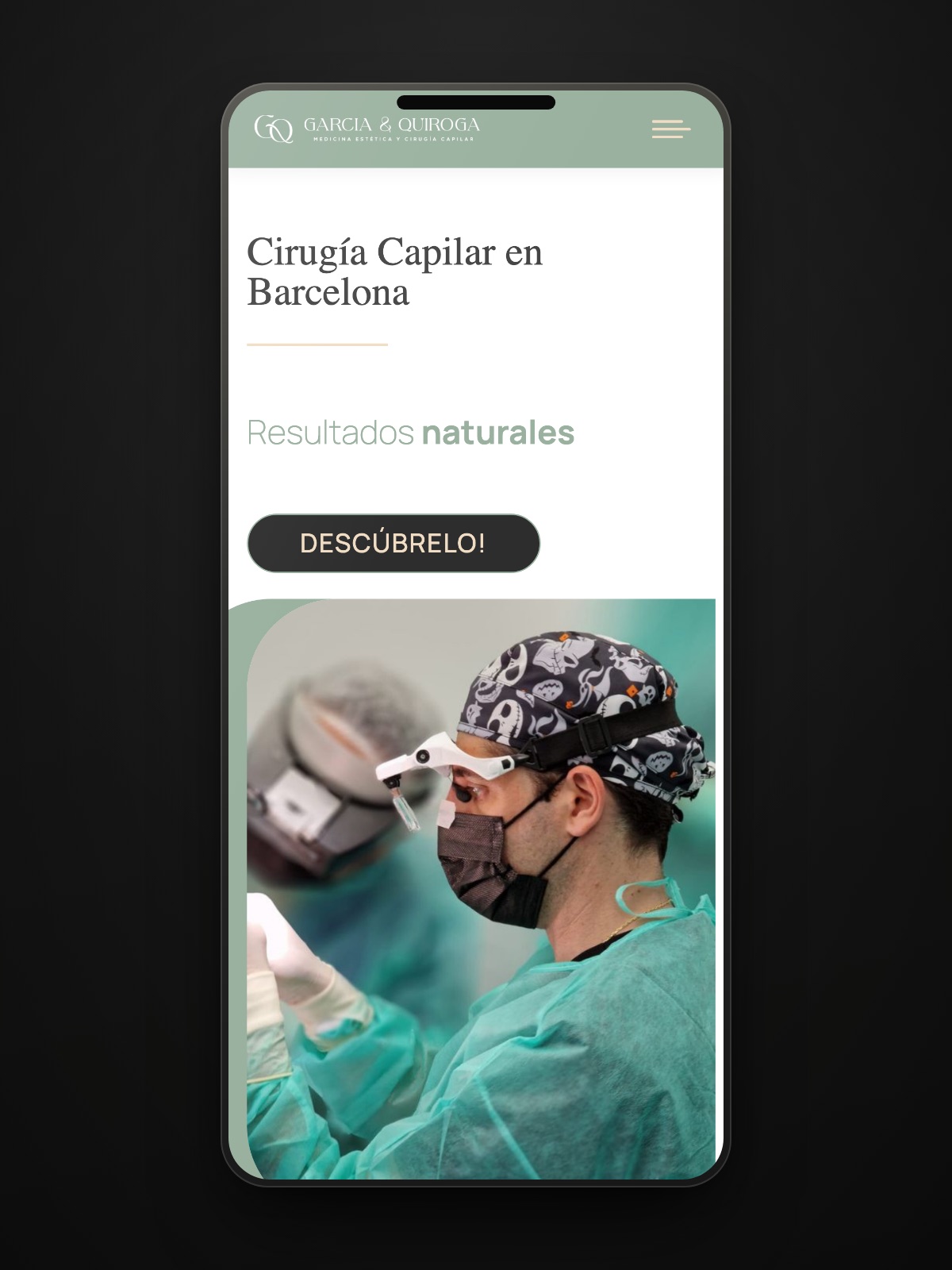
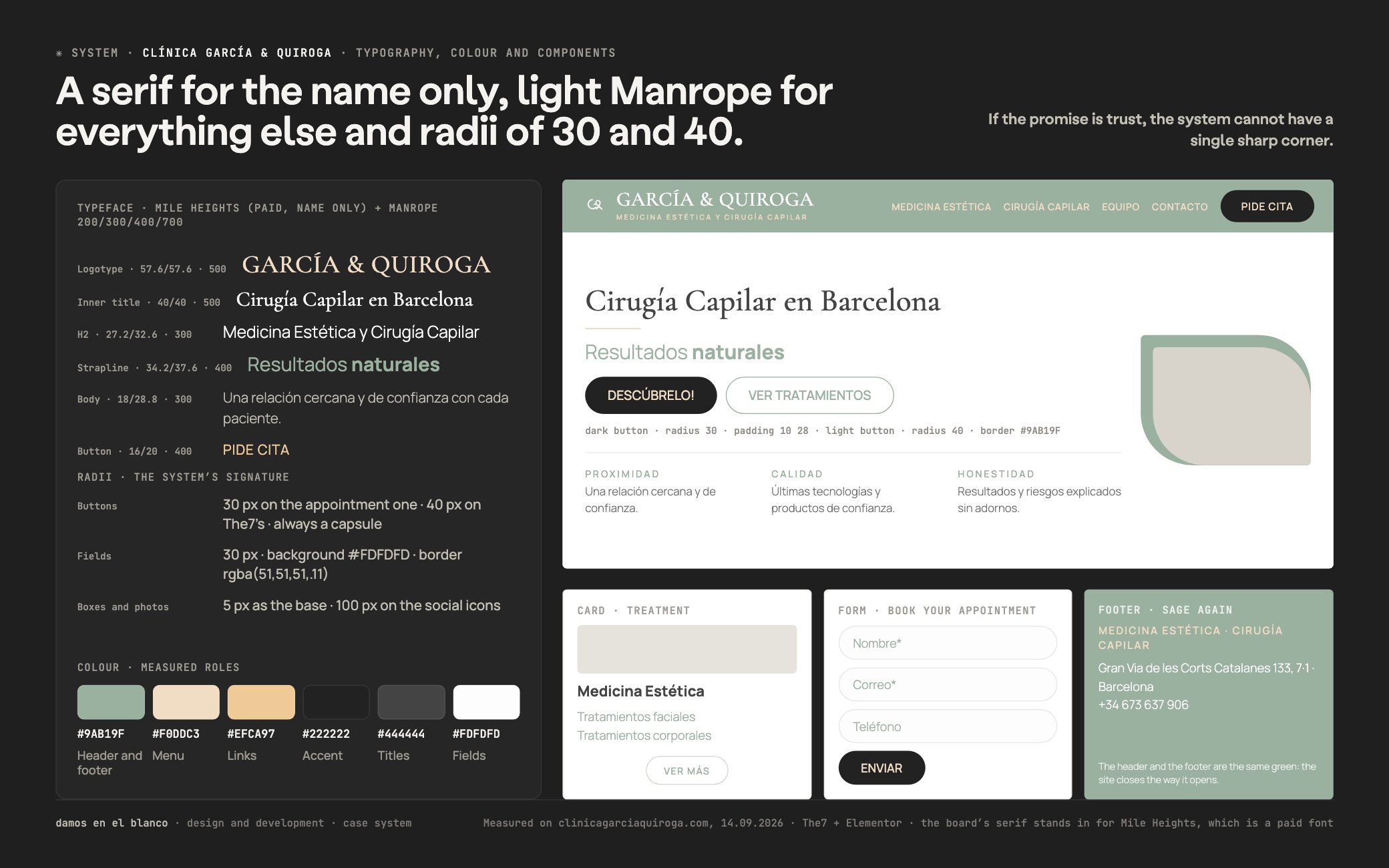
A digital identity that does not smell of the operating theatre. Sage green as the base colour, body text included, plus cream and sand gold, and a brand typeface used only for the name and the headings. Light Manrope for everything else. Not one sharp corner: capsule buttons, rounded fields and a green wave where a straight line would go.
Four specialities ordered into two families. Facial aesthetics, body aesthetics, hair medicine and hair surgery, each with its own page and its own language. On top, a contact layer that does not push: “PIDE CITA” fixed in the header, phone, WhatsApp and a short form with consent.
Development on WordPress with our own child theme. No off-the-shelf install: colour, type and components were defined by hand on top of the theme, and that is why the site holds up page by page. Then five explainer articles, so there was something to say that was not a promotion.
The decision that orders the whole project was not to show results. Someone considering a hair graft does not need to see a stranger’s head: they need to know who is going to operate on them. That is why the social proof on this site is two names and two faces, not a gallery.
Underneath there is WordPress with our own child theme on top of The7 and Elementor Pro: the commercial theme provides the skeleton and our code provides the system. The brand colours do not live in a panel setting but in global variables — #9ab19f for the base green, #f0ddc3 and #efca97 for the light tones — and that is what stops every page from ending up painted its own way.
The typeface for the name does not come from Google Fonts: it is loaded as an @font-face on our own server, with no third-party calls. And the radii are normalised — 40 px on the buttons, 30 px on the fields — so that the feeling of “no sharp edges here” belongs to the system and not to one particular page.
The appointment form carries explicit consent and its own redirect after sending; WhatsApp is a floating button and not a widget that hijacks the screen. Small decisions, but exactly the ones that decide whether somebody ends up booking.
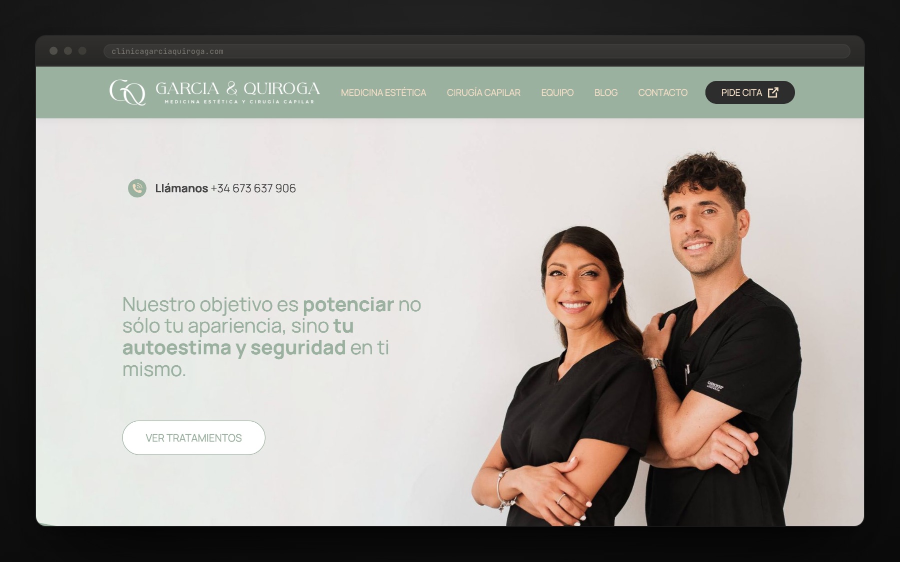
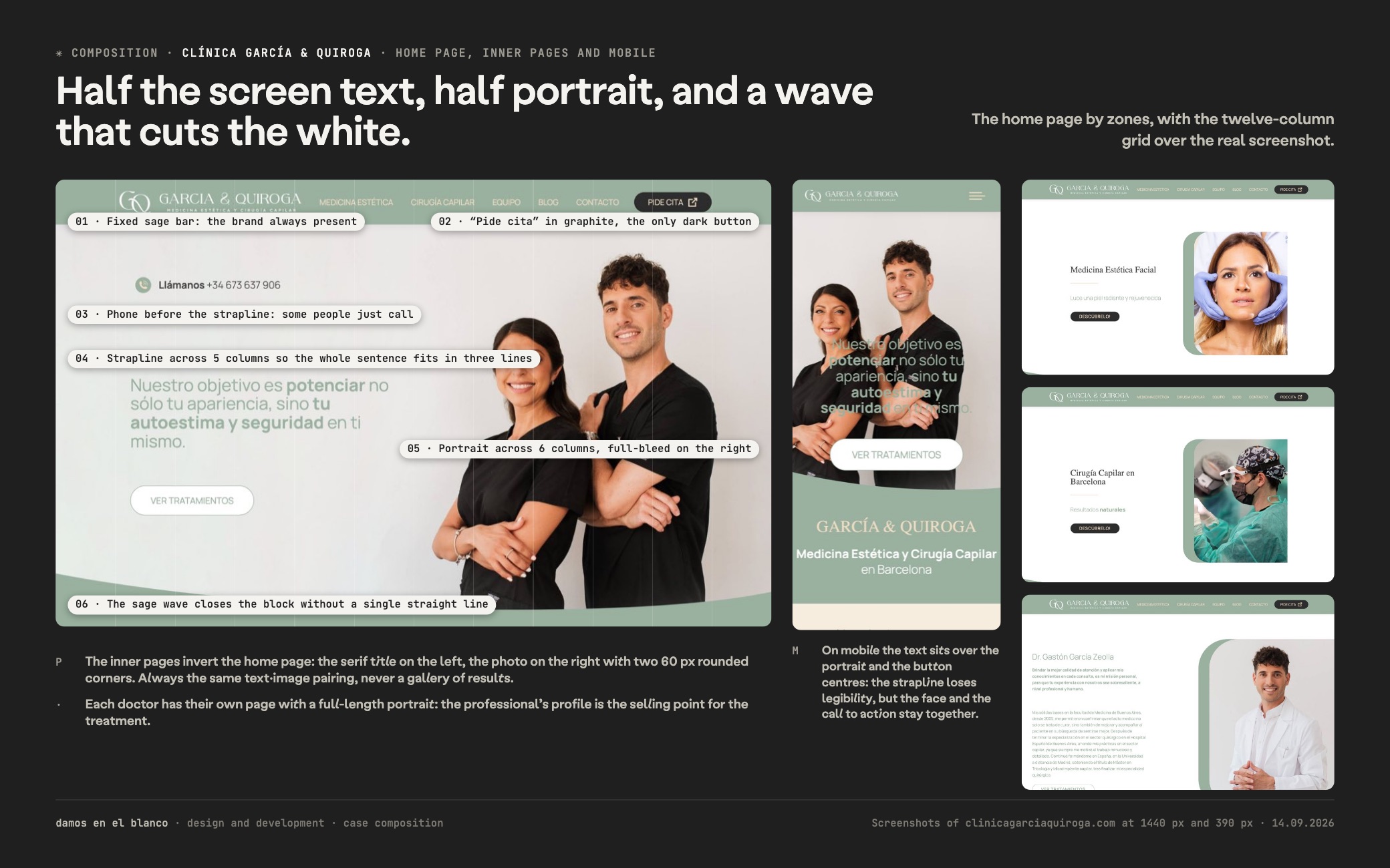
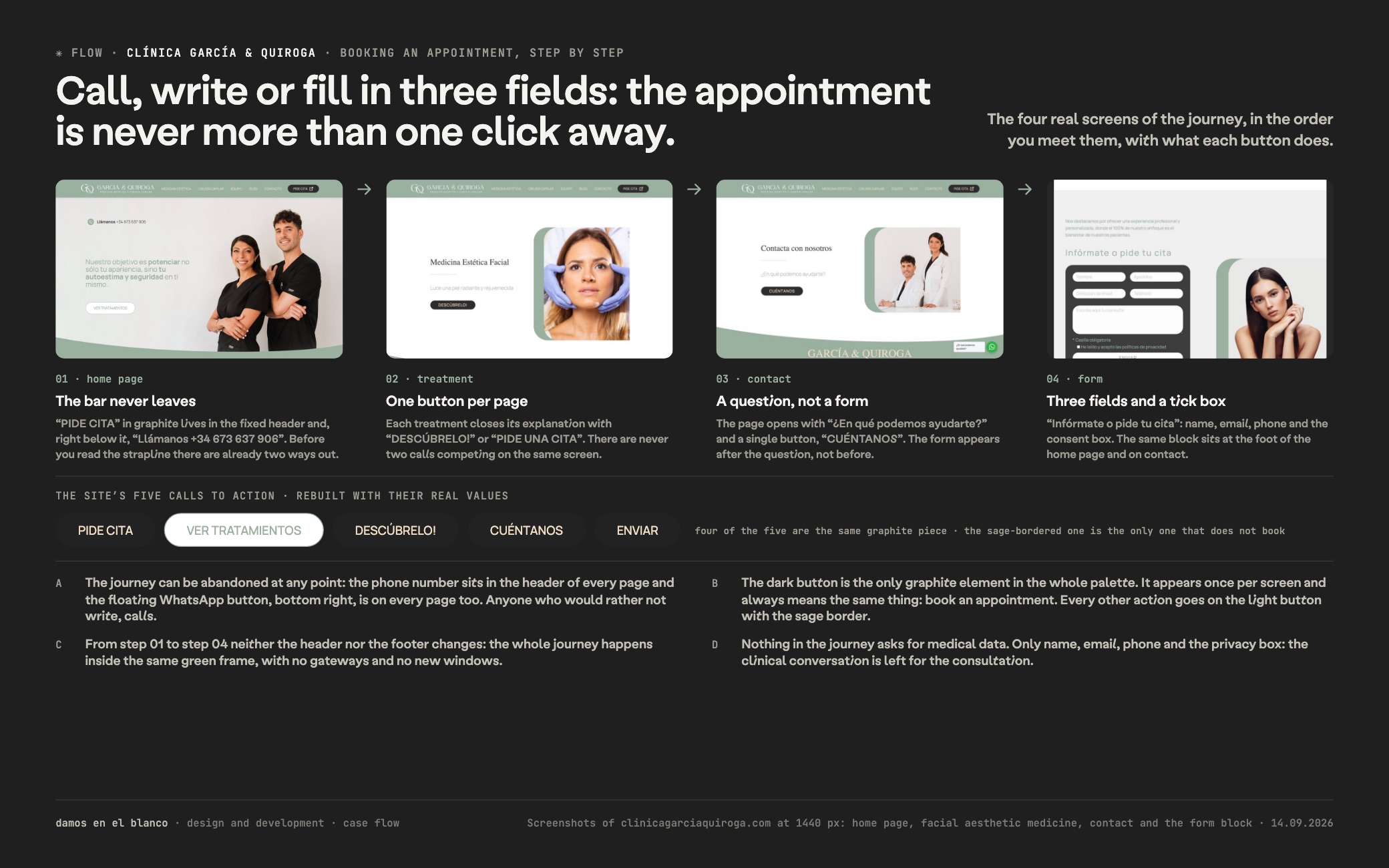
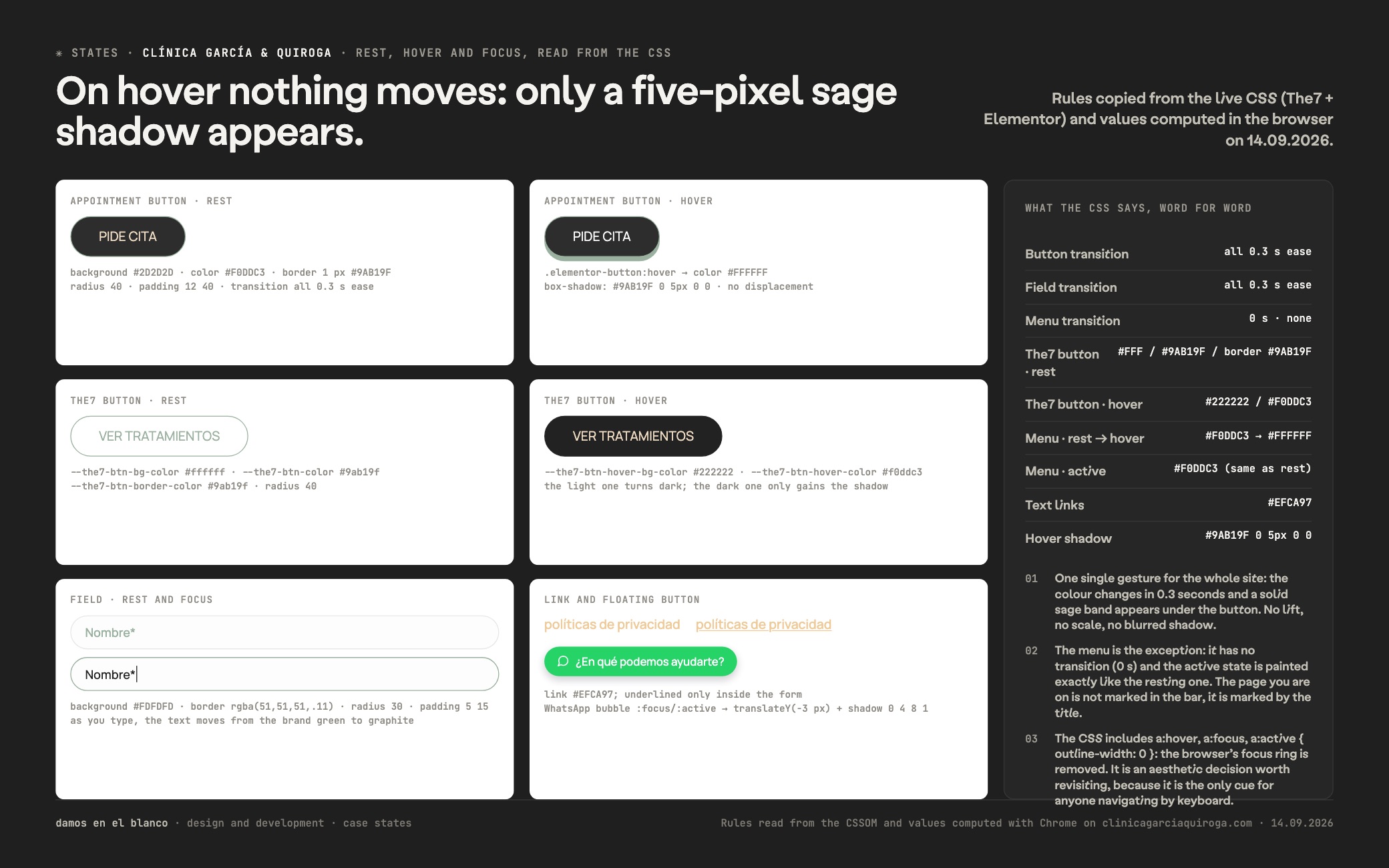
"Nuestro objetivo es potenciar no sólo tu apariencia, sino tu autoestima y seguridad en ti mismo."clinicagarciaquiroga.com
Want a result like this for your project?
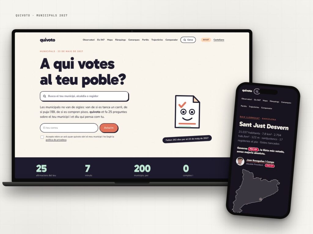
quivoto, the voting compass that starts with your municipality
Municipal elections are not about party labels: they are about what happens on your street.
View case study →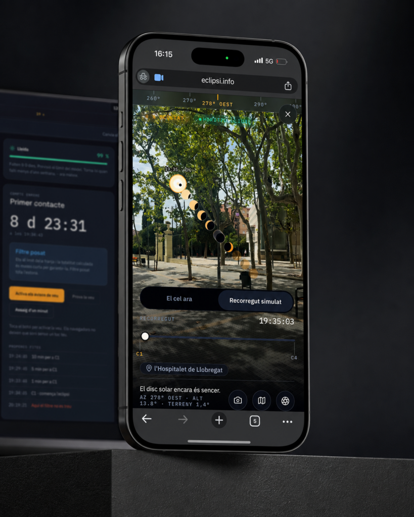
eclipsi.info, the tool that calculates what you’ll see from your exact location
The map tells you where. This tool tells you what you'll see.
View case study →
Roig Obres i Serveis, aerial drone video of the Sils logistics platform
Civil engineering from the air: you get it right away.
View case study →