
Tanit Orbits, identity and web taking off to the rhythm of the new space age
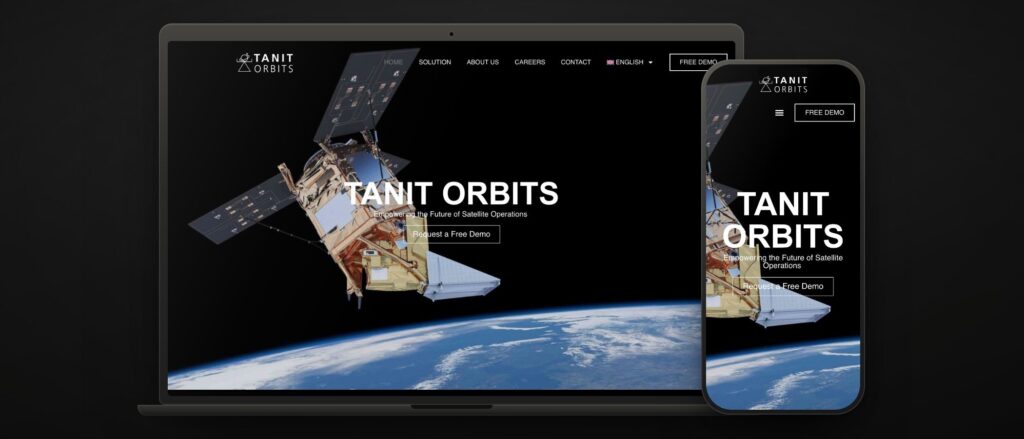 tanitorbits.com · orbital data for satellite operators
 Tanit Orbits set out to change how satellites are operated: precise orbital data to make better decisions, cut risk and extend the life of every satellite. Plenty of ambition… and a digital presence that had to match the mission.
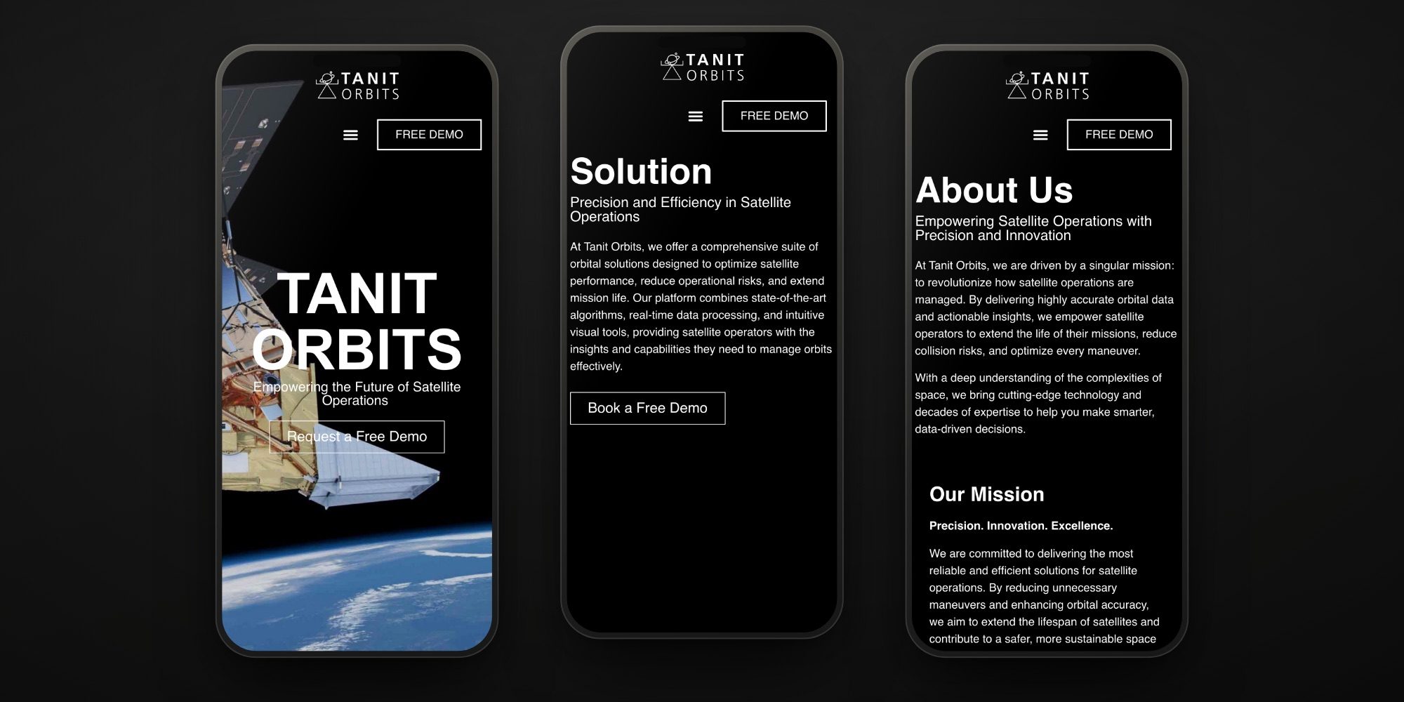
The brief: a brand and a website that conveyed technology and trust, able to convince a satellite operator to ask for a demo, and as good to look at as flying through space.
We created an identity with a view of space. A modern logo, a coherent visual system and a tone that shouts innovation without stopping at the pose. A brand worthy of people who manage manoeuvres and orbital predictions, and one that holds up equally well in an investor pitch and on a trade-show stand.
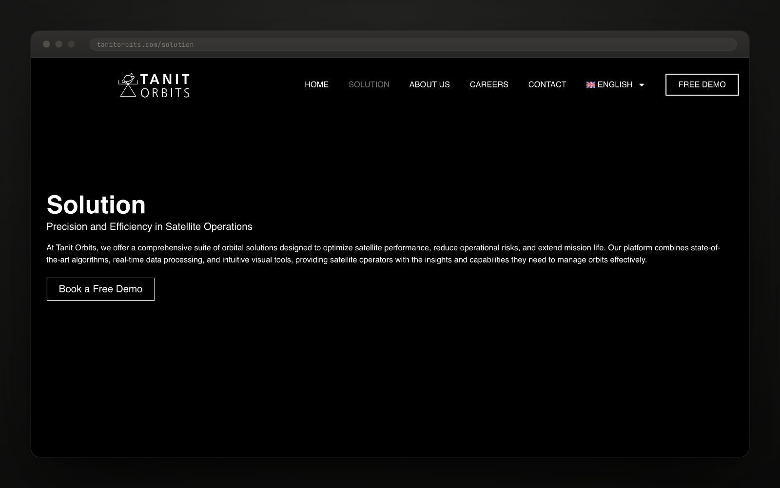
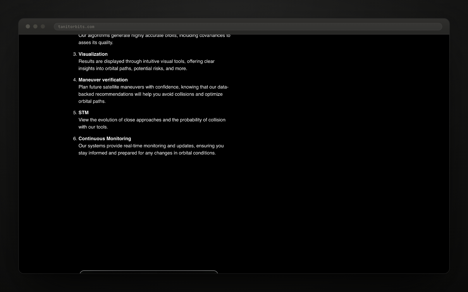
We put the complicated part in order. Orbit determination, covariances, manoeuvre verification, space traffic management, continuous monitoring… We turned it into a six-step journey, «from data to decision», that anyone can follow without being an aerospace engineer.
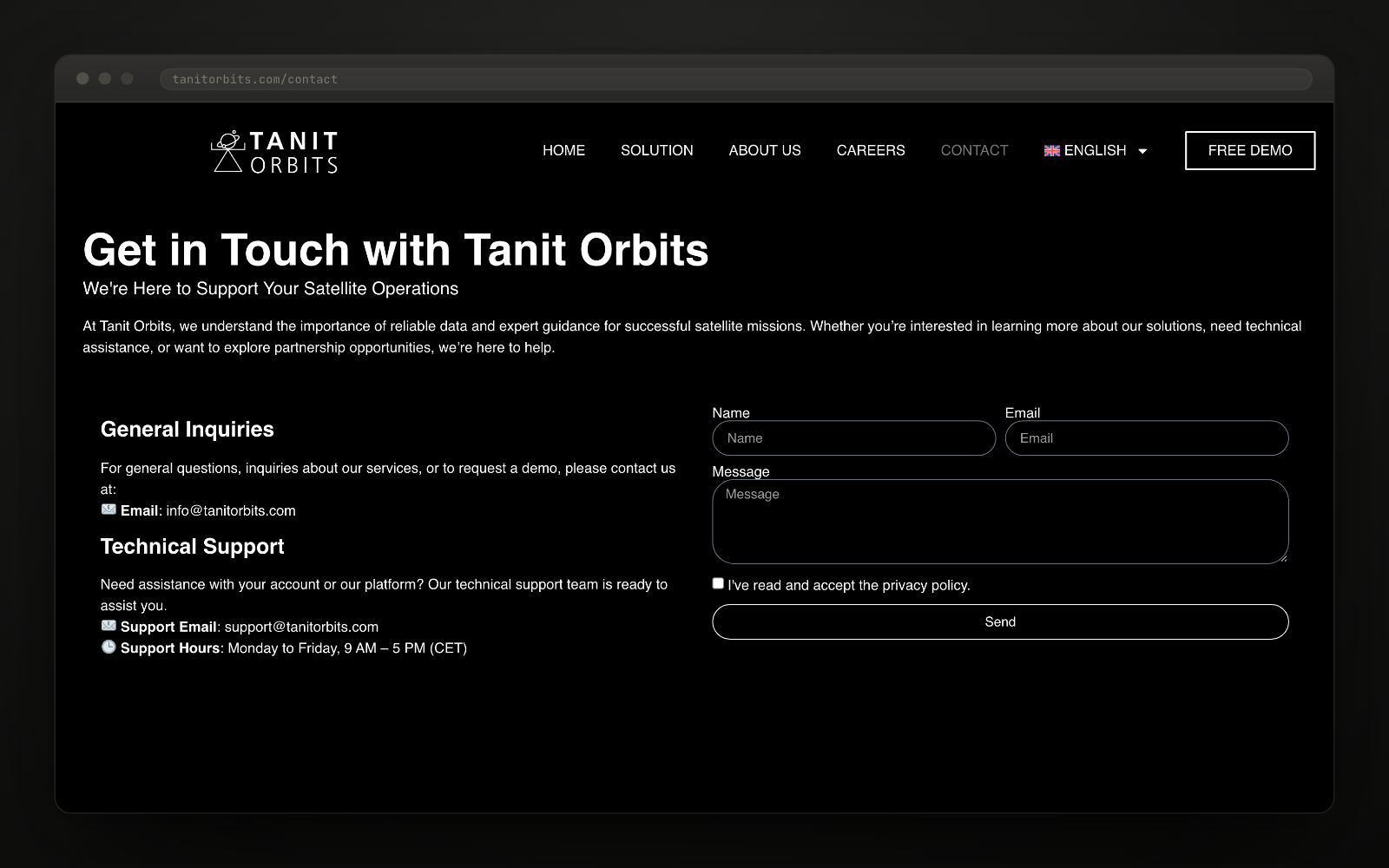
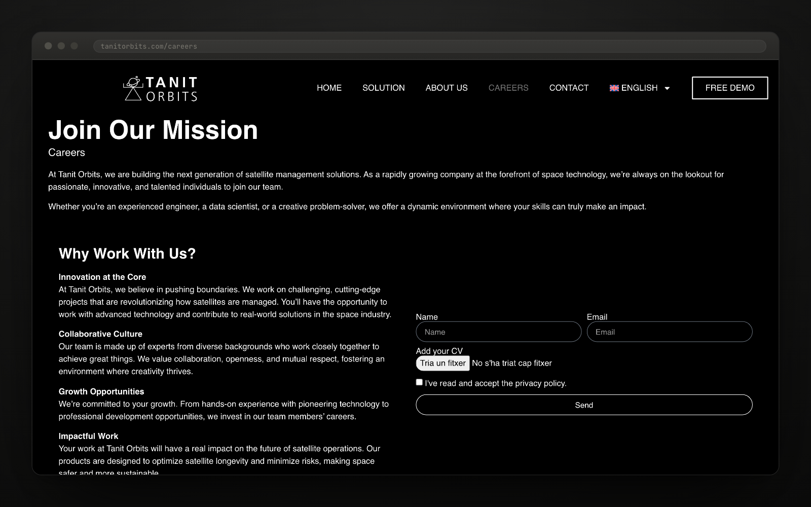
We designed a clean, professional website, in English and Spanish, with the free demo visible from the first second. Solution, team, careers and contact: four sections and not one of them filler.
And we wrote for the customer, not for the founder. A satellite operator does not buy technology: it buys less risk and a longer working life. Every sentence on the site starts there.
Talking about satellites does not have to be hieroglyphics. The key was turning the product into a journey — data, orbit, visualisation, manoeuvre, risk, monitoring — and letting the brand supply the ambition while the website supplied the clarity.
The Tanit Orbits product is hard to explain and easy to understand if you tell it in order. First, data: tracking for a satellite arrives from several sources (GNSS, optical measurements). Then the orbit: the algorithms determine it, with its margin of error. Then seeing it: trajectories, close approaches, collision probability. And finally, deciding: planning a manoeuvre knowing what happens next.
That sequence is the architecture of the website. There is no «technology» page with a wall of acronyms: there is a journey. When technical content is arranged like a story, the design only has to stay out of the way.
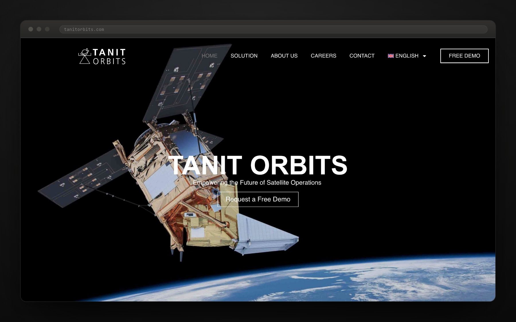
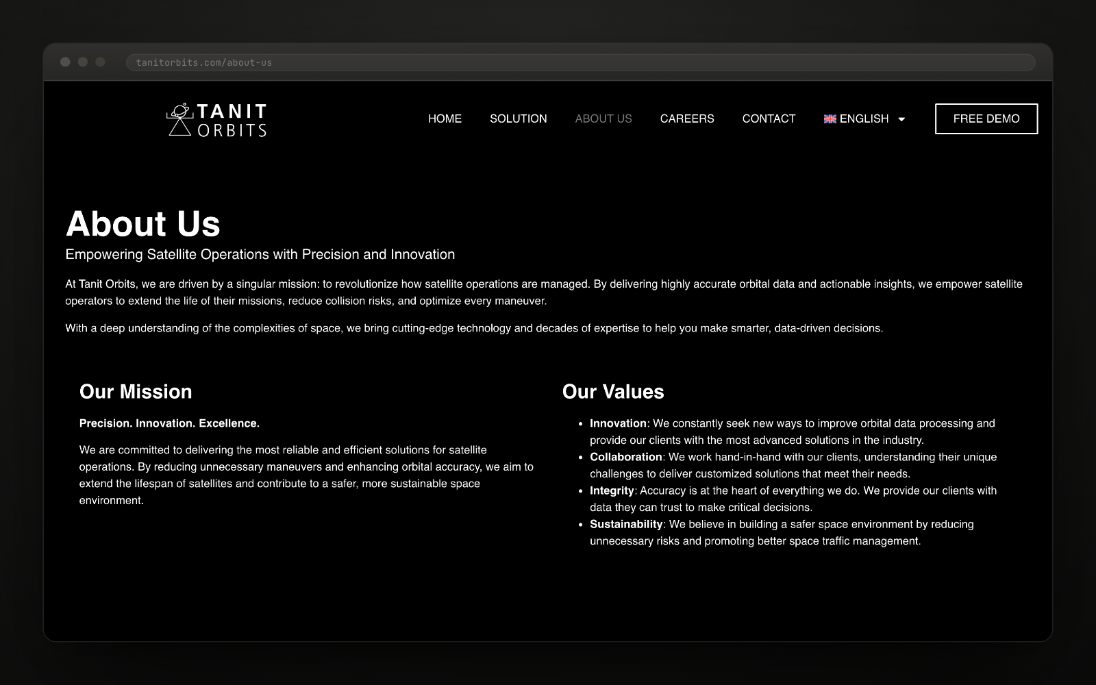
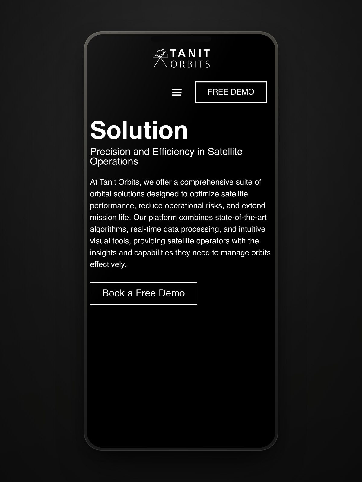
"Orbits, collisions, manoeuvres… and a website that makes it easy."The project team
Want a result like this for your project?
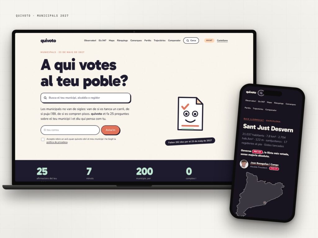
quivoto, the voting compass that starts with your municipality
Municipal elections are not about party labels: they are about what happens on your street.
View case study →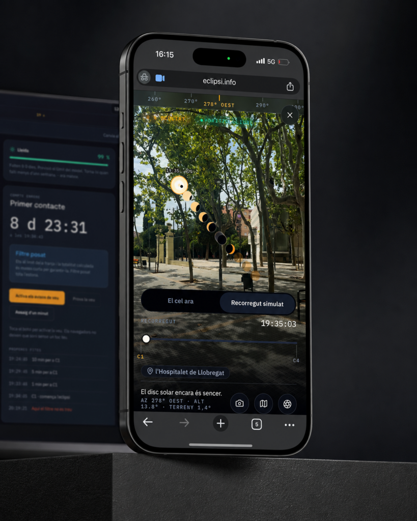
eclipsi.info, the tool that calculates what you’ll see from your exact location
The map tells you where. This tool tells you what you'll see.
View case study →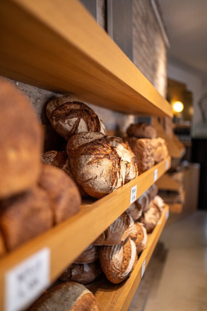
Modèlic, a sourdough bakery with its own voice on social
Real bread. And a feed that smells just as good.
View case study →