Qi Gong Barcelona, an ancient tradition with the prices on show
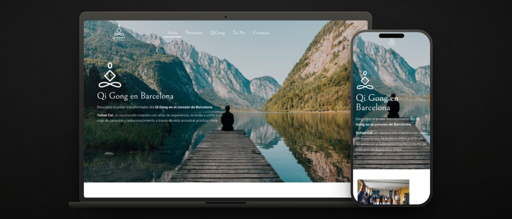 qigong.barcelona · 5 pages · 7 published prices
 Cai Yutian started in the martial arts at eight years old, in Beijing, with master Zhao QuanFu. He now teaches Qi Gong in Barcelona and practises Tui Na, the therapeutic massage of traditional Chinese medicine, at a clinic in the Congrés neighbourhood. One teacher, one practice and no structure behind it.
The brief was his first website. Not a catalogue and not a shop: the page that convinces someone who has heard of Qi Gong and is not sure it is for them, explaining what it is, who teaches it and what it costs, and ending in an email or a phone call.
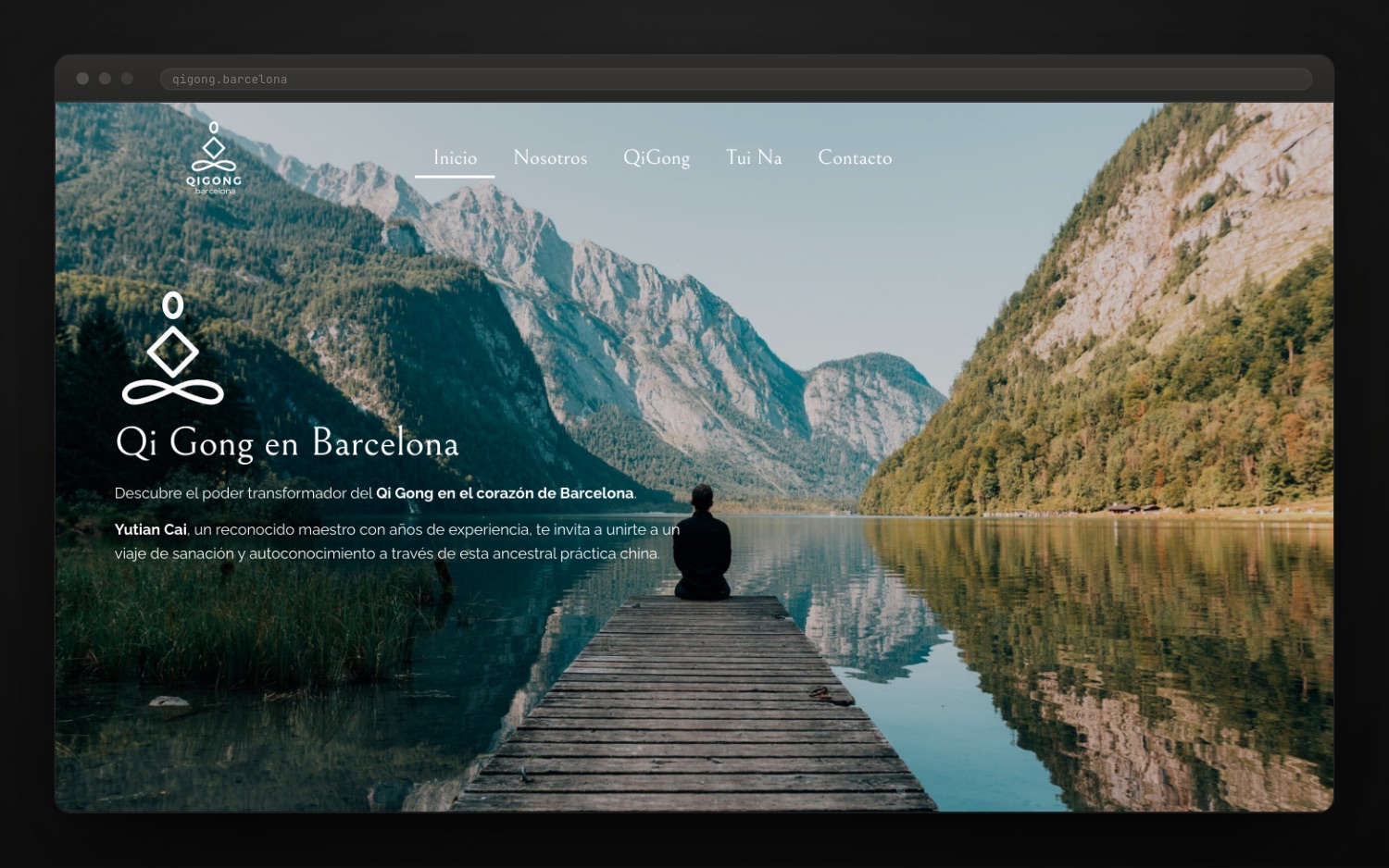
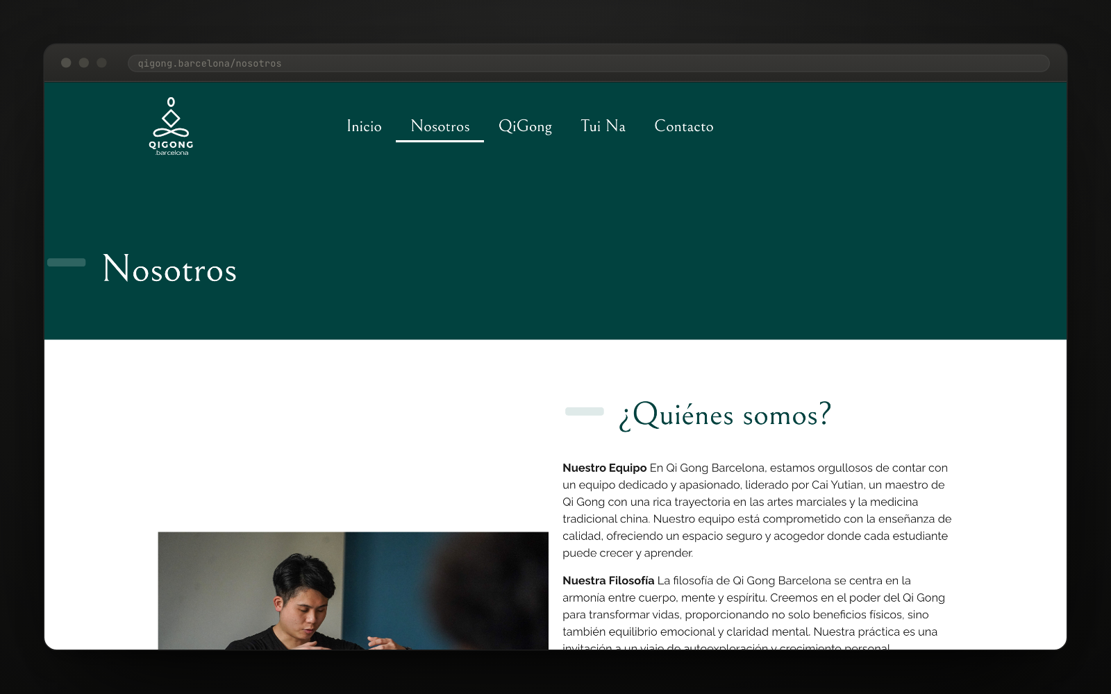
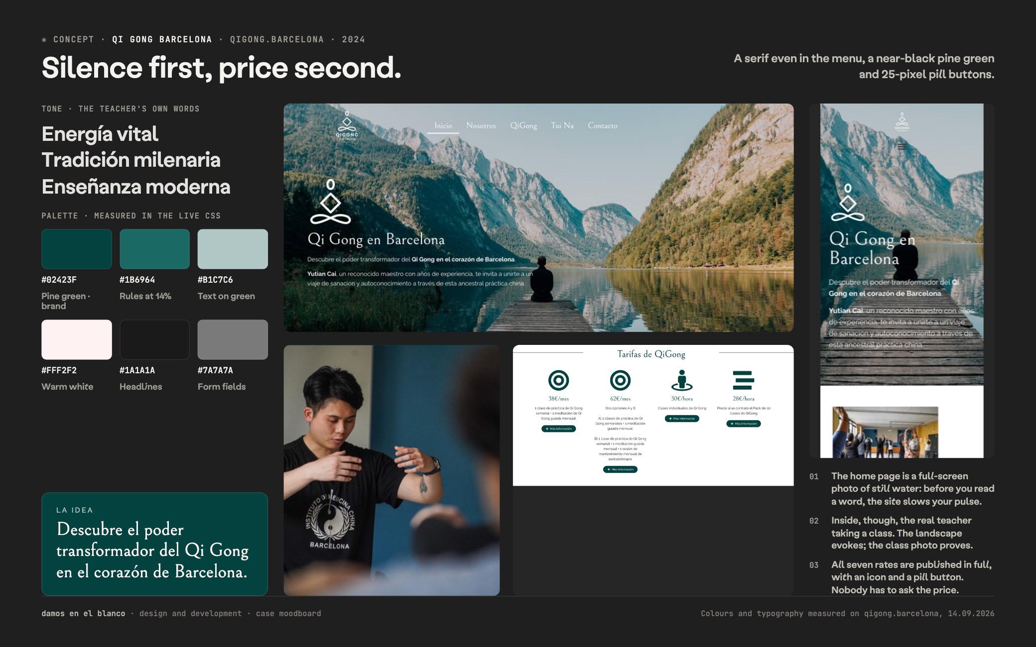
We started with the silence. Still water full screen, a pine green that is almost black as the only brand colour, and a serif even in the menu — something almost nobody does. Before saying anything, the site had to sound like what it sells: calm, and in no hurry.
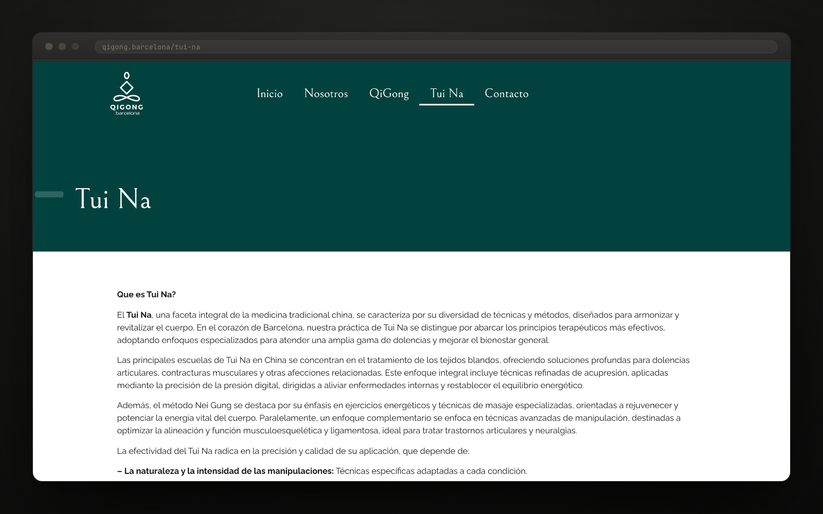
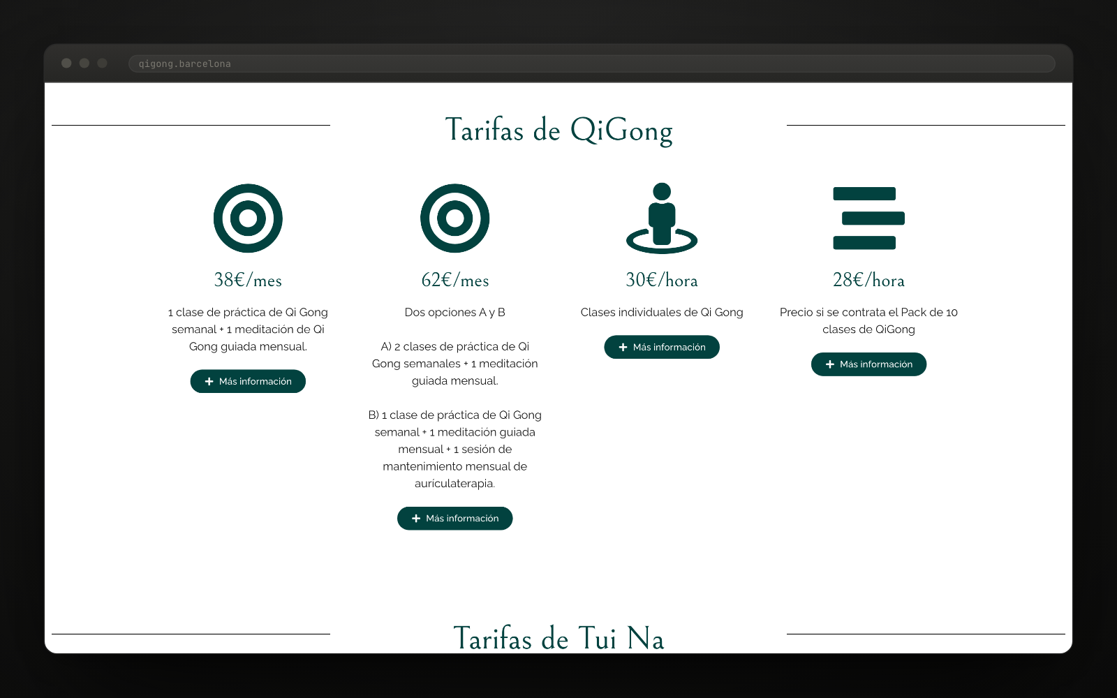
We put the seven prices on the site. Four for Qi Gong and three for Tui Na, with what each one includes: weekly classes, a monthly guided meditation, one-to-one sessions and packs of five and of ten. Someone teaching on their own cannot afford for the price to be an awkward conversation over email.
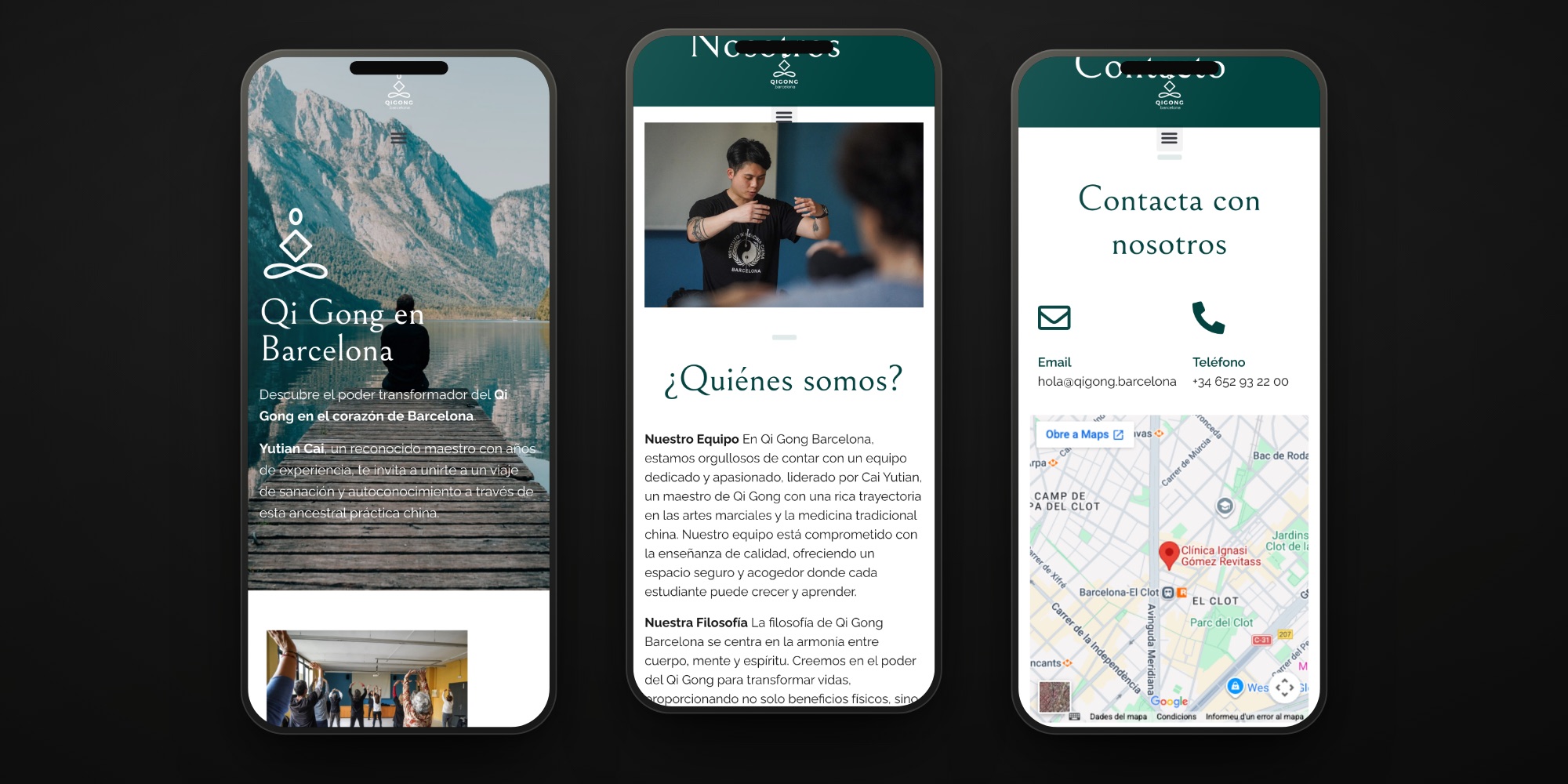
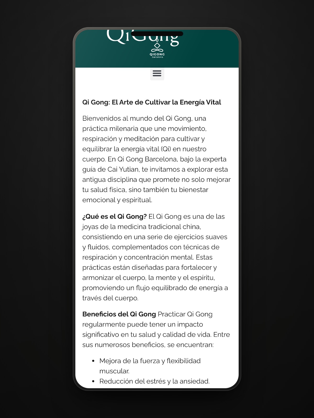
We told the person, not the method. The portrait of the master, his story from Beijing and the real photographs of classes — correcting a student, a group in a community centre — do the work that no text about vital energy can do. That is where the site becomes credible.
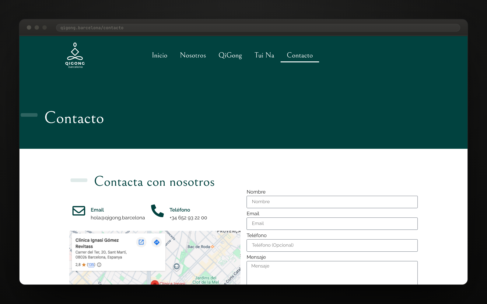
Design, website and development from scratch. WordPress with our own child theme, Bellefair and Raleway self-hosted on the server instead of served from outside, and five pages: home, about, QiGong, Tui Na and contact, the last of these with a form and a map. The first four went up on 20 February 2024; Tui Na arrived in April, when the service started.
Publishing the prices was the design decision, not a technical detail. In a sector where almost nobody shows them, putting the seven prices — packs included — up before anyone asks is what separates a teacher from a mystery. Everything else is built so that this moment does not jar: air, a single colour and no sales pitch.
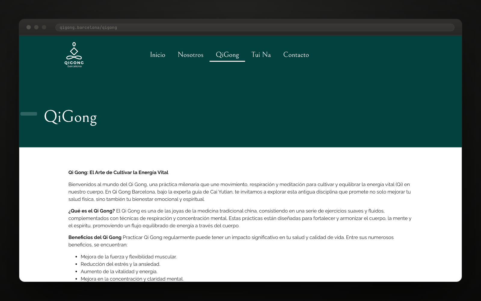
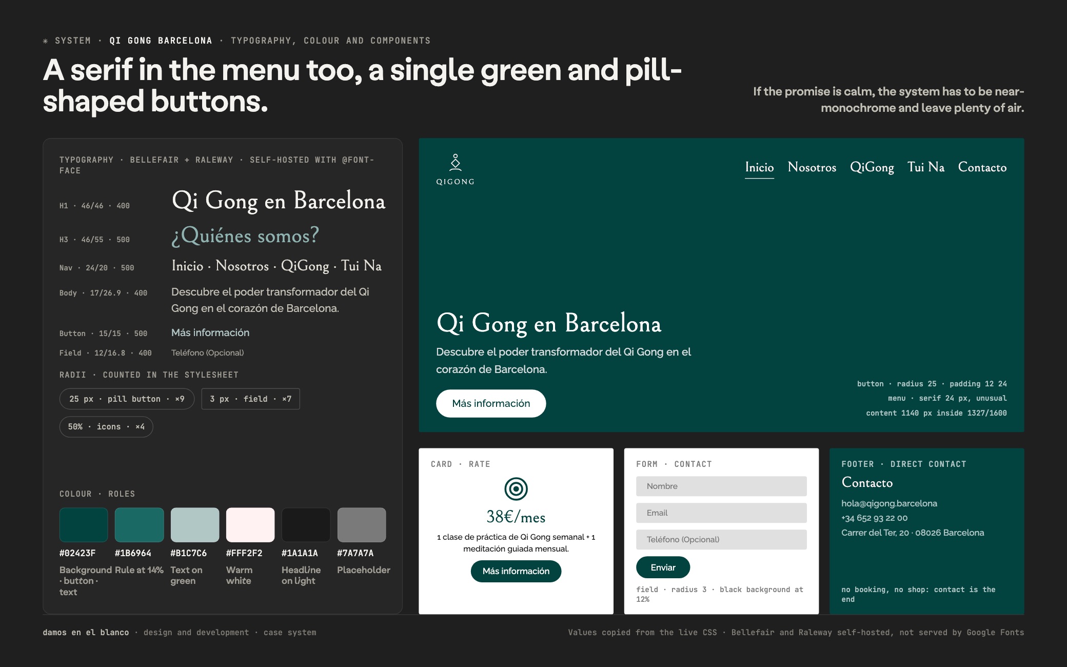
The type pairing is Bellefair, a high-contrast serif, for everything you look at, and Raleway for everything you read. Both are self-hosted with @font-face rather than loaded from Google Fonts: that is a technical decision, not the page builder’s default, and it shows in the site not depending on a third party to paint its own headline. The odd detail in the system is the menu, set at 24 px in the serif; body text runs in Raleway at 17/26.9.
There is exactly one colour: the pine green #02423F, with forty-two uses as text and ten as background. It is joined by a green rule at 14% opacity, a greyish green for text over dark backgrounds and a warm off-white. The buttons are full pills, 25 px radius, and the form fields almost square, 3 px: that contrast is the only expressive gesture in the whole site.
There is not much machinery underneath, and that is right. WordPress with our own child theme, content at 1,140 px with plenty of vertical air, a contact form with a privacy consent box and an embedded map with the address of the clinic. No online booking, no shop and no members’ area: five pages the client can maintain and that do not break on their own.
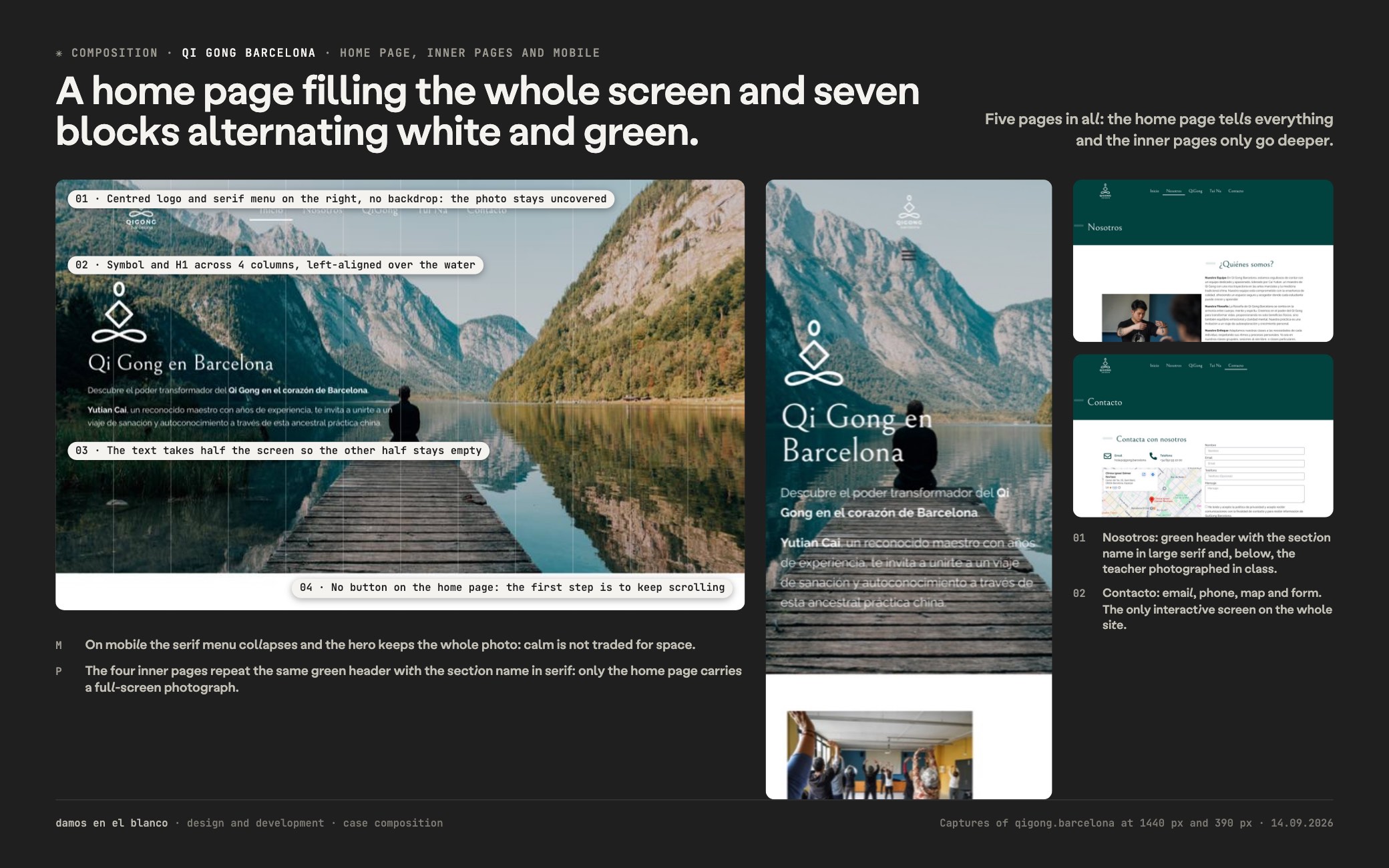
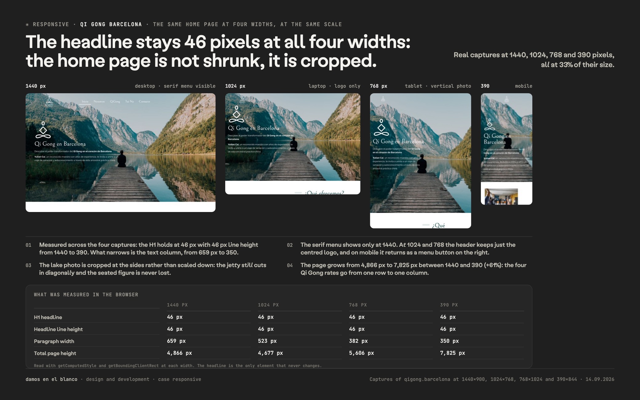
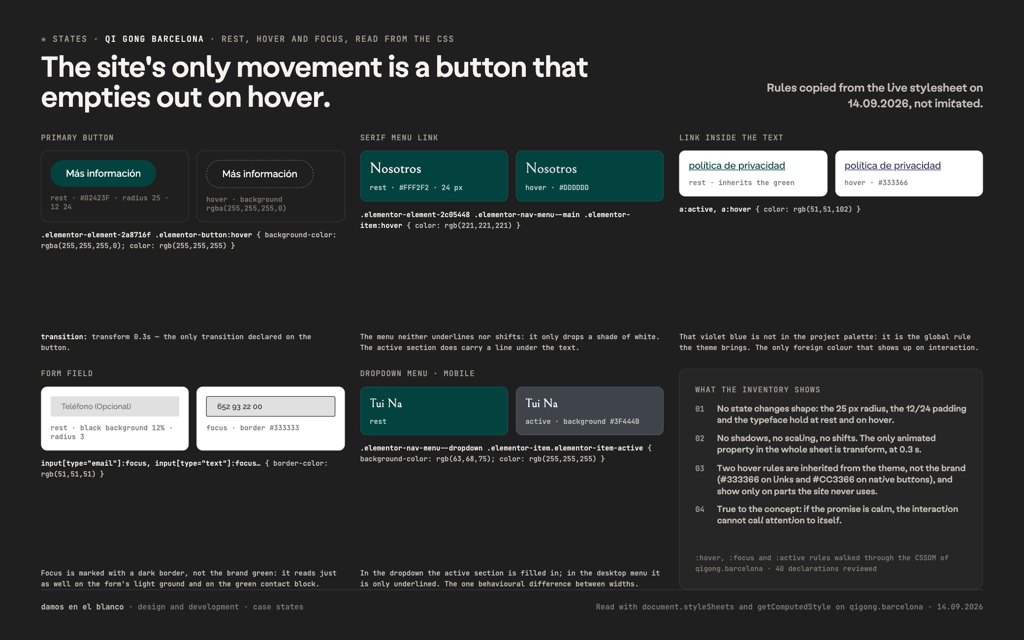
"Tradición Milenaria, Enseñanza Moderna"qigong.barcelona
Want a result like this for your project?
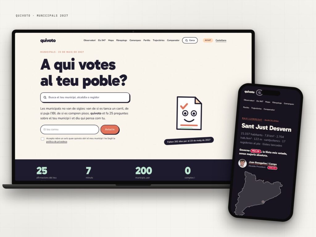
quivoto, the voting compass that starts with your municipality
Municipal elections are not about party labels: they are about what happens on your street.
View case study →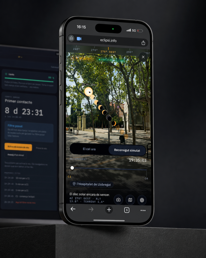
eclipsi.info, the tool that calculates what you’ll see from your exact location
The map tells you where. This tool tells you what you'll see.
View case study →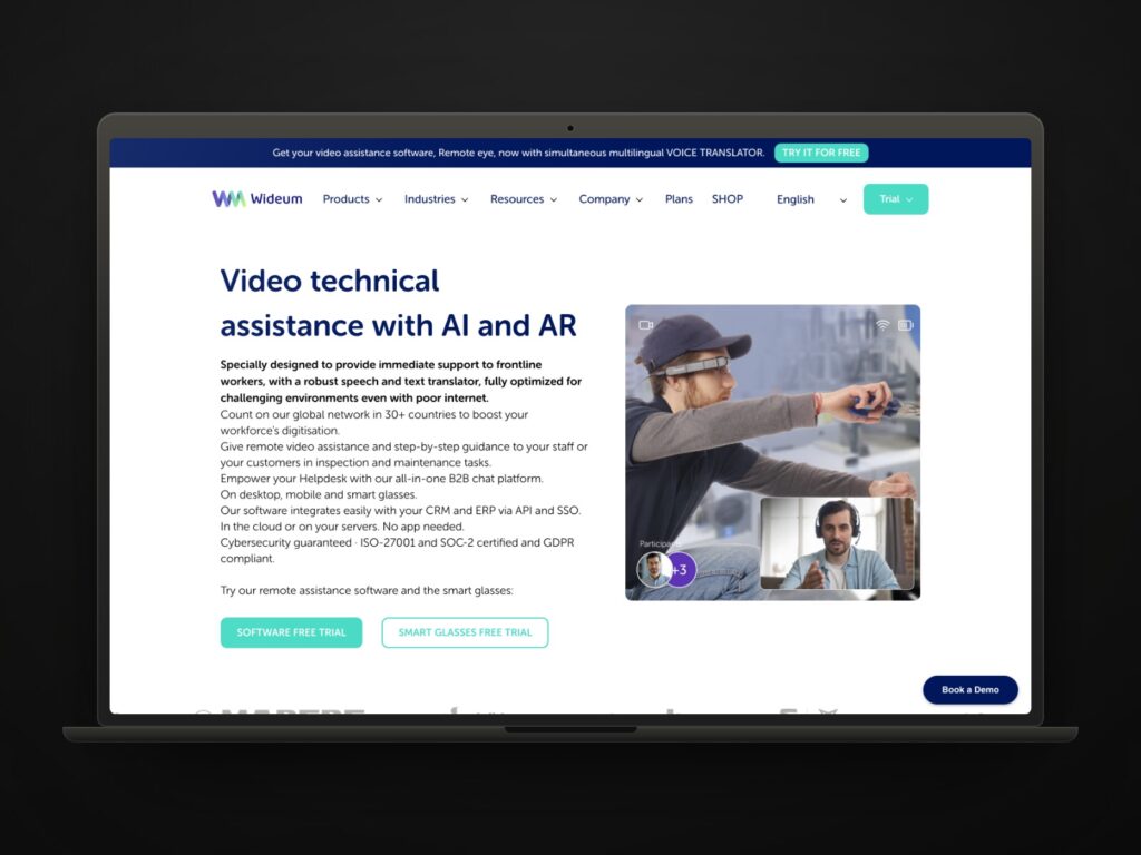
Wideum, a new website and digital strategy for a tech scale-up
Hard technology, easy website. That was the whole job.
View case study →