Poni Club Catalunya
Four schools. A way into each.
The brief
Centre d’Equitació Poni Club Catalunya sits in the Vall de Sant Just, inside the Collserola park, ten minutes from Barcelona. It was founded in 1988 and was the first pony club in Catalonia: in 1990 it ran the first Pony Championship with more than ninety riders, and in 1998 it opened the Petita Escola for children aged three to six. Today it has more than a hundred ponies and horses and a team of eighteen professionals.
The problem was not telling all that. Four schools share the same yard — the Petita Escola, the riding school, the competition school and the tourist trails — and whoever arrives is not looking for “a riding centre”: they are looking for their own thing, and they want to know in five seconds whether there is a place for them.
What we did
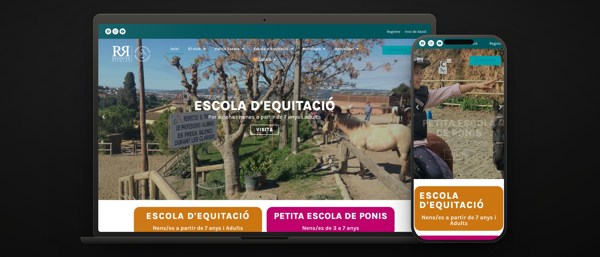
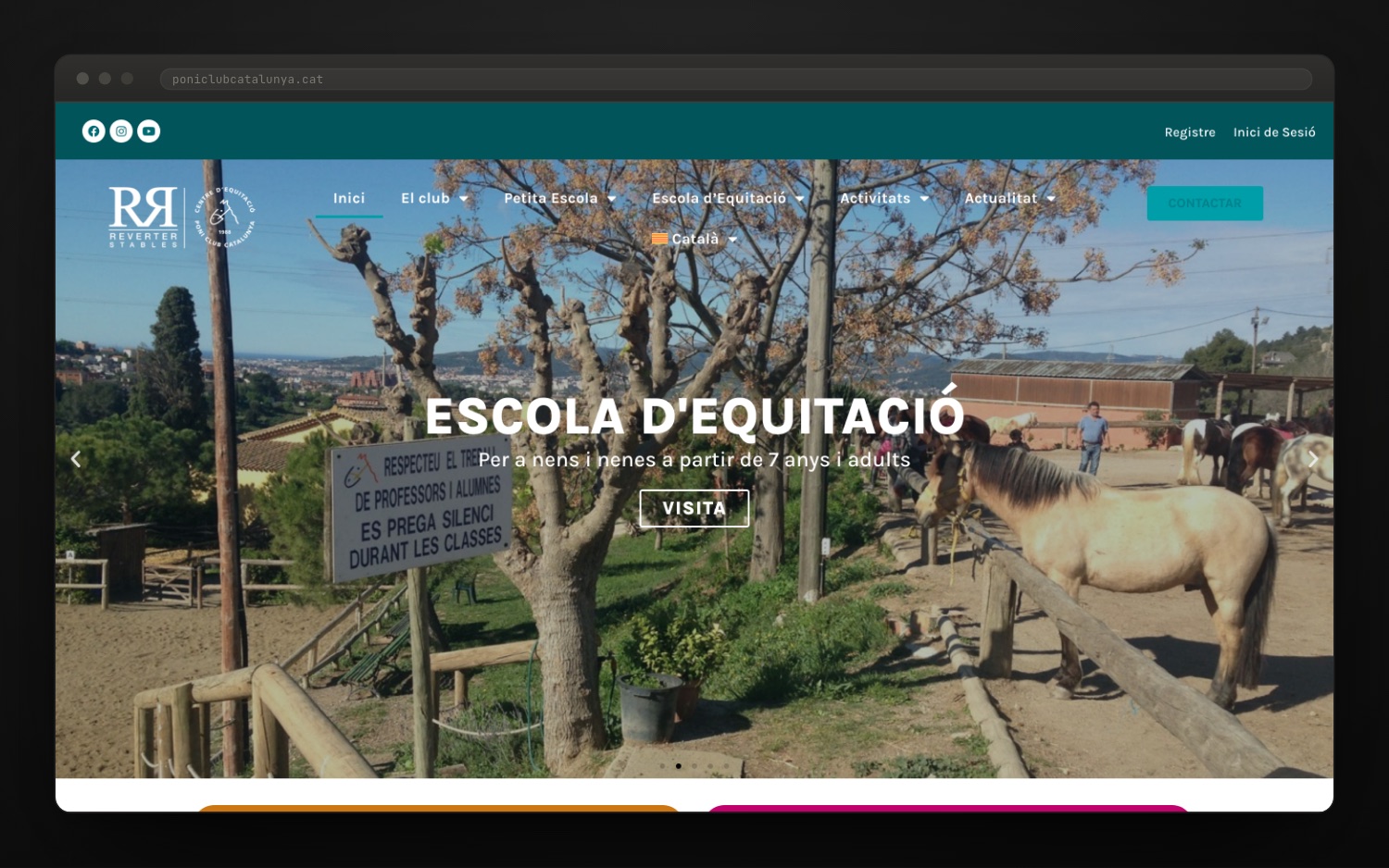
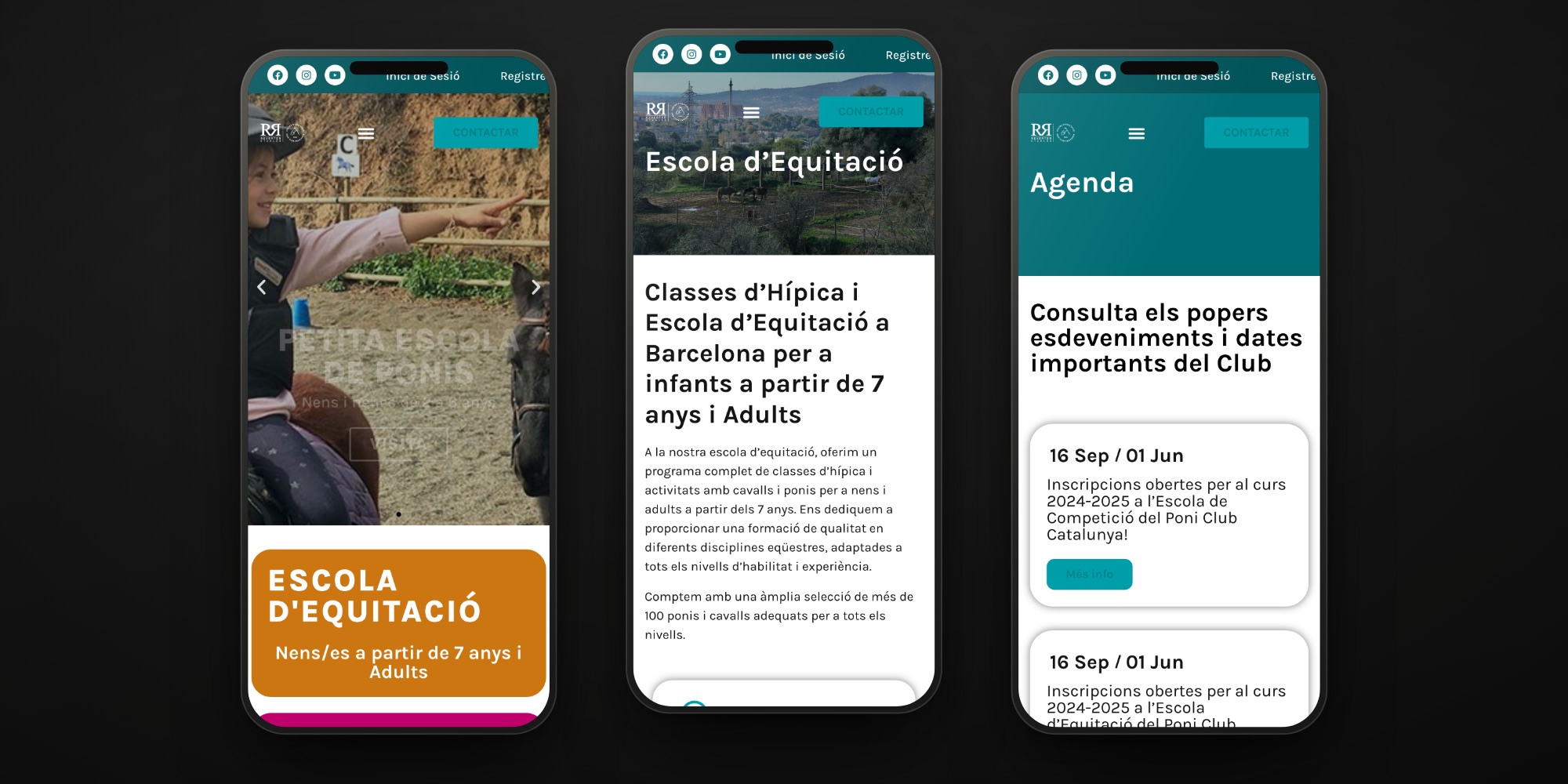
The home page does not explain the club: it divides it up. Four full-width coloured doors, each with its name and, right underneath, the age it is meant for. Orange for the Escola d’Equitació, magenta for the Petita Escola, black for competition and turquoise for the horse trails. Whoever arrives recognises themselves before reading.
We kept the institutional turquoise for the club itself. It is the colour of the top bar, the diary and the notices: the corridor, never a classroom. That way each school can have a colour of its own without the whole thing turning into a funfair.
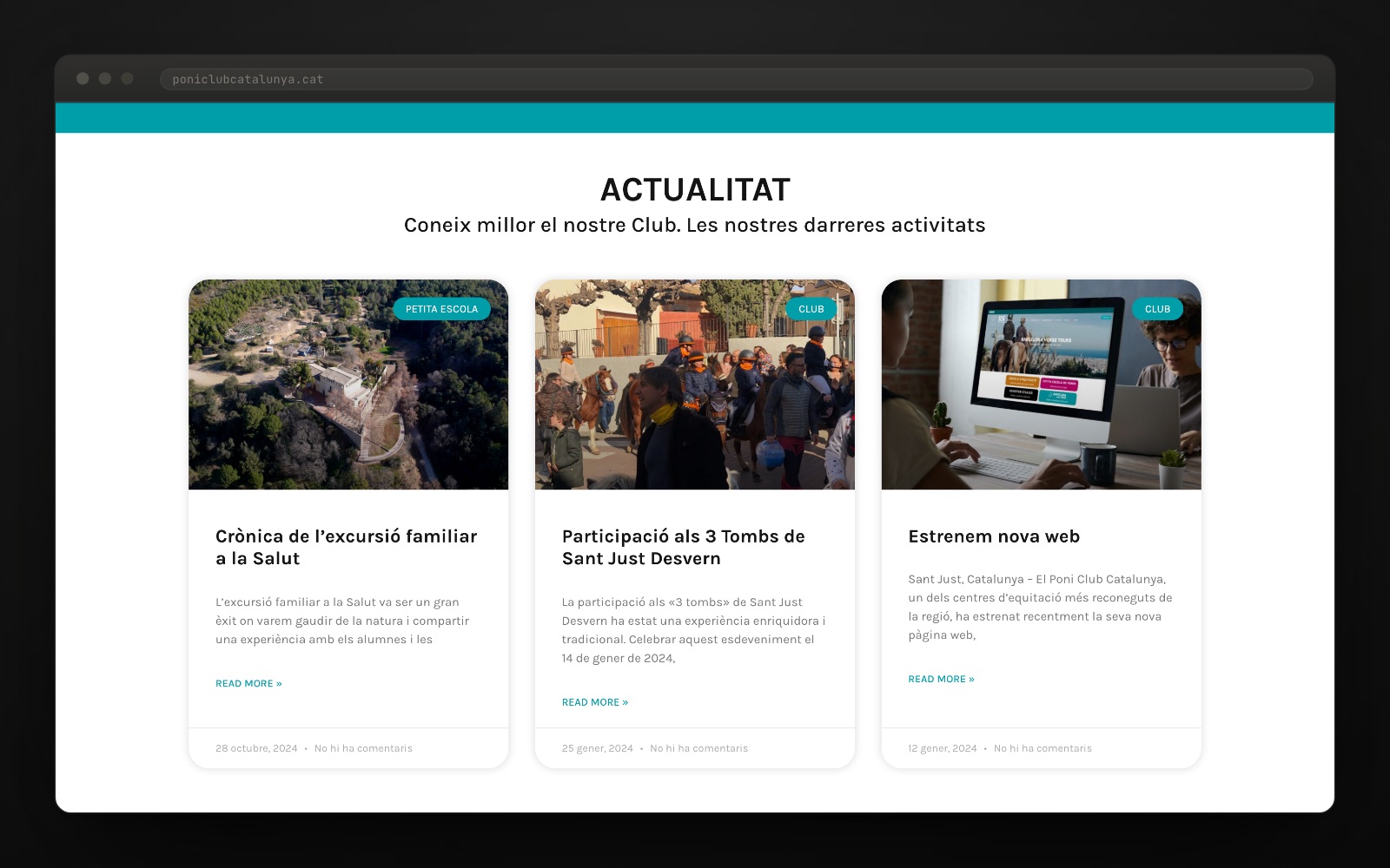
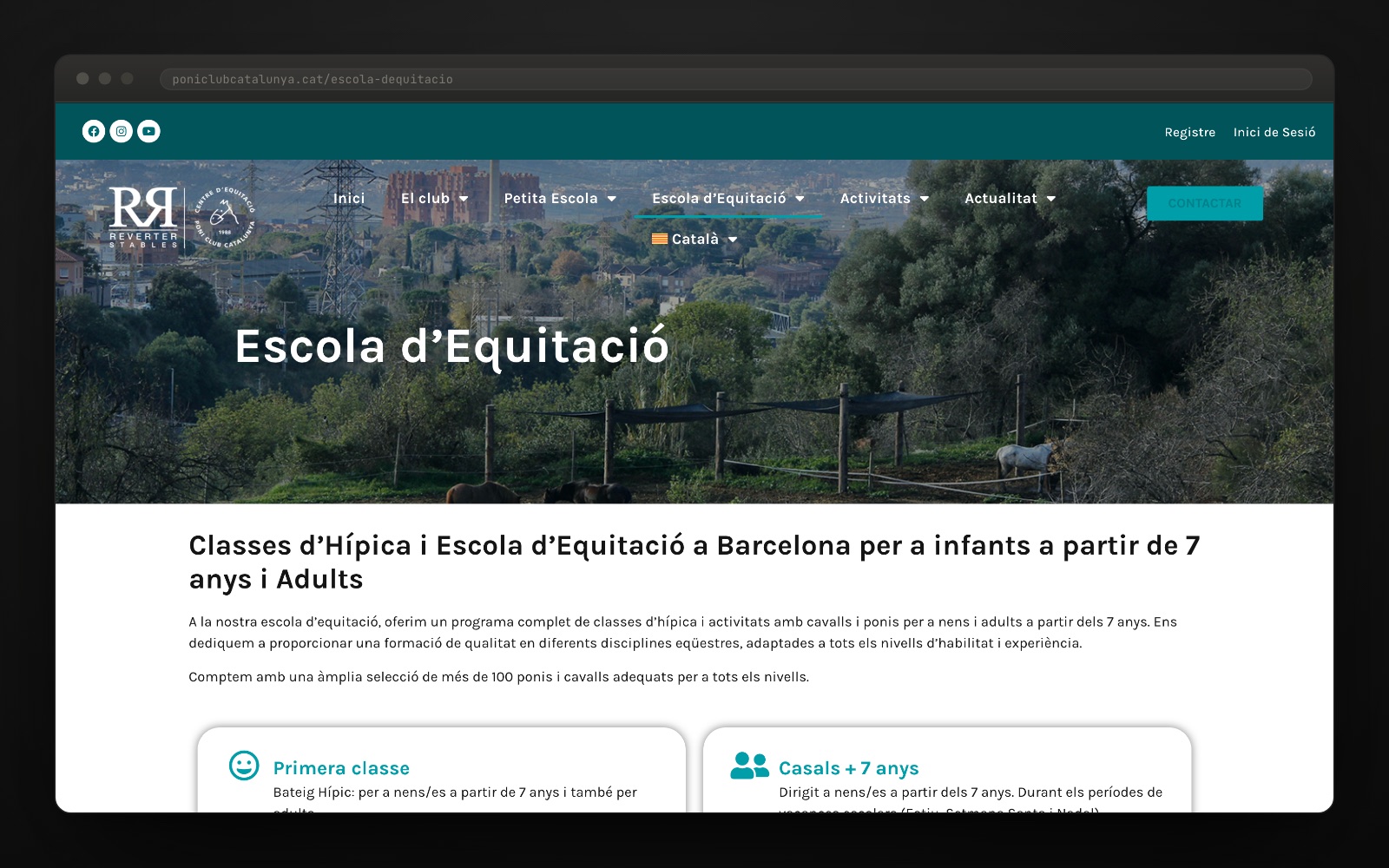
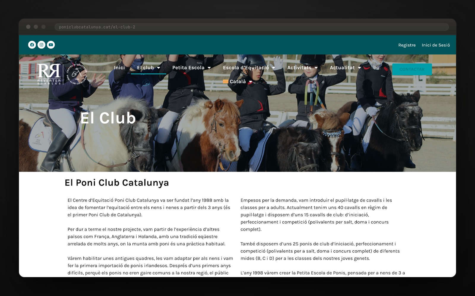
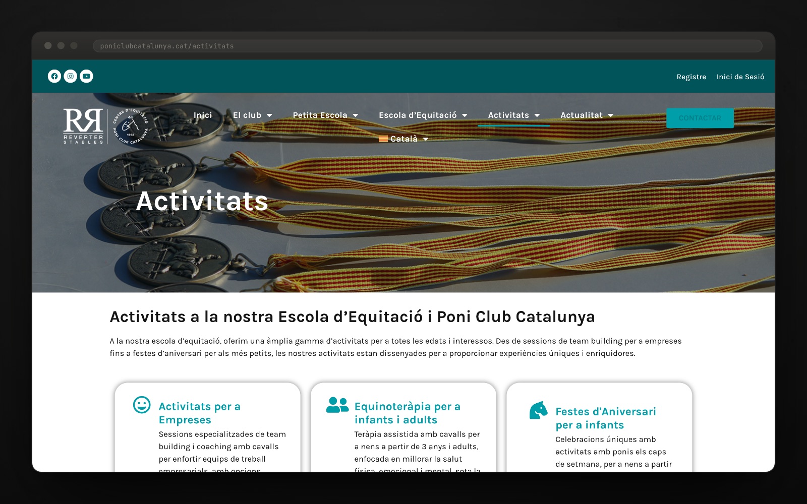
We ordered 68 pages into five branches. El club, Petita Escola, Escola d’Equitació, Activitats and Actualitat, with three menu levels and the same pages in Catalan and in Spanish. The activities that are not lessons — companies, equine therapy, birthdays, school visits — stop hiding inside a dropdown.
We built the whole site and it launched in January 2024. Design, development and programming from scratch on WordPress, with a dated diary, news tagged by school, an Instagram wall, reviews and booking linked to the centre’s own calendar. We also moved the site from the .com domain to the .cat, with a permanent redirect.
Colour helps you find your place.
In a club with history, the temptation is to tell the history. Here the decision was to start at the end: four doors with an age under each one. 1988, the championships and the eighteen qualified professionals are all still there — they are what earns trust — but one screen further down, once you already know which door is yours.
Poni Club Catalunya · information architecture
One place. Four reasons to visit.
The website’s first decision is to recognise who is arriving. Colour identifies the activity; each school’s information follows from there.
-
Learn to ride
Escola d’Equitació
Classes, levels and a first session.
-
Start young
Petita Escola de Ponis
A first encounter with ponies, classes and activities.
-
Train and compete
Reverter Sport Horses
A dedicated entrance for the competition school.
-
Explore the surroundings
Barcelona Horse Tours
Horse riding routes through Collserola.
A shared identity. A different path for each intention.
Explore the club website ↗An editorial composition of the navigation system. Colours and names taken from the club website, viewed on 24/09/2026.
The project in numbers
How it's built
Underneath there is a WordPress with our own child theme and Elementor Pro, and a type system with a single family: Karla, self-hosted, in four weights. The door headings run at 39 px in weight 900 with 2.5 px of letter-spacing; card titles at 21/700; the menu at 17/700; body text at 16/24. A 1,140 px container, a 64 px top bar and a veil of rgba(0,23,24,.28) over the header photos so the white text always reads.
The corners are the other trait of the system: 25 px radius on the doors and on the inside cards, 10 px on the menu dropdowns and 3 px on the buttons. Colour here is not decoration: it is classification. #CC7612, #C0016C, black and #009EA9 identify each school and then come back in the section headers, in the news tags and in the icons.
The rest is integration. Catalan and Spanish with hreflang across the 68 pages, booking and customer registration in the riding centre’s own system, course tickets through an external payment gateway, a diary with date ranges, an Instagram wall and Google reviews. And the domain move from the .com to the .cat, solved with a permanent redirect so as not to lose twenty years of links.
How it went
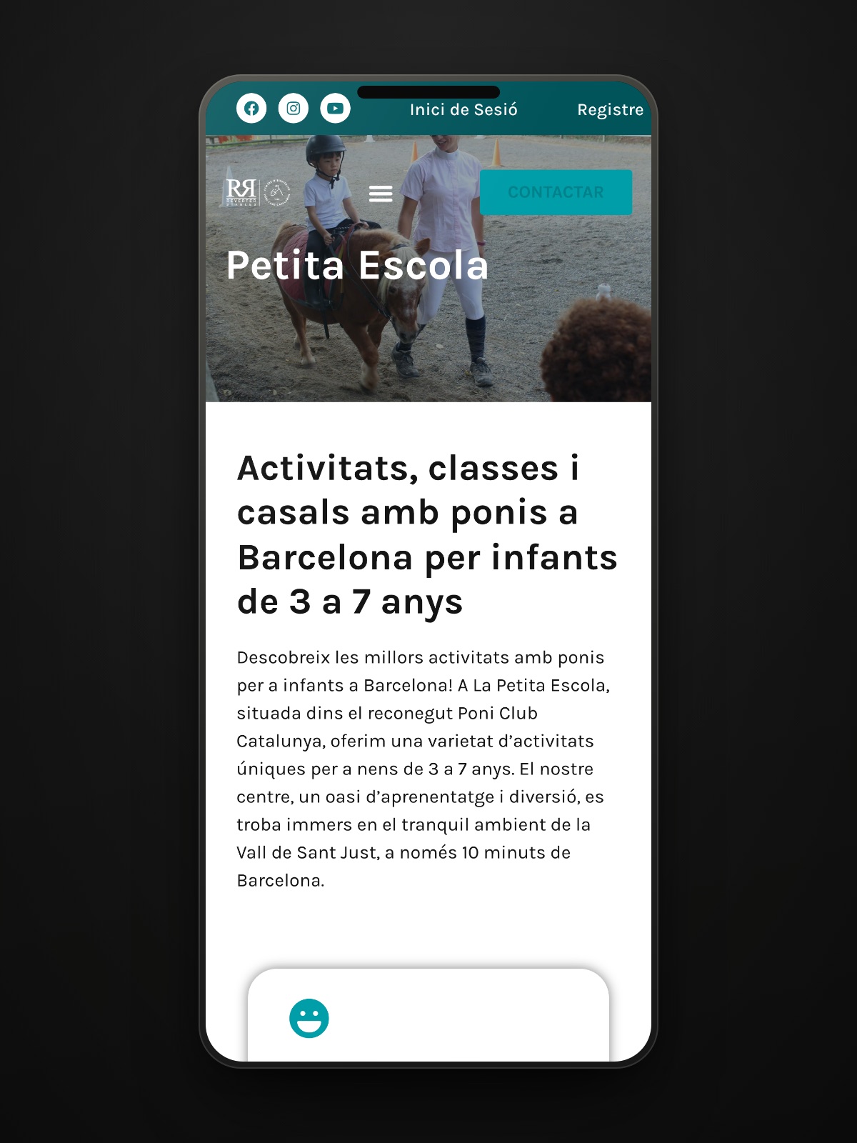
Gallery · the project in pictures (click to enlarge)
The information continues inside.
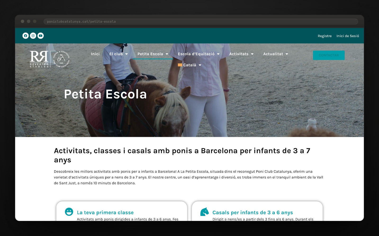
Petita Escola develops its own offer. The club news section shares updates and activities through one editorial structure. Two content levels with different purposes.
More images from the project 6 ↗
"Hem pogut crear un lloc que no només és atractiu visualment, sinó també fàcil d'utilitzar per als nostres membres i visitants."Poni Club Catalunya, «Estrenem nova web» (12.01.2024)
Want a result like this for your project?
More from this sector
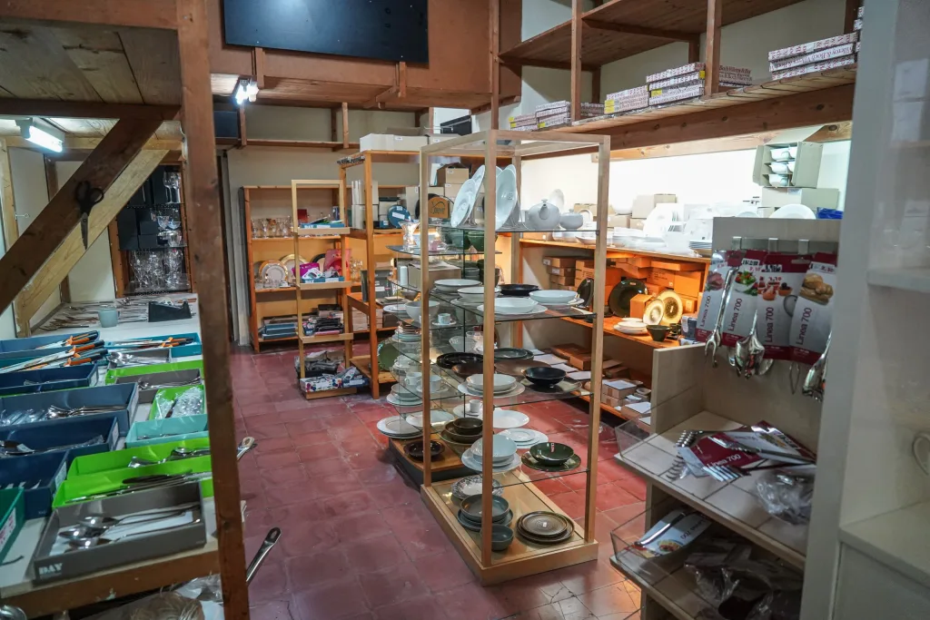
Cristall i Porcellana
A digital catalogue for composing the table piece by piece
View case study →
CIPDI + San José Consultors
An adaptable learning architecture for two professional contexts
View case study →
Viver Isart
A century-old nursery shaped into a living digital experience
View case study →