
Silo, sustainable innovation packaged in a sparkling website
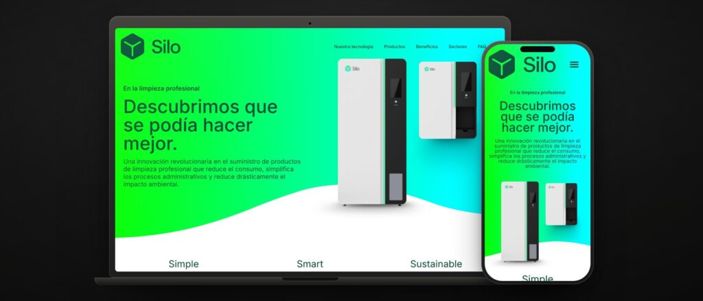 silo.care · simple, smart, sustainable
 Silo set out to do something unglamorous and badly needed: change how offices and professional spaces are cleaned, with cleaning-product dispensing machines that cut consumption, packaging and transport. A startup with a green idea and an appetite for the whole sector.
What it lacked was a website that explained all this without making your head spin, and that convinced companies that cleaning can be green and pay off. Because Silo’s argument is not «we are green»: it is «you pay for what you use».
We defined their digital strategy before drawing anything: who the website talks to (facilities managers, cleaning companies, specific sectors), what each of them doubts and what makes them ask for information.
We turned the system into seven steps. Installing the machines, choosing the products, refilling, monitoring and alerts, billing by actual consumption, reports and restocking. A new system makes sense when you tell it in order, and that sequence is the backbone of the website.
We built a custom website that breathes sustainability and innovation, just like their machines: technology, products, benefits, sectors and frequently asked questions. Three words, simple, smart, sustainable, hold the whole message together.
The website does not just show products: it teaches. It explains to companies why green cleaning pays off, with no sermons and no small print. The environmental argument comes after the financial one, not before it.
When you sell a system nobody has seen before, the website is the demo. The key was telling the whole process, from installing the machine to the consumption report, before talking about sustainability. Anyone who understands how it works is already convinced of why.
Silo does not compete with another cleaning product: it competes with the habit of ordering drums of the stuff. So the website had to teach a model, not show a catalogue. Every section answers a real objection: «what about storage?» (it disappears), «what about ordering?» (the machine orders for you), «what does it cost me?» (what you use, in real time), «does it work for my sector?» (a page per sector).
The result is a website that reads top to bottom like an explanation, with the FAQ as the closer. When the product is a new idea, the best sales page is a good lesson.
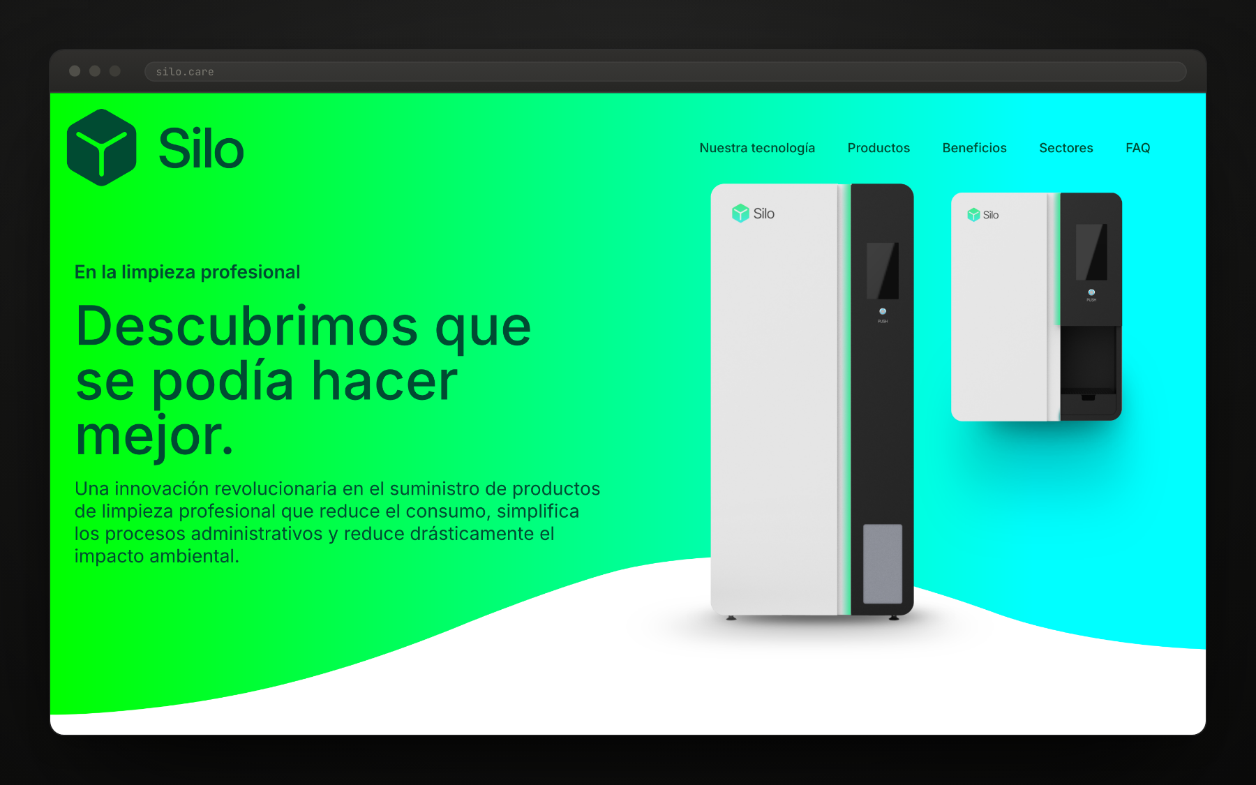
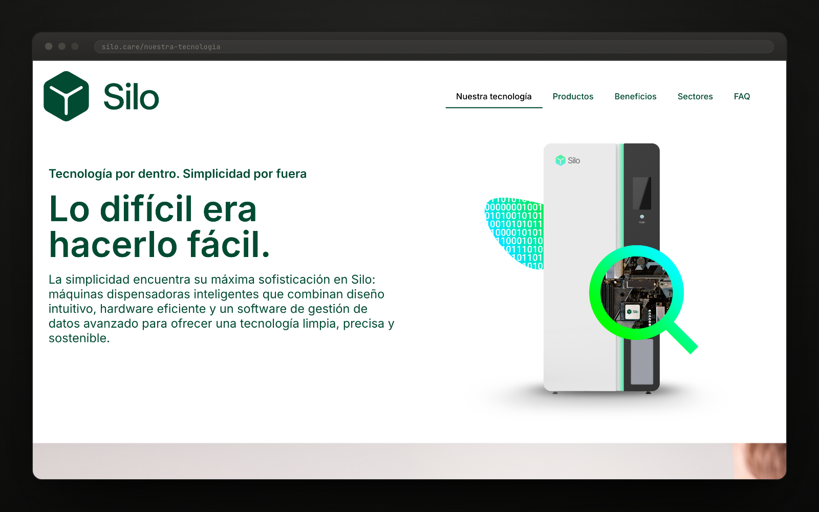
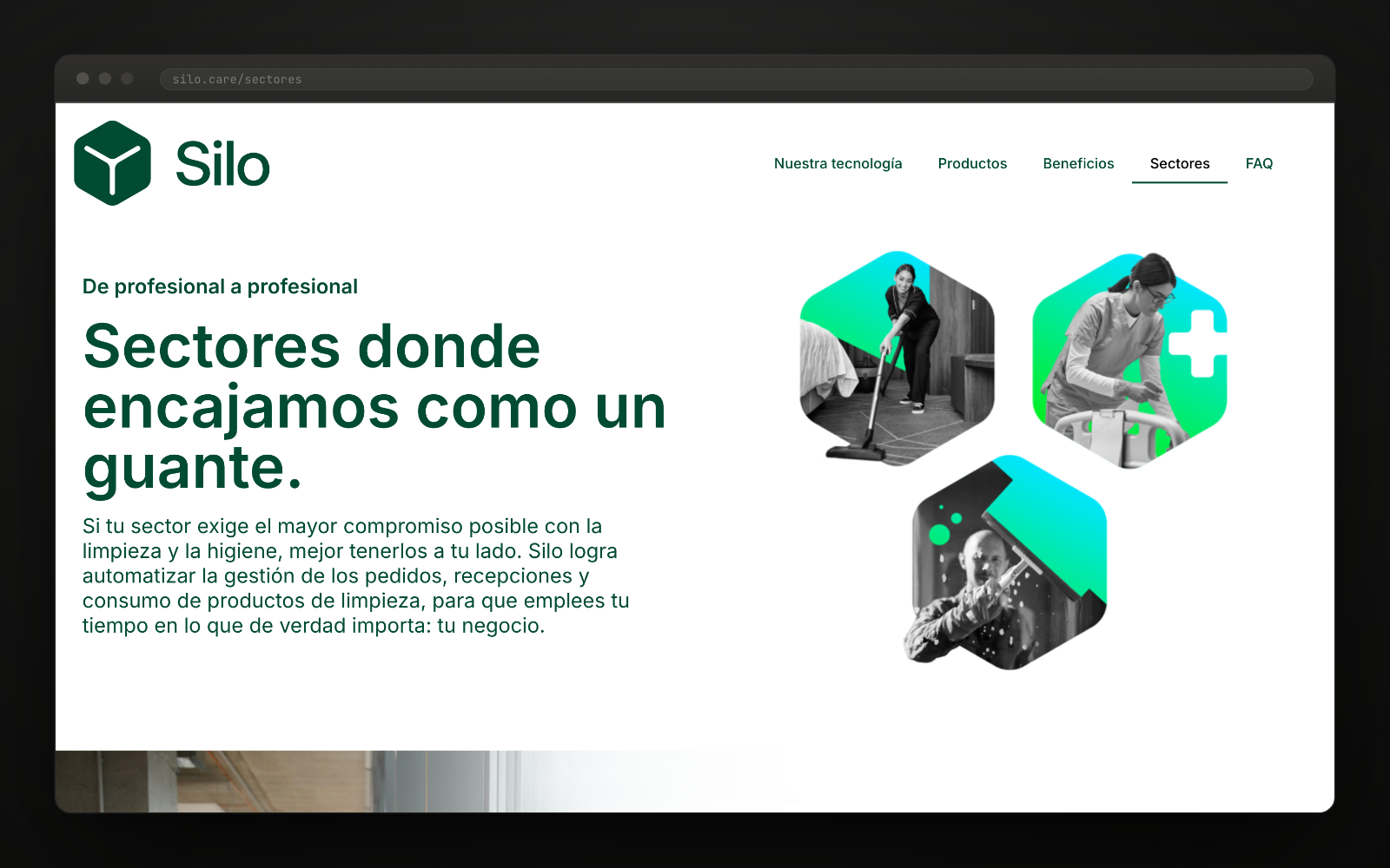
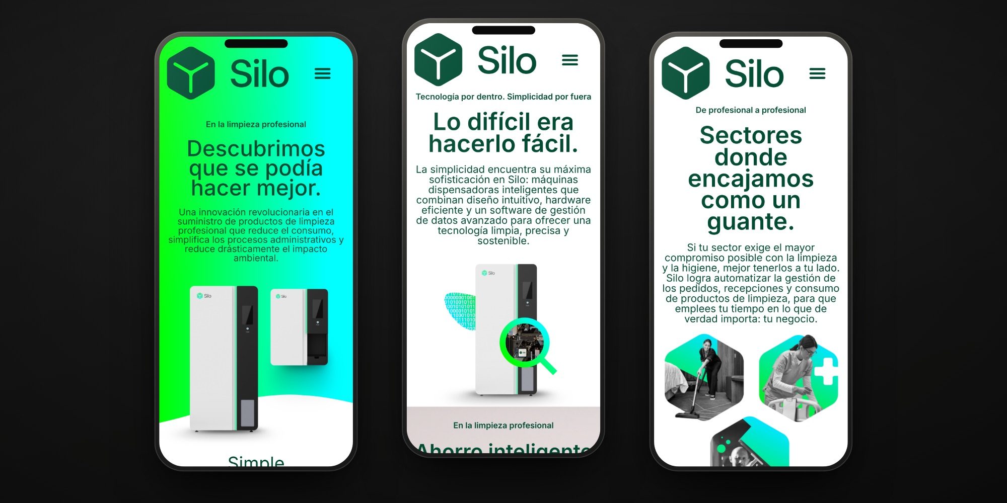
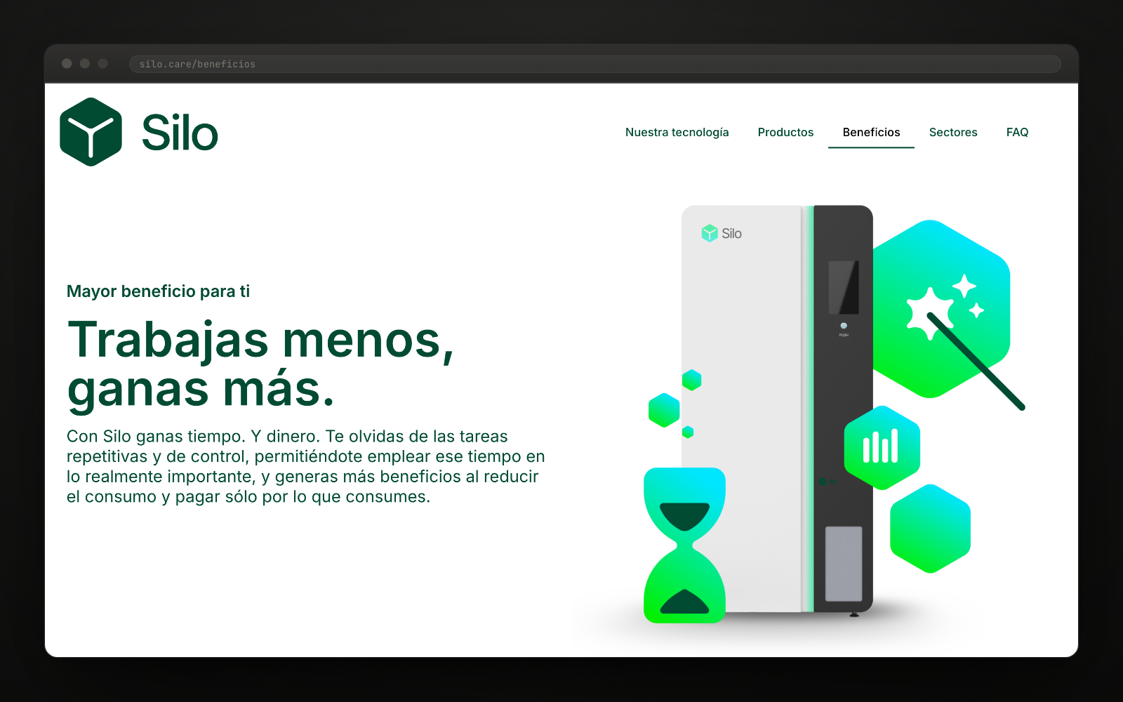
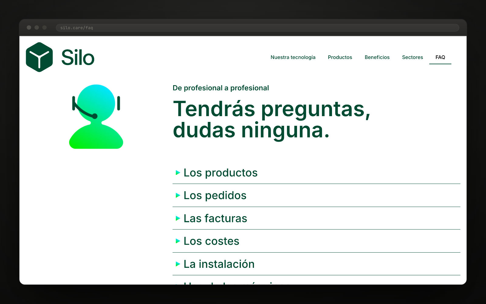
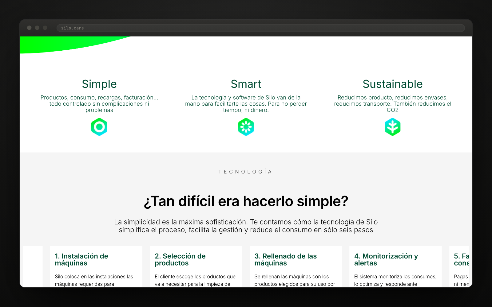
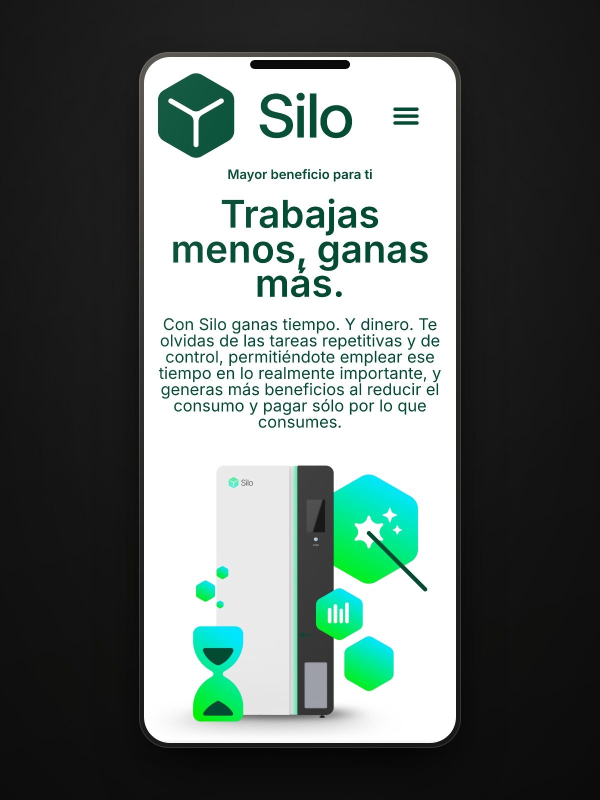
"If Silo cleans your office, we cleaned up their website."The project team
Want a result like this for your project?
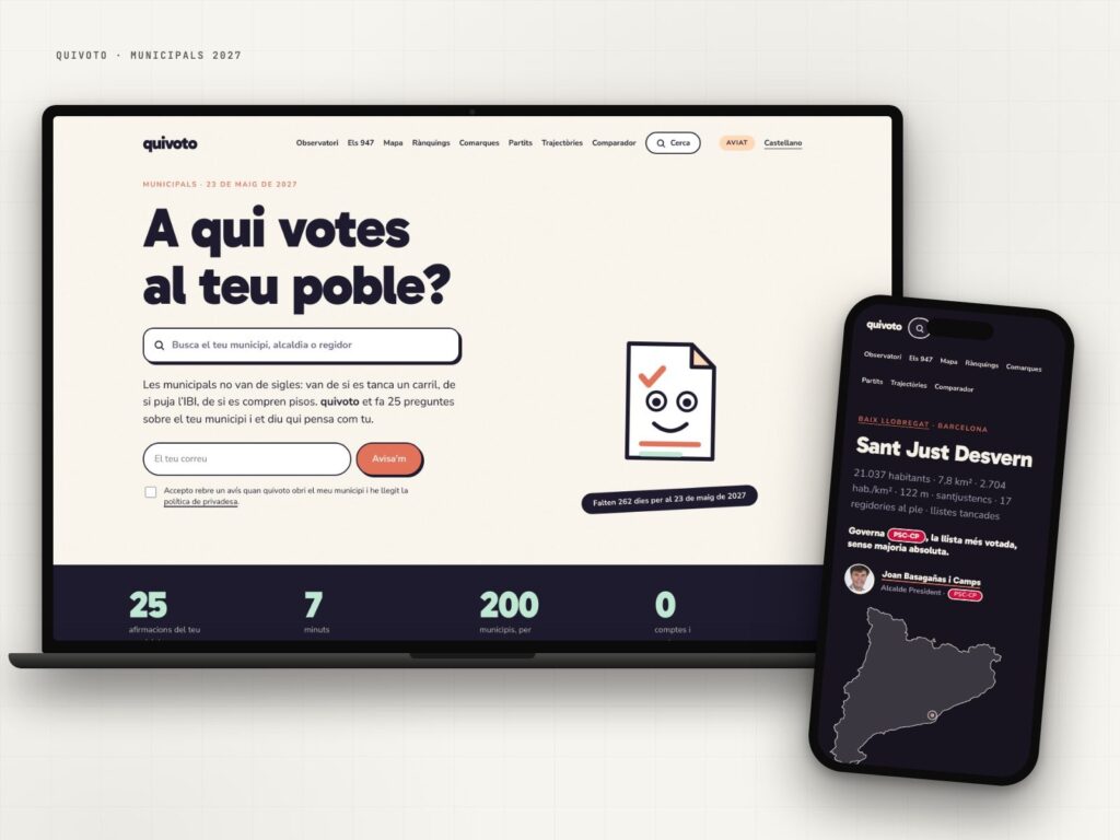
quivoto, the voting compass that starts with your municipality
Municipal elections are not about party labels: they are about what happens on your street.
View case study →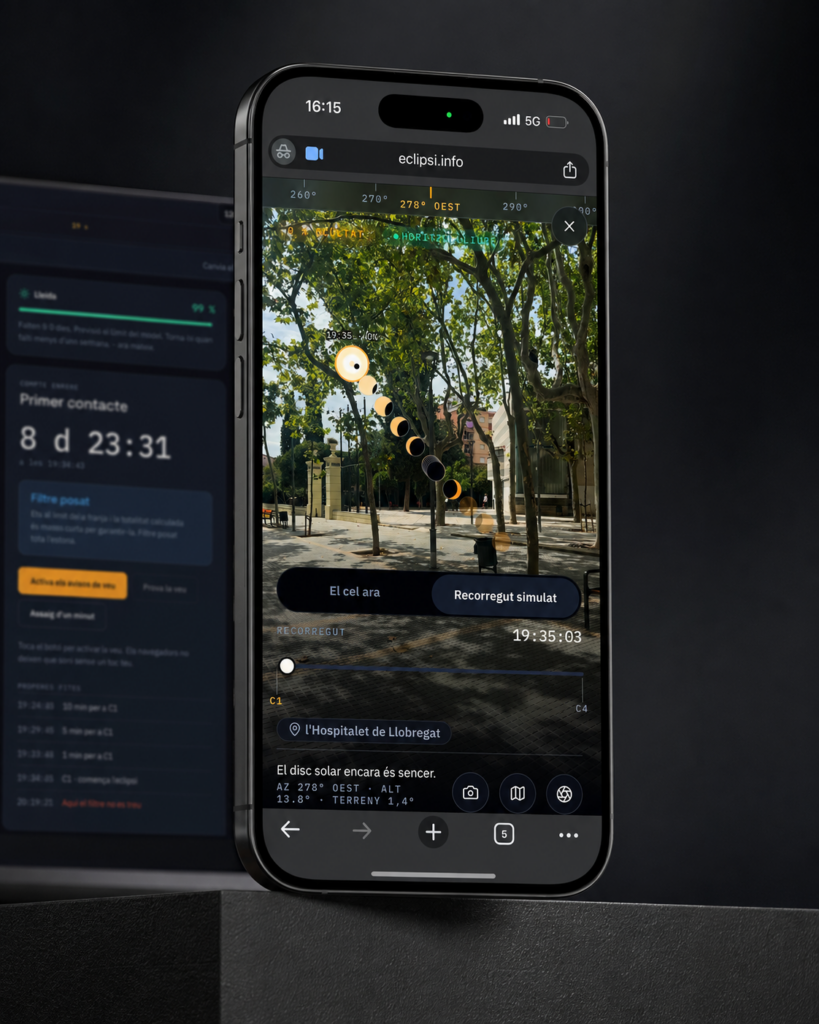
eclipsi.info, the tool that calculates what you’ll see from your exact location
The map tells you where. This tool tells you what you'll see.
View case study →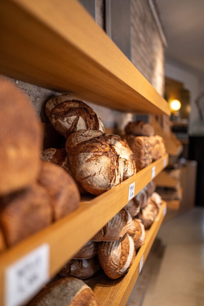
Modèlic, a sourdough bakery with its own voice on social
Real bread. And a feed that smells just as good.
View case study →