
GBS Finance
Trust is built, not improvised.
The brief
GBS Finance is an independent investment bank founded in 1991, present in southern Europe, Latin America and China, with hundreds of M&A deals advised. Prestige and international reach… and a digital image that had fallen behind.
The challenge: a website that spoke the language of that level — sophistication, solidity and excellence — without touching the corporate identity that already worked. No new logo, no new colour: just a website that measures up.
What we did
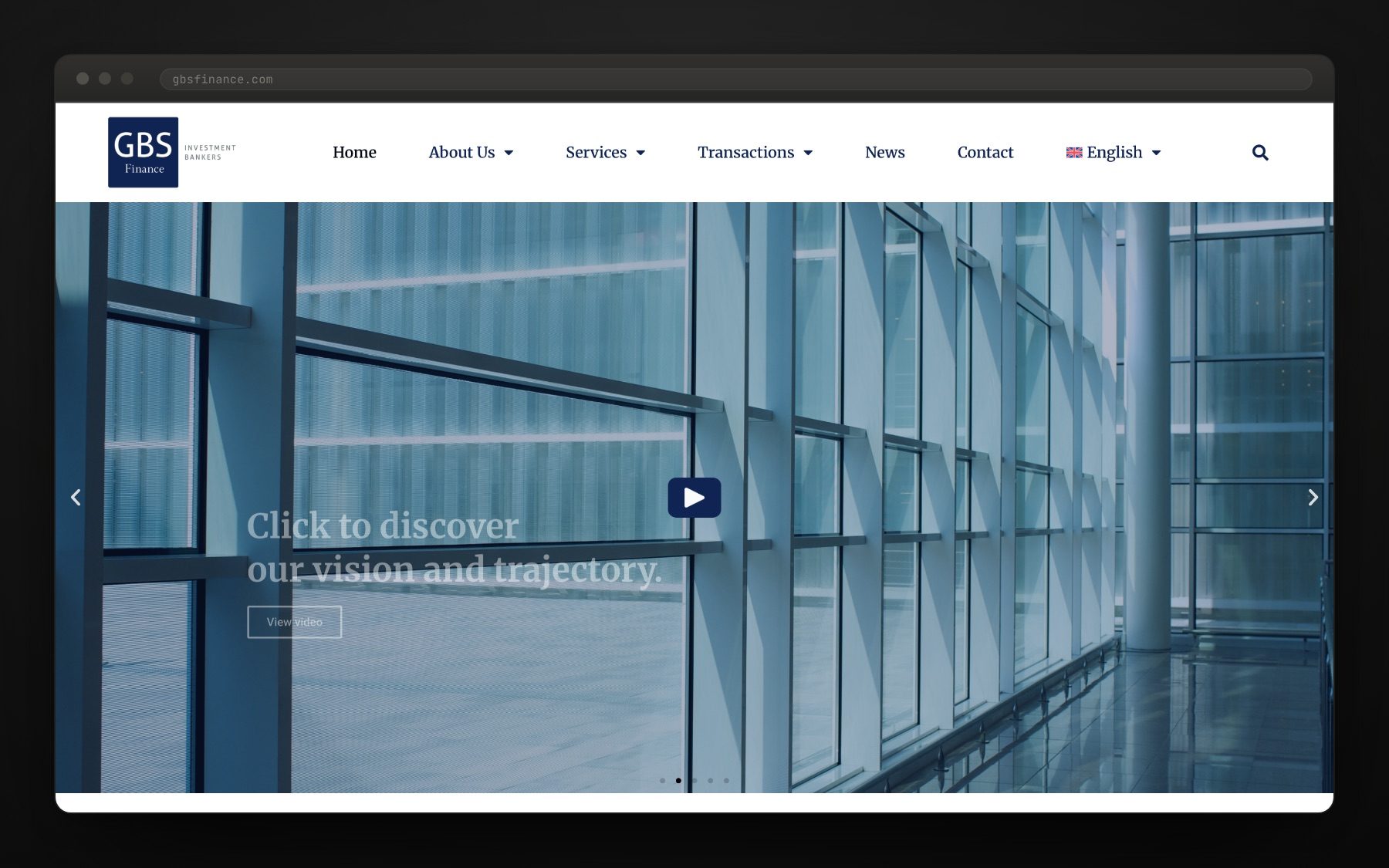
We redesigned the site on WordPress, from the structure up to the typography, leaving the brand untouched. A modern, elegant, practical site that reads as what it is: a bank, not an agency.
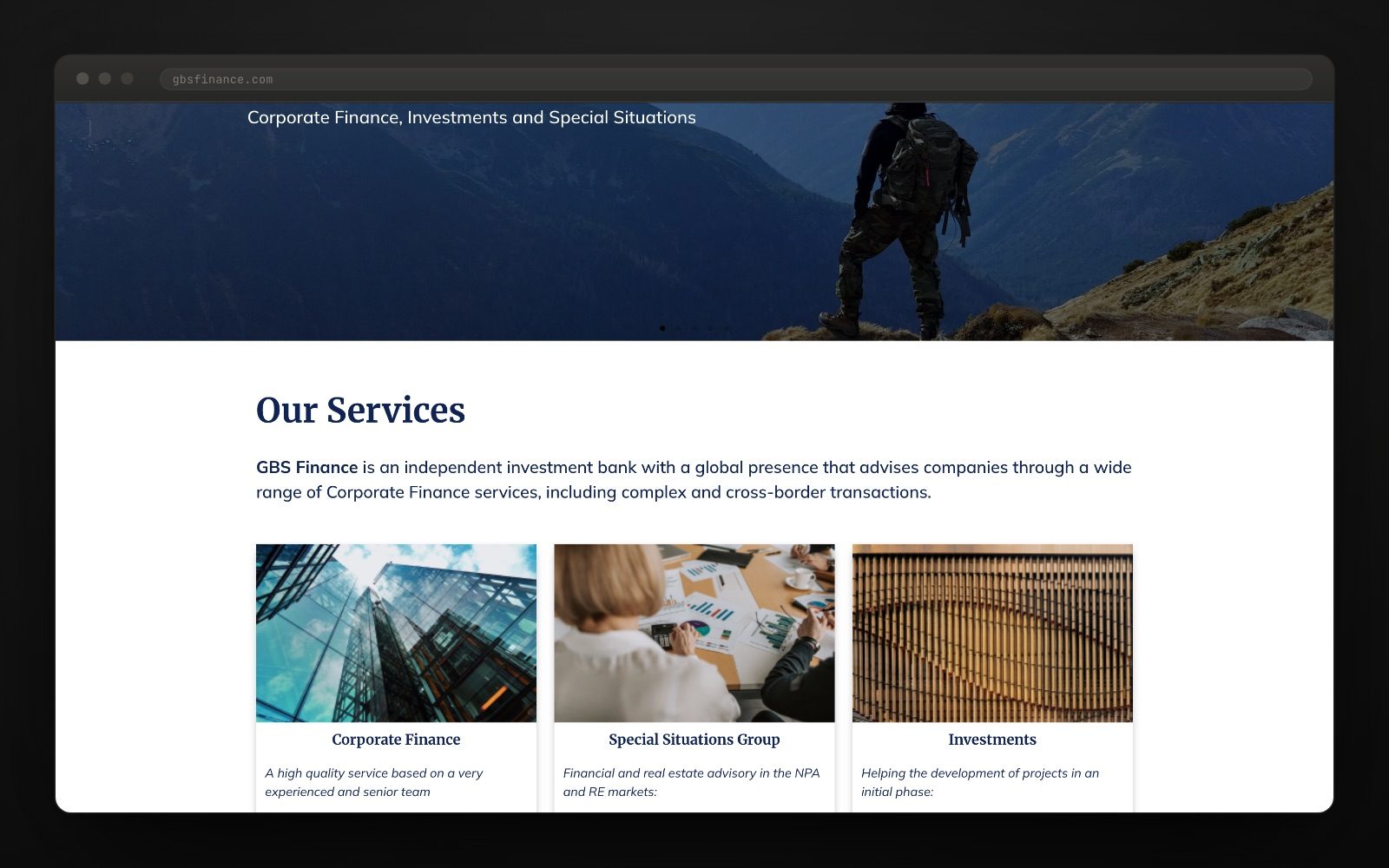
We organised the business into three clear lines — Corporate Finance, Special Situations Group and Investments — each with its own page, its team and its services, so a finance director finds in two clicks who can help and with what.
We built the archive of advised deals and the news section, which is where an investment bank proves what it claims: every transaction with its own entry, every milestone with its note. We added custom features so sensitive information is handled properly.
And we made it bilingual. English and Spanish with the same structure and the same care, because half their contacts do not read Spanish and the other half will not forgive machine-translated English.
A website that matches the work.
In investment banking the website does not sell: it confirms. Whoever arrives has already heard of you and comes to check you are as serious as they were told. The key was designing for that check: deals, team and geographic presence before any headline.
The project in numbers
What an investment banking website demands
It does not demand effects. It demands that the deal archive is up to date, because that is the proof; that the team has faces and track records, because you hire people; that the geographic presence is real, with a page per country and not a row of flags; and that the whistleblowing channel and the legal notices sit where regulation says they should, not hidden away.
It also demands speed and discretion: light pages, no extra trackers, forms that reach the right person. Sophistication, on a financial website, means nothing gets in the way. The figures shown on the site (year founded, deals advised, offices) are the ones the bank publishes itself.
How it went
Gallery · the project in pictures (click to enlarge)
Making experience visible.
The website organises four proofs of trust: the team, transactions, international reach and language versions. Actual recording, 26 September 2026.
- Home
- Team
- Transactions
- EN / ES
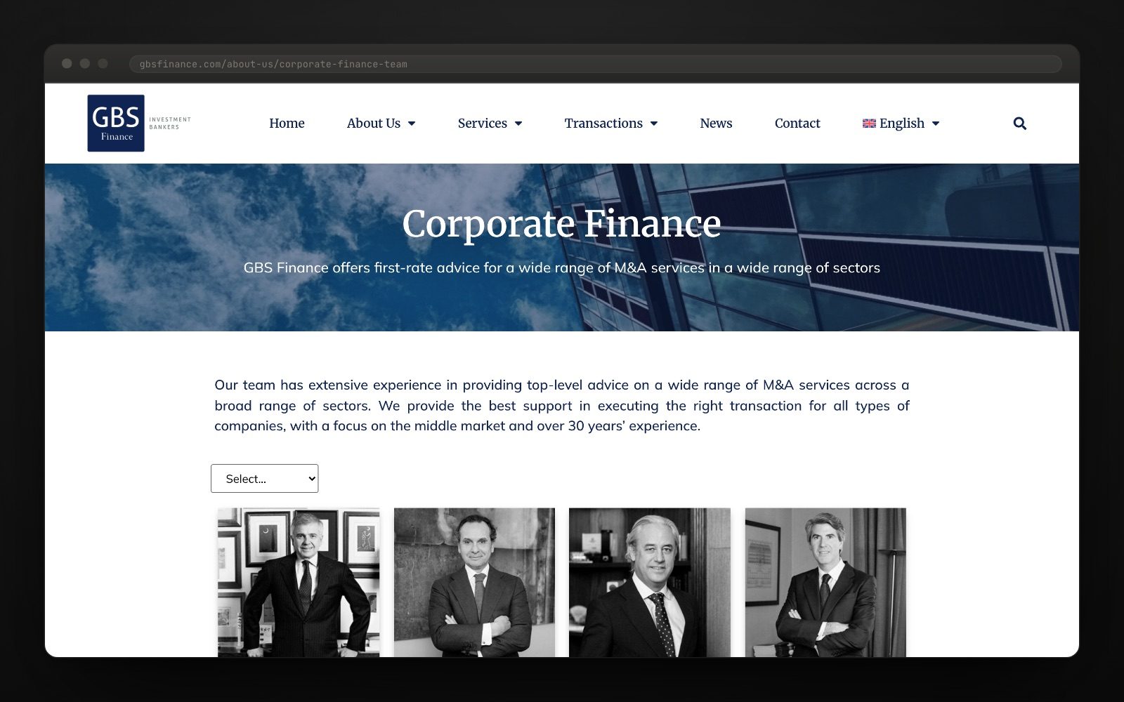
A team you can get to know.
Every profile and transaction has its own place. The structure makes the work visible without turning it into an abstract promise.
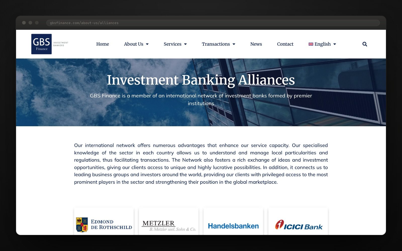
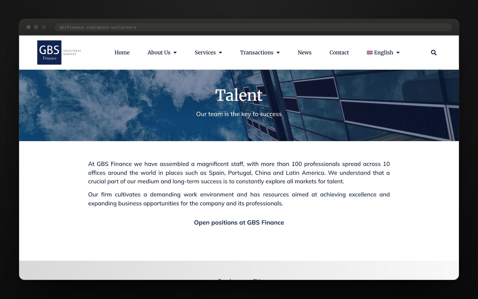
Everything else, in its place.
CSR on its own page, the international network in one column, and a mobile version to read in the taxi.
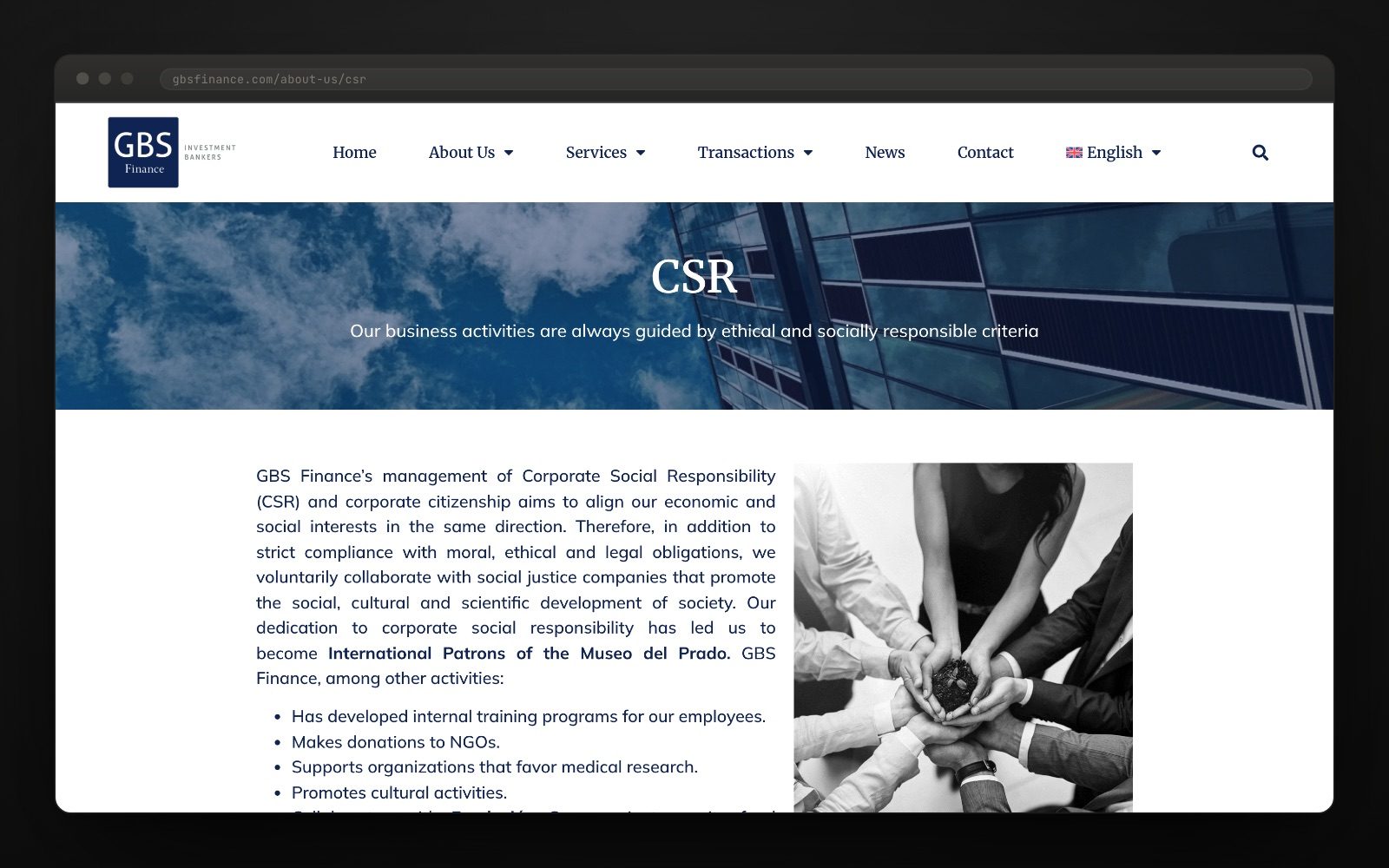
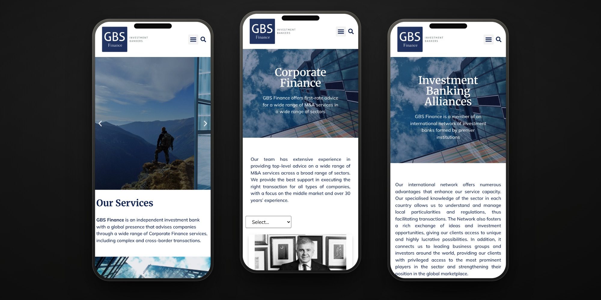
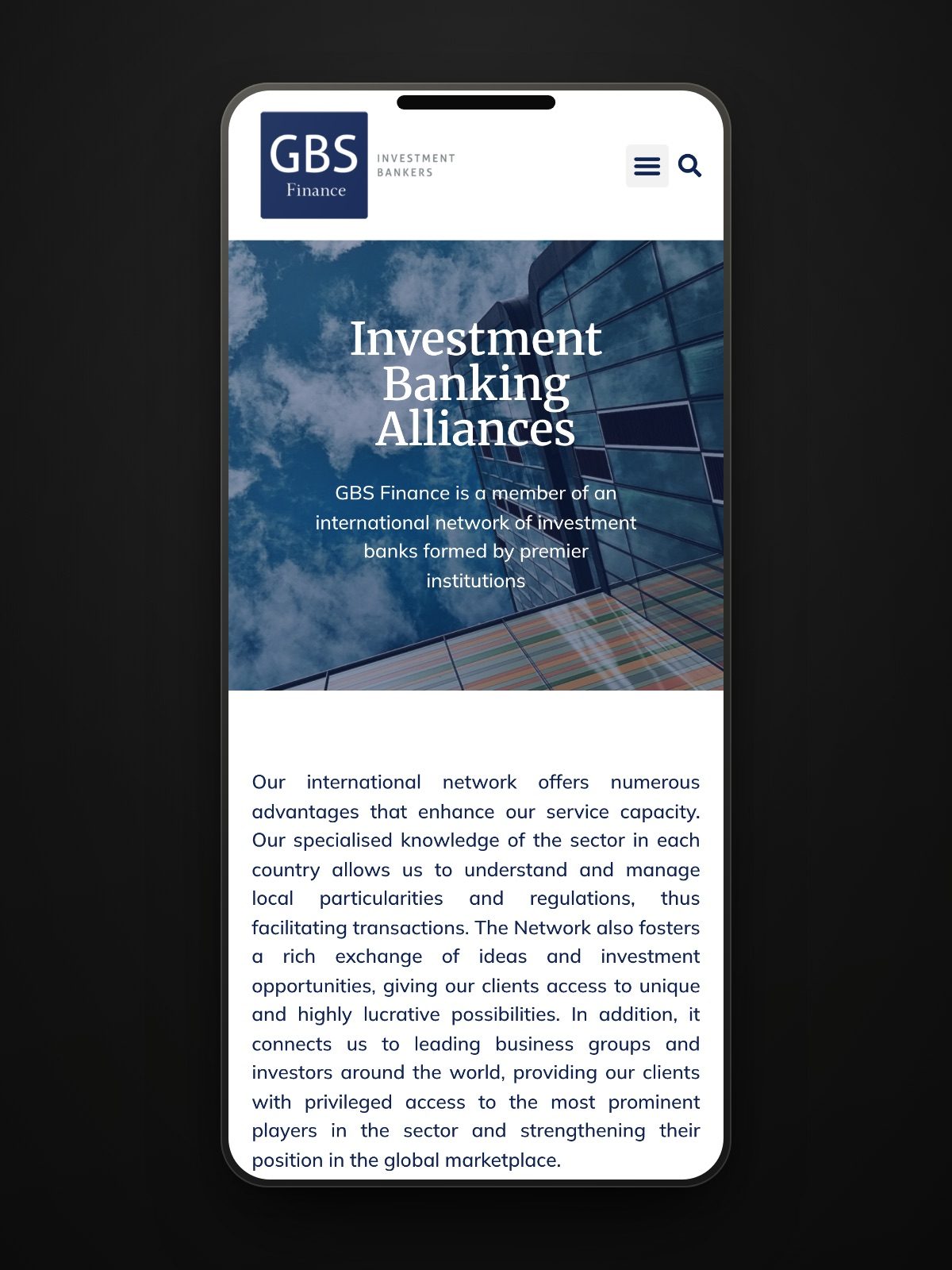
"We are here to lead. The website should say so too."Management
Want a result like this for your project?
More from this sector
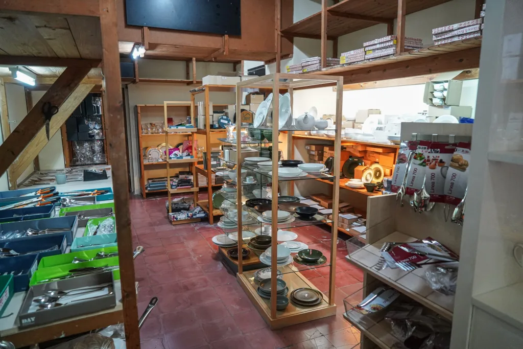
Cristall i Porcellana
A digital catalogue for composing the table piece by piece
View case study →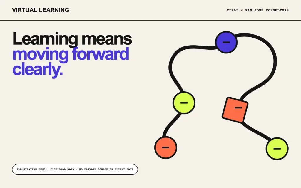
CIPDI + San José Consultors
An adaptable learning architecture for two professional contexts
View case study →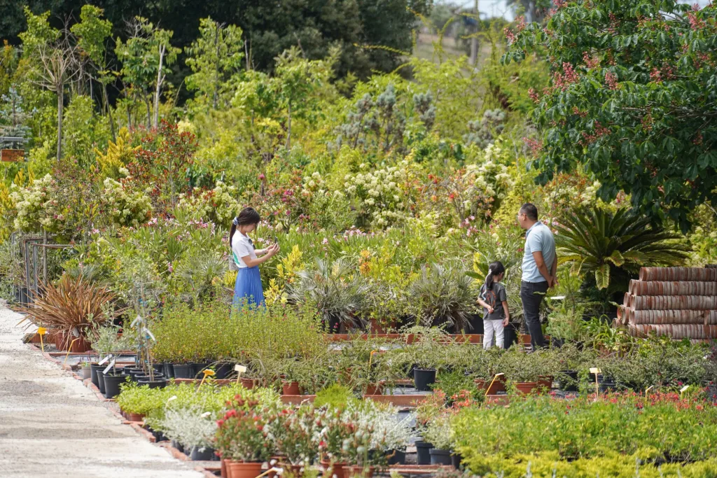
Viver Isart
A century-old nursery shaped into a living digital experience
View case study →