drone.barcelona
Clarity before take-off.
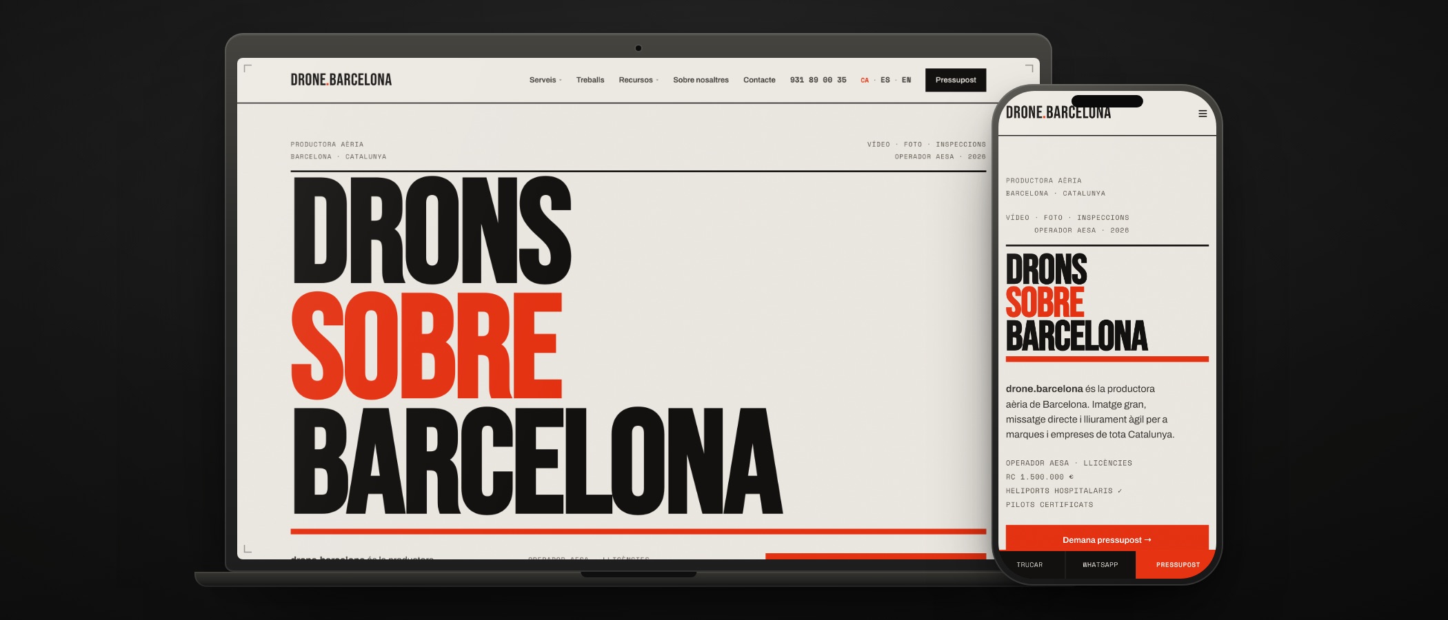
The starting point
This site does not belong to a client: it is ours. drone.barcelona is a Damos en el Blanco brand, built from scratch — name, domain, identity, website and development — for aerial drone work in Barcelona and across Catalonia. The site says so in its own footer, and we say so here.
It started with an uncomfortable observation: anyone can get a pretty aerial shot. What decides a booking is not the shot, it is whether you can fly there, under which permit and when it gets delivered. So the site had to sell legality and lead time, not postcards.
What we did
The name and the domain first. drone.barcelona says the what and the where without explaining anything, and the brand and the address are the same word. From there, a brand kit published on the site itself: not a loose logo, but a system with its rules in plain sight.
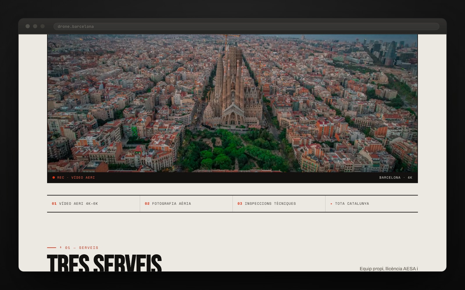
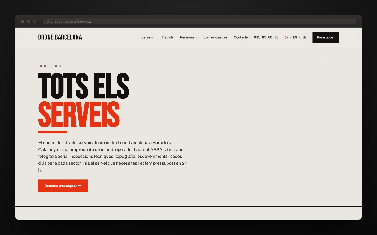
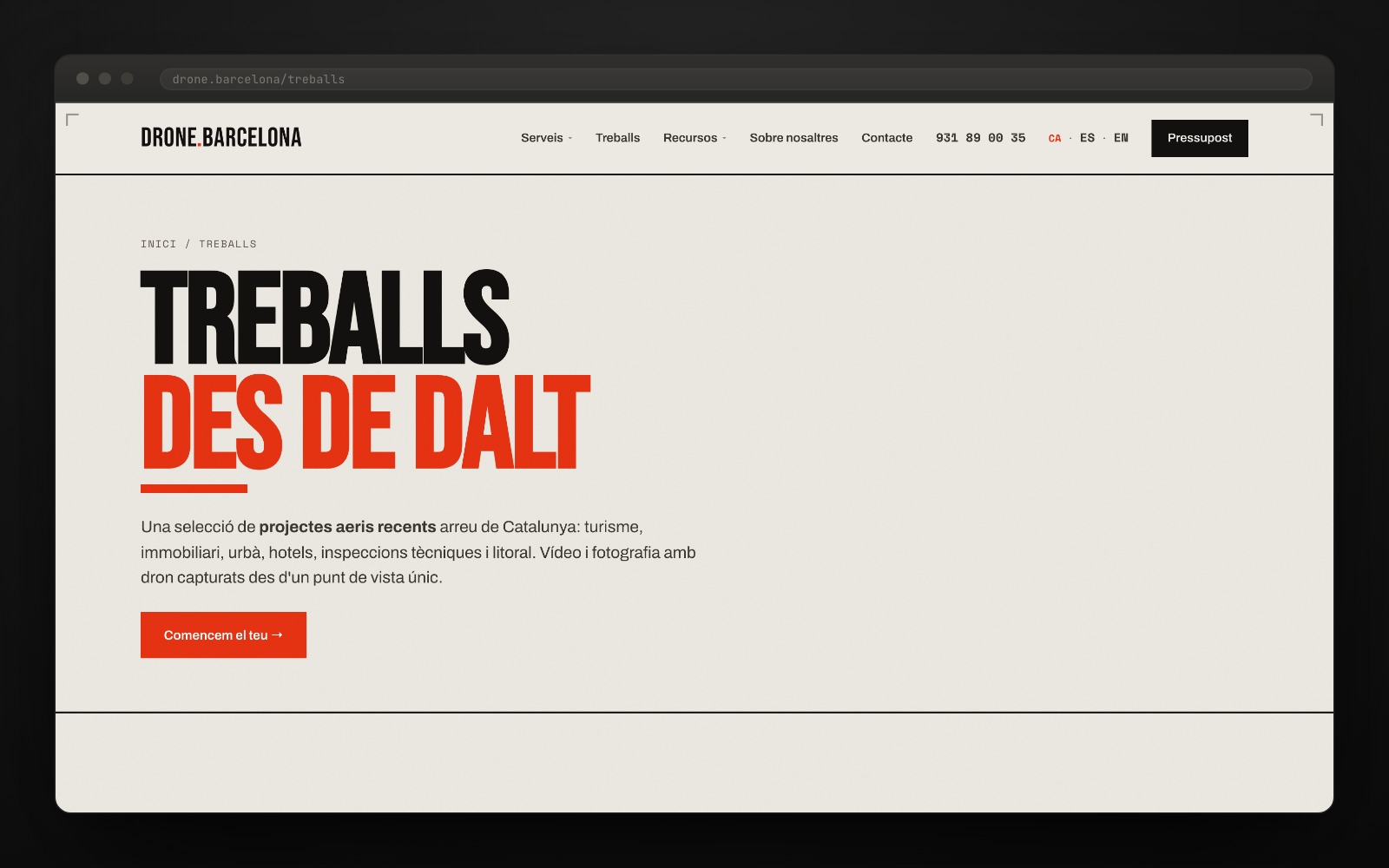
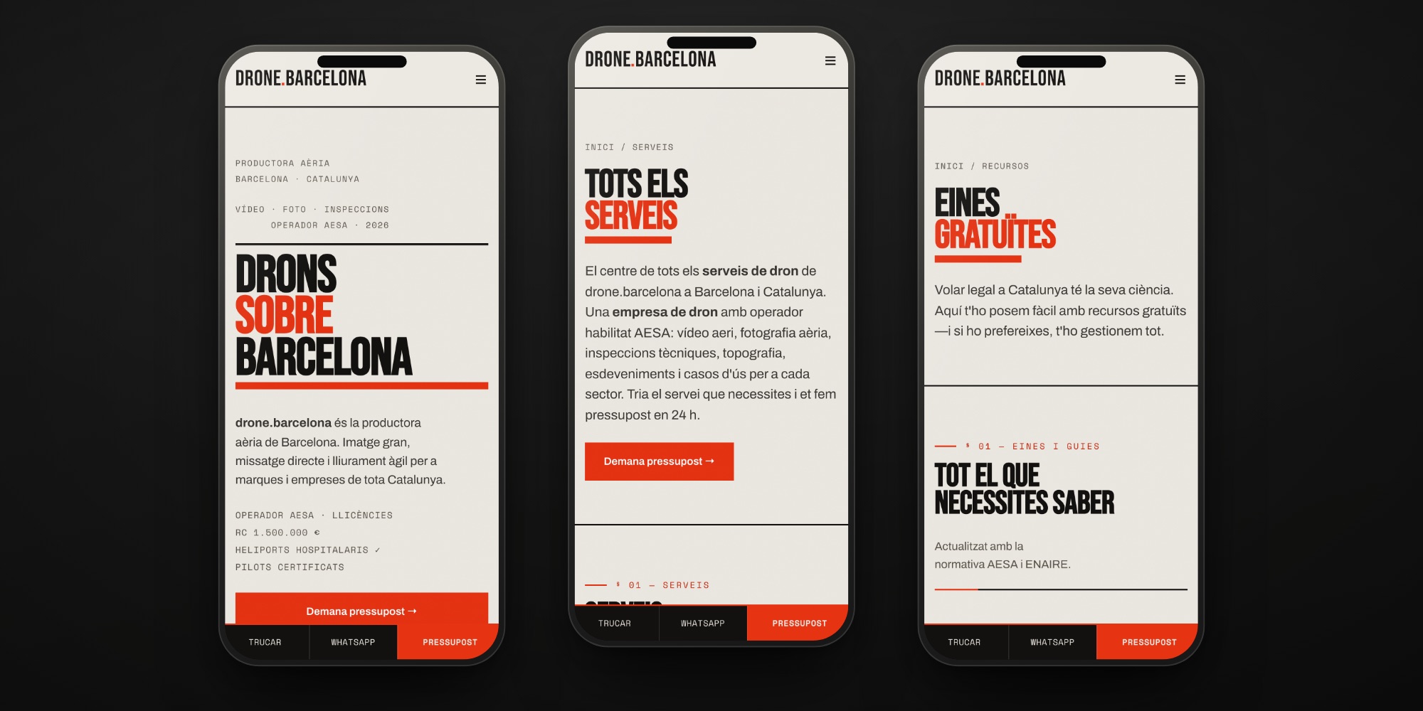
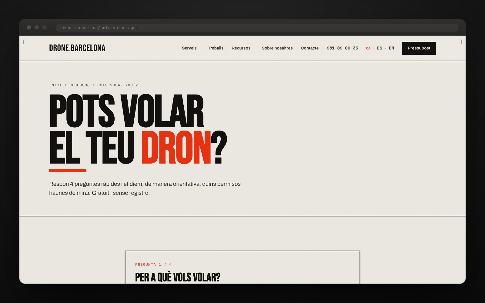
A printed poster, not a landing page. Huge headlines in Bebas Neue with one word in red, body text in Archivo and every guarantee set in Space Mono, as if it were a credential. Zero radii, zero shadows, zero gradients: cream paper, near-black ink and one red. Three typefaces with three jobs: shout, read and certify.
A static site written by hand, with no CMS and no dependencies. Our own HTML, CSS and JavaScript: instant loading, nothing to update and nothing to break. On top of that, the technical SEO a project like this needs on day one: hreflang in Catalan, Spanish and English with x-default, canonical, and FAQPage, LocalBusiness and a service catalogue in JSON-LD.
A structure built so that somebody finds it. Three services, six sectors, eight pages written county by county, an animated coverage map and a four-question tool that answers whether you can fly there and under which permit. Lead generation is not bolted on at the end: it is the architecture.
The paperwork up front. And well set.
The decision was to put the paperwork up front. In a sector that sells itself with spectacular shots, this site opens with the boring part — licences, insurance, lead times, where you can fly and where you cannot — because that is exactly what somebody needs to know before signing. And because the boring part, well set, gets looked at too.
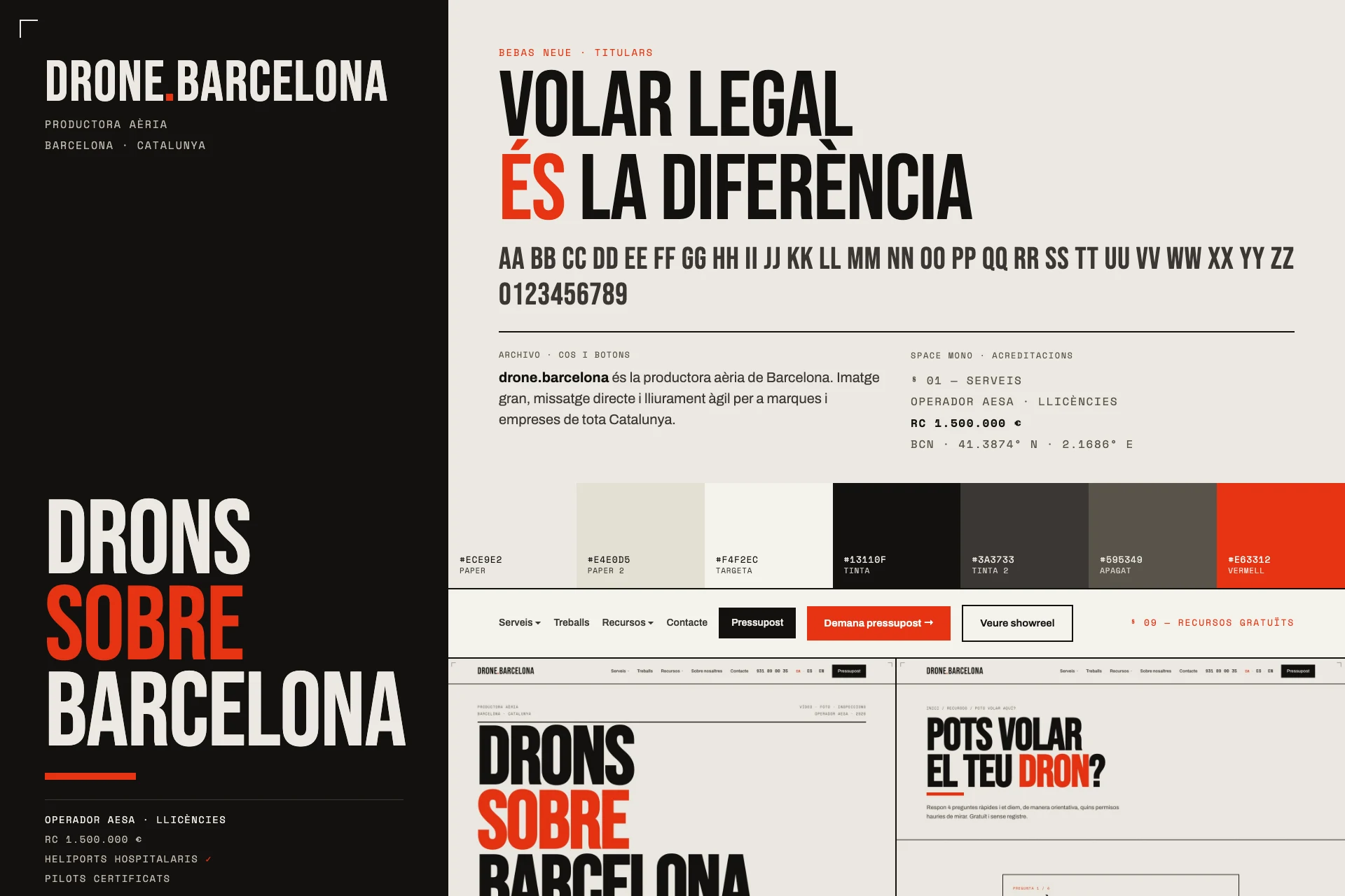
The project in numbers
What's underneath
Best to say it plainly: the images you see on drone.barcelona today are stock, sample material to show how the system breathes, and the site itself admits as much in writing on its work page. This case is not about a shoot: it is about standing up a brand — name, identity, website, structure and SEO — and leaving it ready for the real work to take its place.
We have flown drones, and it is in this same catalogue: the aerial site video for Roig Obres i Serveis and the construction timelapses for Time Lapse Barcelona, which the site names as a partner. That is the material that will replace the samples.
Technically, the project is proof that a small site does not need a CMS. No database, no plugins and no template layer: one stylesheet and one script of our own, scroll-triggered entrance animations and hand-written JSON-LD. What would be maintenance in a CMS is a commit here.
How it went
Gallery · the project in pictures (click to enlarge)
Flying legally, in four clicks
The guide explains Barcelona’s controlled airspace; the tool answers which permits to check. Actual recording, no simulated results.
- Home
- Permits guide
- “Pots volar aquí?” · 4 questions
- Orientative result
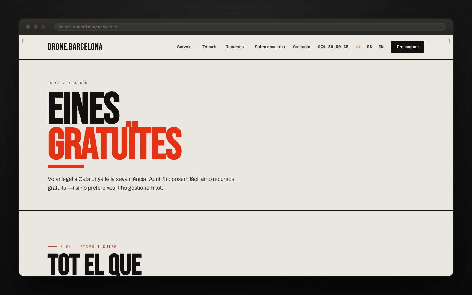
Big type, short message.
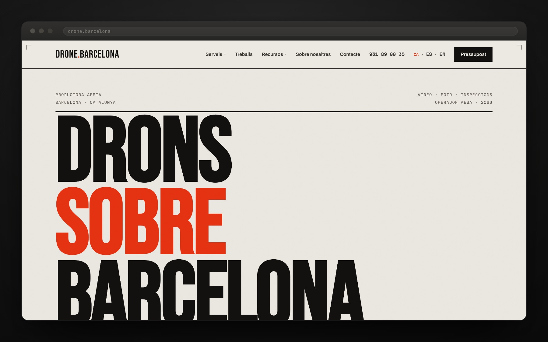
Always within reach.
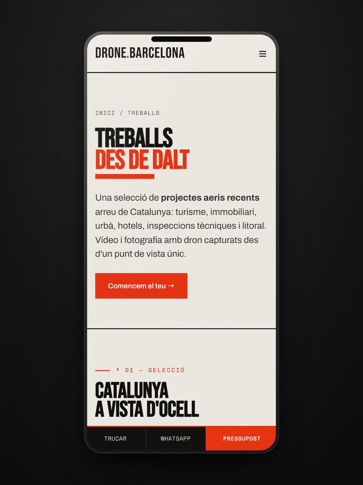
"Mirem el territori des d’on ningú més pot. Cada vol, legal; cada pla, pensat per vendre."drone.barcelona
Credits · the people behind it
Want a result like this for your project?
More from this sector
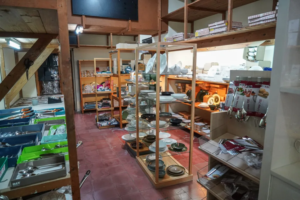
Cristall i Porcellana
A digital catalogue for composing the table piece by piece
View case study →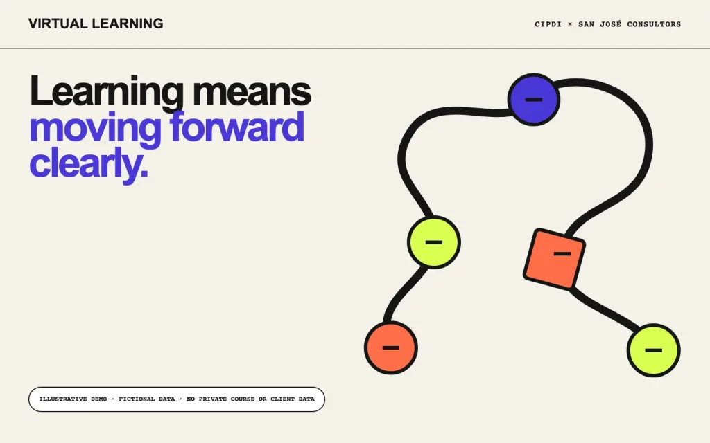
CIPDI + San José Consultors
An adaptable learning architecture for two professional contexts
View case study →
Viver Isart
A century-old nursery shaped into a living digital experience
View case study →